Turn on suggestions
Auto-suggest helps you quickly narrow down your search results by suggesting possible matches as you type.
Splunk Search
×
Are you a member of the Splunk Community?
Sign in or Register with your Splunk account to get your questions answered, access valuable resources and connect with experts!
Turn on suggestions
Auto-suggest helps you quickly narrow down your search results by suggesting possible matches as you type.
- Find Answers
- :
- Using Splunk
- :
- Splunk Search
- :
- Re: PIE CHART mouseover is displaying 100% value f...
Options
- Subscribe to RSS Feed
- Mark Topic as New
- Mark Topic as Read
- Float this Topic for Current User
- Bookmark Topic
- Subscribe to Topic
- Mute Topic
- Printer Friendly Page
- Mark as New
- Bookmark Message
- Subscribe to Message
- Mute Message
- Subscribe to RSS Feed
- Permalink
- Report Inappropriate Content
the_wolverine
Champion
02-06-2015
03:33 PM
My search:
- | chart max(REPORTING) as REPORTING max(MISSING) as MISSING
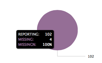
The table looks fine, 2 columns, REPORTING and MISSING, with value of 102 REPORTING and 4 MISSING.
The pie chart looks like this:
Where is 100% coming from? How do I remove it?
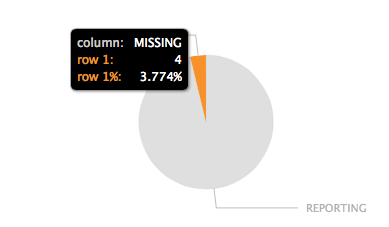
And if I add "| transpose" I get this chart with unwanted row/column text:
1 Solution
- Mark as New
- Bookmark Message
- Subscribe to Message
- Mute Message
- Subscribe to RSS Feed
- Permalink
- Report Inappropriate Content
the_wolverine
Champion
02-06-2015
03:58 PM
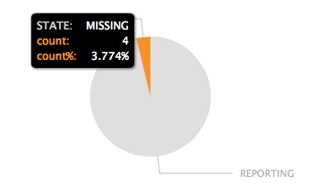
Workaround this by using transpose and rename the column and "row 1":
| chart max(REPORTING) as
"REPORTING" max(MISSING) as "MISSING" | transpose | rename "row 1" as count "column" as STATE
- Mark as New
- Bookmark Message
- Subscribe to Message
- Mute Message
- Subscribe to RSS Feed
- Permalink
- Report Inappropriate Content
the_wolverine
Champion
02-06-2015
03:58 PM
Get Updates on the Splunk Community!
Index This | Why did the turkey cross the road?
November 2025 Edition
Hayyy Splunk Education Enthusiasts and the Eternally Curious!
We’re back with this ...
Enter the Agentic Era with Splunk AI Assistant for SPL 1.4
🚀 Your data just got a serious AI upgrade — are you ready?
Say hello to the Agentic Era with the ...
Feel the Splunk Love: Real Stories from Real Customers
Hello Splunk Community,
What’s the best part of hearing how our customers use Splunk? Easy: the positive ...


