Turn on suggestions
Auto-suggest helps you quickly narrow down your search results by suggesting possible matches as you type.
Splunk Search
×
Are you a member of the Splunk Community?
Sign in or Register with your Splunk account to get your questions answered, access valuable resources and connect with experts!
Turn on suggestions
Auto-suggest helps you quickly narrow down your search results by suggesting possible matches as you type.
- Find Answers
- :
- Using Splunk
- :
- Splunk Search
- :
- Re: PIE CHART mouseover is displaying 100% value f...
Options
- Subscribe to RSS Feed
- Mark Topic as New
- Mark Topic as Read
- Float this Topic for Current User
- Bookmark Topic
- Subscribe to Topic
- Mute Topic
- Printer Friendly Page
- Mark as New
- Bookmark Message
- Subscribe to Message
- Mute Message
- Subscribe to RSS Feed
- Permalink
- Report Inappropriate Content
the_wolverine
Champion
02-06-2015
03:33 PM
My search:
- | chart max(REPORTING) as REPORTING max(MISSING) as MISSING
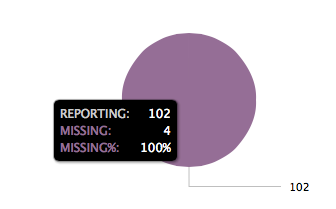
The table looks fine, 2 columns, REPORTING and MISSING, with value of 102 REPORTING and 4 MISSING.
The pie chart looks like this:
Where is 100% coming from? How do I remove it?
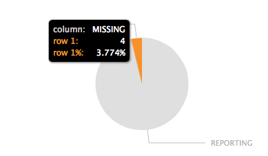
And if I add "| transpose" I get this chart with unwanted row/column text:
1 Solution
- Mark as New
- Bookmark Message
- Subscribe to Message
- Mute Message
- Subscribe to RSS Feed
- Permalink
- Report Inappropriate Content
the_wolverine
Champion
02-06-2015
03:58 PM
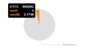
Workaround this by using transpose and rename the column and "row 1":
| chart max(REPORTING) as
"REPORTING" max(MISSING) as "MISSING" | transpose | rename "row 1" as count "column" as STATE
- Mark as New
- Bookmark Message
- Subscribe to Message
- Mute Message
- Subscribe to RSS Feed
- Permalink
- Report Inappropriate Content
the_wolverine
Champion
02-06-2015
03:58 PM
Get Updates on the Splunk Community!
What the End of Support for Splunk Add-on Builder Means for You
Hello Splunk Community!
We want to share an important update regarding the future of the Splunk Add-on Builder ...
Solve, Learn, Repeat: New Puzzle Channel Now Live
Welcome to the Splunk Puzzle PlaygroundIf you are anything like me, you love to solve problems, and what ...
Building Reliable Asset and Identity Frameworks in Splunk ES
Accurate asset and identity resolution is the backbone of security operations. Without it, alerts are ...


