Turn on suggestions
Auto-suggest helps you quickly narrow down your search results by suggesting possible matches as you type.
Splunk Search
×
Join the Conversation
Without signing in, you're just watching from the sidelines. Sign in or Register to connect, share, and be part of the Splunk Community.
Turn on suggestions
Auto-suggest helps you quickly narrow down your search results by suggesting possible matches as you type.
- Find Answers
- :
- Using Splunk
- :
- Splunk Search
- :
- Re: PIE CHART mouseover is displaying 100% value f...
Options
- Subscribe to RSS Feed
- Mark Topic as New
- Mark Topic as Read
- Float this Topic for Current User
- Bookmark Topic
- Subscribe to Topic
- Mute Topic
- Printer Friendly Page
- Mark as New
- Bookmark Message
- Subscribe to Message
- Mute Message
- Subscribe to RSS Feed
- Permalink
- Report Inappropriate Content
the_wolverine
Champion
02-06-2015
03:33 PM
My search:
- | chart max(REPORTING) as REPORTING max(MISSING) as MISSING
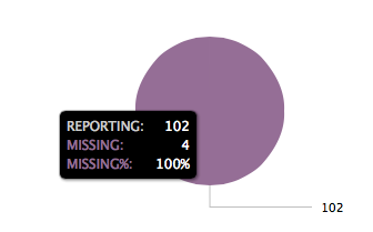
The table looks fine, 2 columns, REPORTING and MISSING, with value of 102 REPORTING and 4 MISSING.
The pie chart looks like this:
Where is 100% coming from? How do I remove it?
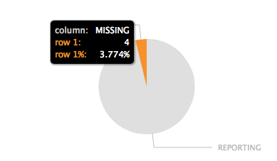
And if I add "| transpose" I get this chart with unwanted row/column text:
1 Solution
- Mark as New
- Bookmark Message
- Subscribe to Message
- Mute Message
- Subscribe to RSS Feed
- Permalink
- Report Inappropriate Content
the_wolverine
Champion
02-06-2015
03:58 PM
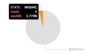
Workaround this by using transpose and rename the column and "row 1":
| chart max(REPORTING) as
"REPORTING" max(MISSING) as "MISSING" | transpose | rename "row 1" as count "column" as STATE
- Mark as New
- Bookmark Message
- Subscribe to Message
- Mute Message
- Subscribe to RSS Feed
- Permalink
- Report Inappropriate Content
the_wolverine
Champion
02-06-2015
03:58 PM
Get Updates on the Splunk Community!
A Season of Skills: New Splunk Courses to Light Up Your Learning Journey
There’s something special about this time of year—maybe it’s the glow of the holidays, maybe it’s the ...
Announcing the Migration of the Splunk Add-on for Microsoft Azure Inputs to ...
Announcing the Migration of the Splunk Add-on for Microsoft Azure Inputs to Officially Supported Splunk ...
Splunk Observability for AI
Don’t miss out on an exciting Tech Talk on Splunk Observability for AI!
Discover how Splunk’s agentic AI ...


