
Turn on suggestions
Auto-suggest helps you quickly narrow down your search results by suggesting possible matches as you type.
Dashboards & Visualizations
×
Join the Conversation
Without signing in, you're just watching from the sidelines. Sign in or Register to connect, share, and be part of the Splunk Community.
- Find Answers
- :
- Using Splunk
- :
- Dashboards & Visualizations
- :
- sub aggregation pie chart with splunk ?
Options
- Subscribe to RSS Feed
- Mark Topic as New
- Mark Topic as Read
- Float this Topic for Current User
- Bookmark Topic
- Subscribe to Topic
- Mute Topic
- Printer Friendly Page
- Mark as New
- Bookmark Message
- Subscribe to Message
- Mute Message
- Subscribe to RSS Feed
- Permalink
- Report Inappropriate Content

mcarpentier
Engager
09-05-2016
09:30 AM
Hi all,
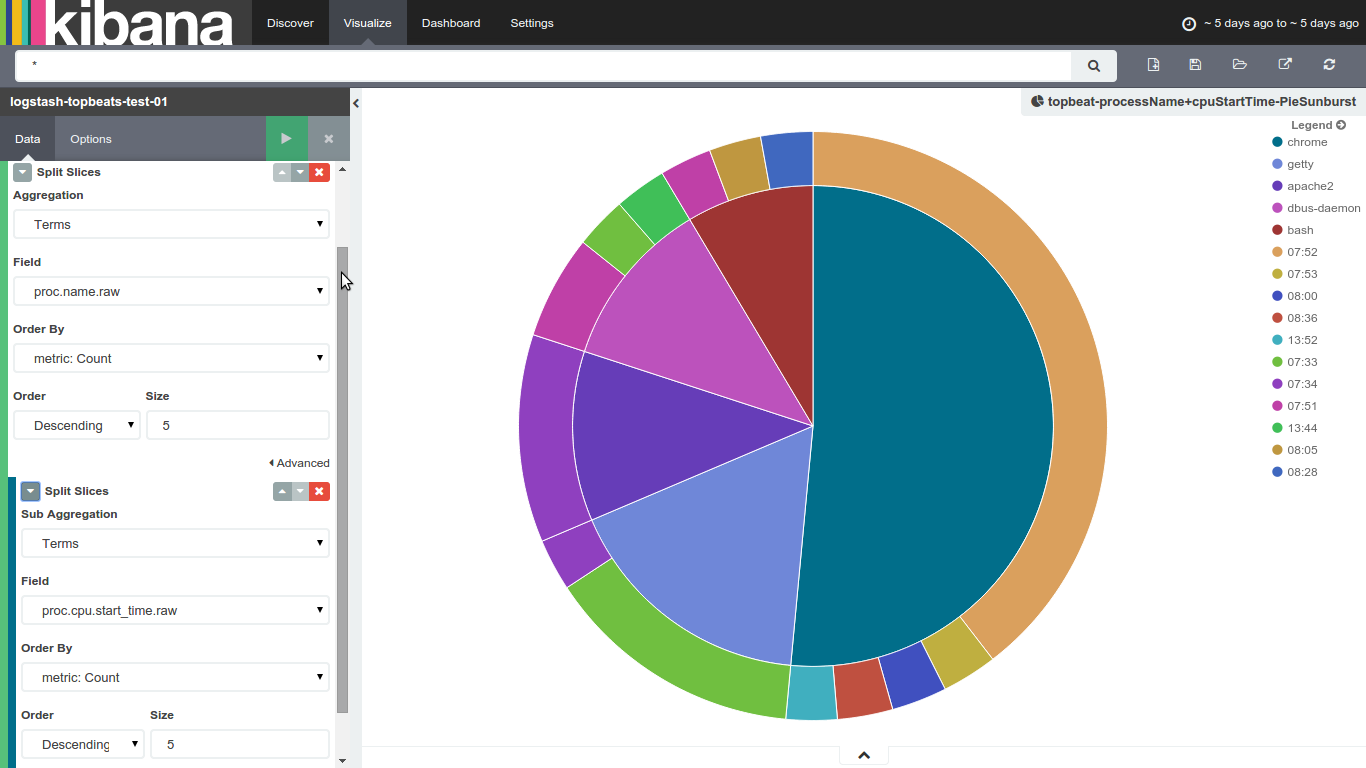
New to splunk, i'm quite used to kibana's sub aggreagation charts, like the one below : it's a very convenient way to show some of my datas
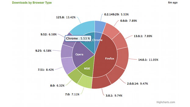
i know Splunk's pie charts are limited to one column, what would the best way to achieve that kind of visualization (sub aggregation ones) in splunk ?
Thanks for your help
Max
1 Solution
- Mark as New
- Bookmark Message
- Subscribe to Message
- Mute Message
- Subscribe to RSS Feed
- Permalink
- Report Inappropriate Content

inventsekar

SplunkTrust
09-06-2016
08:31 AM
- Mark as New
- Bookmark Message
- Subscribe to Message
- Mute Message
- Subscribe to RSS Feed
- Permalink
- Report Inappropriate Content
inventsekar
SplunkTrust
09-06-2016
08:31 AM



Got questions? Get answers!
Join the Splunk Community Slack to learn, troubleshoot, and make connections with fellow Splunk practitioners in real time!
Meet up IRL or virtually!
Join Splunk User Groups to connect and learn in-person by region or remotely by topic or industry.
Get Updates on the Splunk Community!
SOC4Kafka - New Kafka Connector Powered by OpenTelemetry
The new SOC4Kafka connector, built on OpenTelemetry, enables the collection of Kafka messages and forwards ...
Rounding off the Splunk Dashboard Contest
What does a contest-winning Splunk dashboard look like? In this case, it isn't in a browser tab at all. It ...
A Four Part Event Series: AI + Observability: AI Agents, LLMs, Apps, & Infrastructure
AI + Observability: AI Agents, LLMs, Apps, & Infrastructure
The rapid evolution of artificial intelligence ...
