Turn on suggestions
Auto-suggest helps you quickly narrow down your search results by suggesting possible matches as you type.
Dashboards & Visualizations
×
Are you a member of the Splunk Community?
Sign in or Register with your Splunk account to get your questions answered, access valuable resources and connect with experts!
Turn on suggestions
Auto-suggest helps you quickly narrow down your search results by suggesting possible matches as you type.
- Find Answers
- :
- Using Splunk
- :
- Dashboards & Visualizations
- :
- Re: sub aggregation pie chart with splunk ?
Options
- Subscribe to RSS Feed
- Mark Topic as New
- Mark Topic as Read
- Float this Topic for Current User
- Bookmark Topic
- Subscribe to Topic
- Mute Topic
- Printer Friendly Page
- Mark as New
- Bookmark Message
- Subscribe to Message
- Mute Message
- Subscribe to RSS Feed
- Permalink
- Report Inappropriate Content
mcarpentier
Engager
09-05-2016
09:30 AM
Hi all,
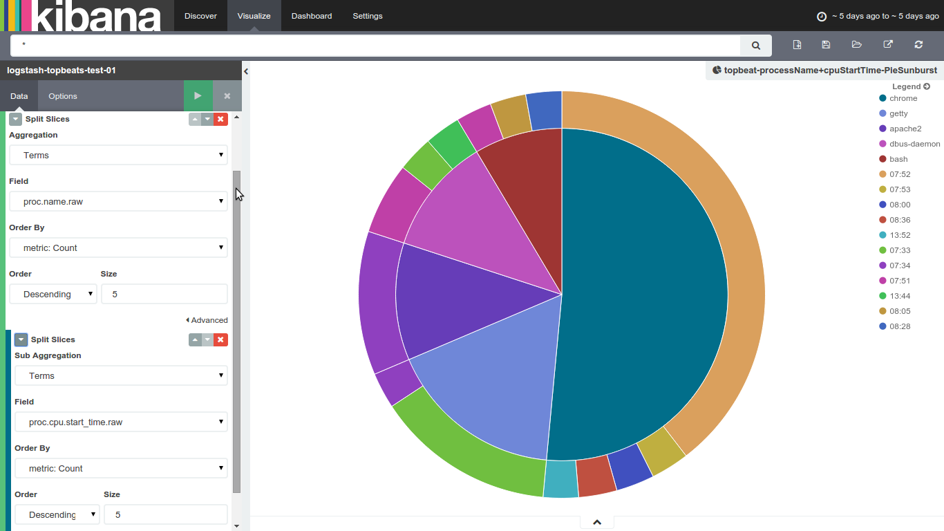
New to splunk, i'm quite used to kibana's sub aggreagation charts, like the one below : it's a very convenient way to show some of my datas
i know Splunk's pie charts are limited to one column, what would the best way to achieve that kind of visualization (sub aggregation ones) in splunk ?
Thanks for your help
Max
1 Solution
- Mark as New
- Bookmark Message
- Subscribe to Message
- Mute Message
- Subscribe to RSS Feed
- Permalink
- Report Inappropriate Content
inventsekar

SplunkTrust
09-06-2016
08:31 AM
Please check Donut Charts app -
https://splunkbase.splunk.com/app/1161/

thanks and best regards,
Sekar
PS - If this or any post helped you in any way, pls consider upvoting, thanks for reading !
Sekar
PS - If this or any post helped you in any way, pls consider upvoting, thanks for reading !
- Mark as New
- Bookmark Message
- Subscribe to Message
- Mute Message
- Subscribe to RSS Feed
- Permalink
- Report Inappropriate Content
inventsekar
SplunkTrust
09-06-2016
08:31 AM
Please check Donut Charts app -
https://splunkbase.splunk.com/app/1161/
thanks and best regards,
Sekar
PS - If this or any post helped you in any way, pls consider upvoting, thanks for reading !
Sekar
PS - If this or any post helped you in any way, pls consider upvoting, thanks for reading !
Get Updates on the Splunk Community!
Splunk Mobile: Your Brand-New Home Screen
Meet Your New Mobile Hub
Hello Splunk Community!
Staying connected to your data—no matter where you are—is ...
Introducing Value Insights (Beta): Understand the Business Impact your organization ...
Real progress on your strategic priorities starts with knowing the business outcomes your teams are delivering ...
Enterprise Security (ES) Essentials 8.3 is Now GA — Smarter Detections, Faster ...
As of today, Enterprise Security (ES) Essentials 8.3 is now generally available, helping SOC teams simplify ...
