- Find Answers
- :
- Using Splunk
- :
- Dashboards & Visualizations
- :
- Re: How to show total count of stacked chart on th...
- Subscribe to RSS Feed
- Mark Topic as New
- Mark Topic as Read
- Float this Topic for Current User
- Bookmark Topic
- Subscribe to Topic
- Mute Topic
- Printer Friendly Page
- Mark as New
- Bookmark Message
- Subscribe to Message
- Mute Message
- Subscribe to RSS Feed
- Permalink
- Report Inappropriate Content
How to show total count of stacked chart on the top of column?
Hi,
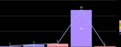
I have total four fields lets say a,b,c and d. i want to show 'a' as a separate column and 'b','c' and 'd' as stacked and beside 'a' along with the sum of fields ('b'+'c'+'d') so that the count of these fields would come on the top of their column so that we can easily compare field 'a' with the count of rest.
Note:- I don't want separate column which would give sum of these three field. You can refer the screenshot.
In case you want further details feel free to ask.
Any help would be appreciated.
Thanks.
- Mark as New
- Bookmark Message
- Subscribe to Message
- Mute Message
- Subscribe to RSS Feed
- Permalink
- Report Inappropriate Content
Were you able to achieve this? Two bars with just one stacked as shown in your image.
- Mark as New
- Bookmark Message
- Subscribe to Message
- Mute Message
- Subscribe to RSS Feed
- Permalink
- Report Inappropriate Content
Alternative approach ,
search ... | addtotals
Add totals gives you the row total with the field name Total
- Click visualization select column chart
- Click format and enable the
stack mode. - select
show data valuesason - Click
chart overlayand Click the text box and selectTotalfield. - make
View as Axisas off - Click Apply.
you will get the stacked chart with numbers. overlay will be an line chart shows number.
- Mark as New
- Bookmark Message
- Subscribe to Message
- Mute Message
- Subscribe to RSS Feed
- Permalink
- Report Inappropriate Content
Hi @davesplunk01 ,
I'm having the same senario like this, after the above steps that you had mentioned, I can see the total on the top along with the line,
I don't need line, Can you please help me in this.
Thanks in Advance!
Manoj Kumar S
- Mark as New
- Bookmark Message
- Subscribe to Message
- Mute Message
- Subscribe to RSS Feed
- Permalink
- Report Inappropriate Content
Sounds like a very specialized visualization. Hmmm. Might be useful.
Basically, you want to be able to "group" the series and stack them. The fact that one of your groups has only one member (a) and the other has three (b,c,d) is irrelevant to the design of the viz.
Seems like you'd want to be able to choose the base color of each group, and have the individual series be variants of that color (up to N different blues for group 1, up to N different reds for group 2, up to N different greens for group 3, etc.)
Don't know of anything like that, but it does seem quite useful. For instance, if you wanted to compare causes of death for men and women, in number of deaths per 100 K, that would be a good viz.
Hmmm. Could also be same colors in each stack in that usage, with maybe a single skinny bar up the side of the stack for group total...

