- Mark as New
- Bookmark Message
- Subscribe to Message
- Mute Message
- Subscribe to RSS Feed
- Permalink
- Report Inappropriate Content
How to create a graph of these results showing a graduation or reduction of the response times?
sheldonjolly
Engager
03-07-2022
07:26 AM
Hi
I have a query based on response times from a service.
index=homebanking "/soa/mcoi-rc-services/ContractService" Time="*" | rex field=_raw "\/(?<time>[^_\/]+)[\w\.]+($|\s)" | stats count by Time | fields - count
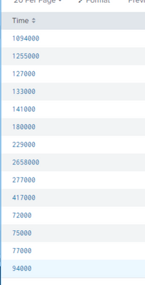
I get these results......
I'd like to now create a graph of these results showing a graduation or reduction of the response times.
Can someone help?
Best,
Sheldon.
- Mark as New
- Bookmark Message
- Subscribe to Message
- Mute Message
- Subscribe to RSS Feed
- Permalink
- Report Inappropriate Content
sheldonjolly
Engager
03-07-2022
10:46 PM
This worked quite nicely. Many thanks.
Now, how do I convert the response time to seconds?
- Mark as New
- Bookmark Message
- Subscribe to Message
- Mute Message
- Subscribe to RSS Feed
- Permalink
- Report Inappropriate Content
somesoni2
Revered Legend
03-07-2022
12:37 PM
Try something like this
index=homebanking "/soa/mcoi-rc-services/ContractService" Time="*" | rex field=_raw "\/(?<time>[^_\/]+)[\w\.]+($|\s)" | timechart avg(Time) as Avg_Response_Time- Mark as New
- Bookmark Message
- Subscribe to Message
- Mute Message
- Subscribe to RSS Feed
- Permalink
- Report Inappropriate Content
richgalloway

SplunkTrust
03-07-2022
08:03 AM
After running the search, click on the Visualization tab and select the visualization that best presents the data.
---
If this reply helps you, Karma would be appreciated.
If this reply helps you, Karma would be appreciated.

