Turn on suggestions
Auto-suggest helps you quickly narrow down your search results by suggesting possible matches as you type.
Showing results for
Dashboards & Visualizations
Turn on suggestions
Auto-suggest helps you quickly narrow down your search results by suggesting possible matches as you type.
Showing results for
- Splunk Answers
- :
- Using Splunk
- :
- Dashboards & Visualizations
- :
- How to create a graph of these results showing a g...
Options
- Subscribe to RSS Feed
- Mark Topic as New
- Mark Topic as Read
- Float this Topic for Current User
- Bookmark Topic
- Subscribe to Topic
- Mute Topic
- Printer Friendly Page
- Mark as New
- Bookmark Message
- Subscribe to Message
- Mute Message
- Subscribe to RSS Feed
- Permalink
- Report Inappropriate Content
How to create a graph of these results showing a graduation or reduction of the response times?
sheldonjolly
Engager
03-07-2022
07:26 AM
Hi
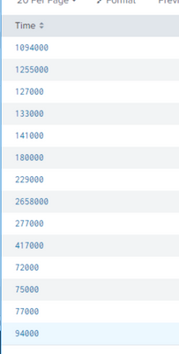
I have a query based on response times from a service.
index=homebanking "/soa/mcoi-rc-services/ContractService" Time="*" | rex field=_raw "\/(?<time>[^_\/]+)[\w\.]+($|\s)" | stats count by Time | fields - count
I get these results......
I'd like to now create a graph of these results showing a graduation or reduction of the response times.
Can someone help?
Best,
Sheldon.
- Mark as New
- Bookmark Message
- Subscribe to Message
- Mute Message
- Subscribe to RSS Feed
- Permalink
- Report Inappropriate Content
sheldonjolly
Engager
03-07-2022
10:46 PM
This worked quite nicely. Many thanks.
Now, how do I convert the response time to seconds?
- Mark as New
- Bookmark Message
- Subscribe to Message
- Mute Message
- Subscribe to RSS Feed
- Permalink
- Report Inappropriate Content
somesoni2
Revered Legend
03-07-2022
12:37 PM
Try something like this
index=homebanking "/soa/mcoi-rc-services/ContractService" Time="*" | rex field=_raw "\/(?<time>[^_\/]+)[\w\.]+($|\s)" | timechart avg(Time) as Avg_Response_Time- Mark as New
- Bookmark Message
- Subscribe to Message
- Mute Message
- Subscribe to RSS Feed
- Permalink
- Report Inappropriate Content
richgalloway

SplunkTrust
03-07-2022
08:03 AM
After running the search, click on the Visualization tab and select the visualization that best presents the data.
---
If this reply helps you, Karma would be appreciated.
If this reply helps you, Karma would be appreciated.
Get Updates on the Splunk Community!
Enter the Splunk Community Dashboard Challenge for Your Chance to Win!
The Splunk Community Dashboard Challenge is underway! This is your chance to showcase your skills in creating ...
.conf24 | Session Scheduler is Live!!
.conf24 is happening June 11 - 14 in Las Vegas, and we are thrilled to announce that the conference catalog ...
Introducing the Splunk Community Dashboard Challenge!
Welcome to Splunk Community Dashboard Challenge! This is your chance to showcase your skills in creating ...

