Join the Conversation
- Find Answers
- :
- Using Splunk
- :
- Splunk Search
- :
- using bar charts
- Subscribe to RSS Feed
- Mark Topic as New
- Mark Topic as Read
- Float this Topic for Current User
- Bookmark Topic
- Subscribe to Topic
- Mute Topic
- Printer Friendly Page
- Mark as New
- Bookmark Message
- Subscribe to Message
- Mute Message
- Subscribe to RSS Feed
- Permalink
- Report Inappropriate Content
Hello splunkers
i want to create a visualization for my command to create a bar chart that contains the (src_ip/user) information on the x-axis and the count on the y-access
i tried this command but it aint working:
index=MyApp eventtype=My_App_Authentication_logs user=* action=failure | top 10 user by src | sort -count | where count>=4 | head 20| table src user count
i need your help please
Thanks in advance
- Mark as New
- Bookmark Message
- Subscribe to Message
- Mute Message
- Subscribe to RSS Feed
- Permalink
- Report Inappropriate Content
use this in the end of your query
|eval "src.user"=src." :: ".user |fields src.user count
- Mark as New
- Bookmark Message
- Subscribe to Message
- Mute Message
- Subscribe to RSS Feed
- Permalink
- Report Inappropriate Content
use this in the end of your query
|eval "src.user"=src." :: ".user |fields src.user count
- Mark as New
- Bookmark Message
- Subscribe to Message
- Mute Message
- Subscribe to RSS Feed
- Permalink
- Report Inappropriate Content
thanks a lot my splunker mate ^_^
- Mark as New
- Bookmark Message
- Subscribe to Message
- Mute Message
- Subscribe to RSS Feed
- Permalink
- Report Inappropriate Content
Please elaborate on "it ain't working". What results do you get and how do they compare to the expected results?
If this reply helps you, Karma would be appreciated.
- Mark as New
- Bookmark Message
- Subscribe to Message
- Mute Message
- Subscribe to RSS Feed
- Permalink
- Report Inappropriate Content
Thanks for the reponse rich ^_^
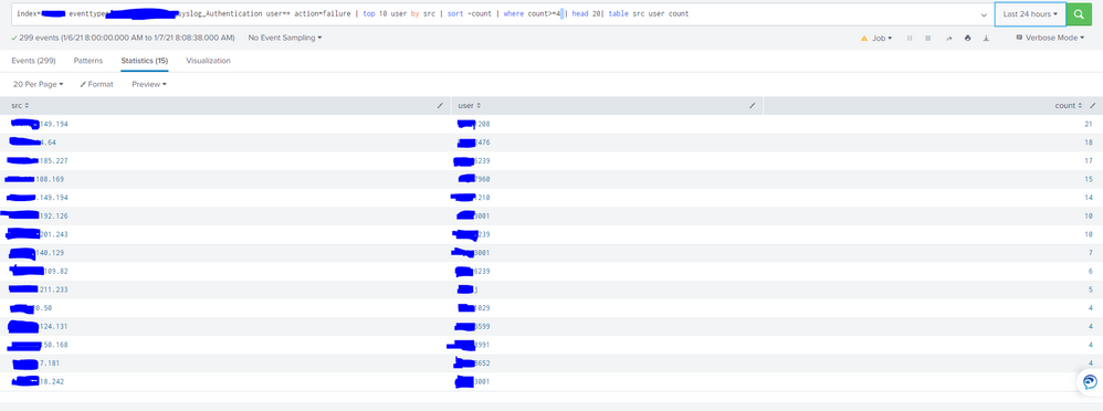
take a look at this statistics:
now i want to show this table as a bar chart where the combination of (SRC/User) is on the x-axis and the count is on the Y-axis, like:
the y-axis only shows the SRC field, i want to combine it with the user field


