Are you a member of the Splunk Community?
- Find Answers
- :
- Using Splunk
- :
- Splunk Search
- :
- Re: How to chart values over time
- Subscribe to RSS Feed
- Mark Topic as New
- Mark Topic as Read
- Float this Topic for Current User
- Bookmark Topic
- Subscribe to Topic
- Mute Topic
- Printer Friendly Page
- Mark as New
- Bookmark Message
- Subscribe to Message
- Mute Message
- Subscribe to RSS Feed
- Permalink
- Report Inappropriate Content
How to chart values over time
Hello
What I am trying to do is to literally chart the values over time. Now the value can be anything. It can be a string too. My goal here is to just show what values occurred over that time
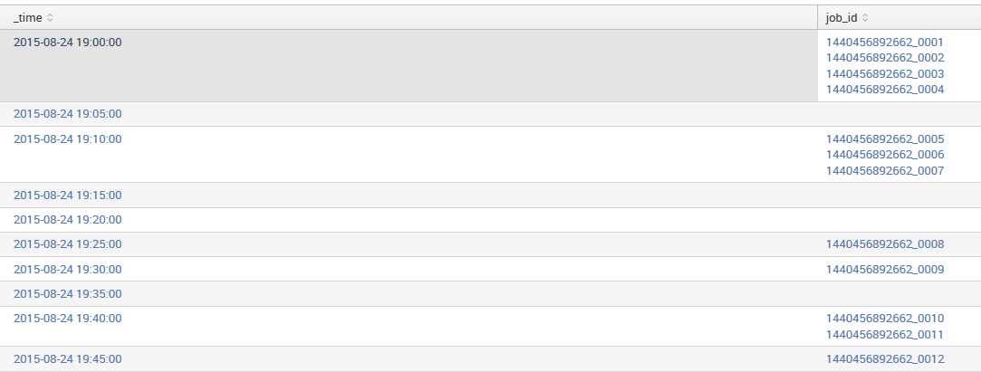
Eg Data:

I need to be able to show in a graph that these job_id's were being executed at that point of time. Is it possible? Do I need to use some advance charting mechanism to show this?
- Mark as New
- Bookmark Message
- Subscribe to Message
- Mute Message
- Subscribe to RSS Feed
- Permalink
- Report Inappropriate Content
This should do it:
... | timechart span=1h count by job_id
- Mark as New
- Bookmark Message
- Subscribe to Message
- Mute Message
- Subscribe to RSS Feed
- Permalink
- Report Inappropriate Content
Unfortunately there's no out-of-the-box way to do that (yet). Using a hack gets you pretty close: You could do
... | timechart values(linecount) by job_id span=1m
Given fine enough resolution for span, this sets the value for each job_id to 1. You can then do a line chart, like so:

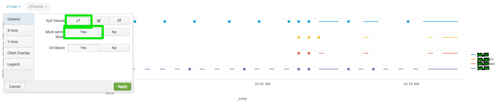
- Mark as New
- Bookmark Message
- Subscribe to Message
- Mute Message
- Subscribe to RSS Feed
- Permalink
- Report Inappropriate Content
If you just want to plot a point to denote that a particular job ID was run, try something like this
your current search giving above table | mvexpand job_id | eval value=1 | table _time job_id value
This will plot a value of 1 for all job_id (select column chart).
*Updated answer *
your current search giving above table | mvexpand job_id | eval value=1 | chart values(value) over _time by job_id limit=0
- Mark as New
- Bookmark Message
- Subscribe to Message
- Mute Message
- Subscribe to RSS Feed
- Permalink
- Report Inappropriate Content
Well yes, thats the plan. But I still need to show which job_id was running then.
- Mark as New
- Bookmark Message
- Subscribe to Message
- Mute Message
- Subscribe to RSS Feed
- Permalink
- Report Inappropriate Content
Give updated answer a try
- Mark as New
- Bookmark Message
- Subscribe to Message
- Mute Message
- Subscribe to RSS Feed
- Permalink
- Report Inappropriate Content
Thanks for the correction.
If this reply helps you, Karma would be appreciated.
- Mark as New
- Bookmark Message
- Subscribe to Message
- Mute Message
- Subscribe to RSS Feed
- Permalink
- Report Inappropriate Content
Have you tried appending a timechart command to your search?
... | timechart values(job_id)
If this reply helps you, Karma would be appreciated.
- Mark as New
- Bookmark Message
- Subscribe to Message
- Mute Message
- Subscribe to RSS Feed
- Permalink
- Report Inappropriate Content
I did. I think the problem is its not a straight number . As you see in the image above, it has a _ in between the two numbers. May be because of that it doesn't know how to chart it
- Mark as New
- Bookmark Message
- Subscribe to Message
- Mute Message
- Subscribe to RSS Feed
- Permalink
- Report Inappropriate Content
|replace "*_*" with "**" in job_id
This make it a number. But thats not really what I want to do. I just want to show the value by _time.
- Mark as New
- Bookmark Message
- Subscribe to Message
- Mute Message
- Subscribe to RSS Feed
- Permalink
- Report Inappropriate Content
I sort of expected that. Charting is something best done with numbers. I'm not sure of the utility of charting unique strings. @woodcock's answer will show job_id's broken down by time. Perhaps you can experiment with different visualizations to see if any work for you.
If this reply helps you, Karma would be appreciated.
- Mark as New
- Bookmark Message
- Subscribe to Message
- Mute Message
- Subscribe to RSS Feed
- Permalink
- Report Inappropriate Content
Something like this will work:
... | bucket _time span=1d | stats values(job_id) by _time
Building Reliable Asset and Identity Frameworks in Splunk ES
Cloud Monitoring Console - Unlocking Greater Visibility in SVC Usage Reporting
Automatic Discovery Part 3: Practical Use Cases
