
Join the Conversation
- Find Answers
- :
- Using Splunk
- :
- Splunk Search
- :
- Frequency Distribution charts?
- Subscribe to RSS Feed
- Mark Topic as New
- Mark Topic as Read
- Float this Topic for Current User
- Bookmark Topic
- Subscribe to Topic
- Mute Topic
- Printer Friendly Page
- Mark as New
- Bookmark Message
- Subscribe to Message
- Mute Message
- Subscribe to RSS Feed
- Permalink
- Report Inappropriate Content

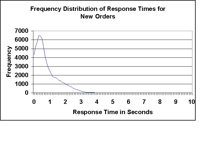
How can I compute a frequency distribution chart?
For example I want to take the time_taken from my IIS web-server log and plot it as a frequency distribution chart to figure out the execution time distribution.
So I can create images like the one below to figure out how well my actual server response time is like.
- Mark as New
- Bookmark Message
- Subscribe to Message
- Mute Message
- Subscribe to RSS Feed
- Permalink
- Report Inappropriate Content
If you want to use absolute values, just doing something like this should be enough (unless I'm misinterpreting what you want):
... | stats count by time_taken
...then go into the stats option and choose a line chart.
If you have many unique values for time_taken and want to group them together, you could use the bucket command for that.
- Mark as New
- Bookmark Message
- Subscribe to Message
- Mute Message
- Subscribe to RSS Feed
- Permalink
- Report Inappropriate Content
If you want to use absolute values, just doing something like this should be enough (unless I'm misinterpreting what you want):
... | stats count by time_taken
...then go into the stats option and choose a line chart.
If you have many unique values for time_taken and want to group them together, you could use the bucket command for that.


Join the Splunk Community Slack to learn, troubleshoot, and make connections with fellow Splunk practitioners in real time!
Join Splunk User Groups to connect and learn in-person by region or remotely by topic or industry.
SOC4Kafka - New Kafka Connector Powered by OpenTelemetry
Rounding off the Splunk Dashboard Contest
A Four Part Event Series: AI + Observability: AI Agents, LLMs, Apps, & Infrastructure
