Turn on suggestions
Auto-suggest helps you quickly narrow down your search results by suggesting possible matches as you type.
Splunk Cloud Platform
×
Join the Conversation
Without signing in, you're just watching from the sidelines. Sign in or Register to connect, share, and be part of the Splunk Community.
- Find Answers
- :
- Splunk Products
- :
- Splunk Cloud Platform
- :
- How can I format pie chart values?
Options
- Subscribe to RSS Feed
- Mark Topic as New
- Mark Topic as Read
- Float this Topic for Current User
- Bookmark Topic
- Subscribe to Topic
- Mute Topic
- Printer Friendly Page
- Mark as New
- Bookmark Message
- Subscribe to Message
- Mute Message
- Subscribe to RSS Feed
- Permalink
- Report Inappropriate Content
How can I format pie chart values?
vergneau
Engager
06-28-2022
02:09 AM
Hello,
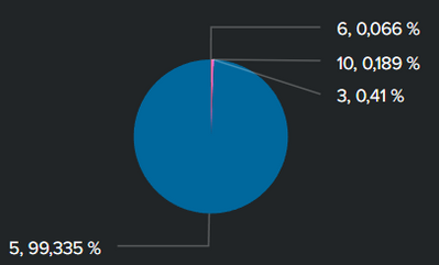
For the context, I created a dashboard on the Splunk cloud app where a pie chart is displayed. The purpose of the pie chart is to display the different types of events and the associated percentages. However the separation between the value and its percentage is quite confusing because it is two numbers separated by commas.
Is there a way to format the values displayed or change the separator?
Thanks in advance
- Mark as New
- Bookmark Message
- Subscribe to Message
- Mute Message
- Subscribe to RSS Feed
- Permalink
- Report Inappropriate Content
Roy_9
Motivator
06-28-2022
02:31 PM
Hello,
You can edit the panel--click on brush icon and you can go to Number format-
Change the precision to 0.0
Unit %
Unit Position before
Use Thousand Operators - Yes
Thanks
Got questions? Get answers!
Join the Splunk Community Slack to learn, troubleshoot, and make connections with fellow Splunk practitioners in real time!
Meet up IRL or virtually!
Join Splunk User Groups to connect and learn in-person by region or remotely by topic or industry.
Get Updates on the Splunk Community!
[Puzzles] Solve, Learn, Repeat: Character substitutions with Regular Expressions
This challenge was first posted on Slack #puzzles channelFor BORE at .conf23, we had a puzzle question which ...
Splunk Community Badges!
Hey everyone! Ready to earn some serious bragging rights in the community? Along with our existing badges ...
[Puzzles] Solve, Learn, Repeat: Matching cron expressions
This puzzle (first published here) is based on matching timestamps to cron expressions.All the timestamps ...

