Turn on suggestions
Auto-suggest helps you quickly narrow down your search results by suggesting possible matches as you type.
Showing results for
Splunk Cloud Platform
Turn on suggestions
Auto-suggest helps you quickly narrow down your search results by suggesting possible matches as you type.
Showing results for
- Splunk Answers
- :
- Splunk Platform Products
- :
- Splunk Cloud Platform
- :
- How can I format pie chart values?
Options
- Subscribe to RSS Feed
- Mark Topic as New
- Mark Topic as Read
- Float this Topic for Current User
- Bookmark Topic
- Subscribe to Topic
- Mute Topic
- Printer Friendly Page
- Mark as New
- Bookmark Message
- Subscribe to Message
- Mute Message
- Subscribe to RSS Feed
- Permalink
- Report Inappropriate Content
How can I format pie chart values?
vergneau
Engager
06-28-2022
02:09 AM
Hello,
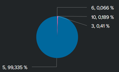
For the context, I created a dashboard on the Splunk cloud app where a pie chart is displayed. The purpose of the pie chart is to display the different types of events and the associated percentages. However the separation between the value and its percentage is quite confusing because it is two numbers separated by commas.
Is there a way to format the values displayed or change the separator?
Thanks in advance
- Mark as New
- Bookmark Message
- Subscribe to Message
- Mute Message
- Subscribe to RSS Feed
- Permalink
- Report Inappropriate Content
Roy_9
Motivator
06-28-2022
02:31 PM
Hello,
You can edit the panel--click on brush icon and you can go to Number format-
Change the precision to 0.0
Unit %
Unit Position before
Use Thousand Operators - Yes
Thanks
Get Updates on the Splunk Community!
Join Us for Splunk University and Get Your Bootcamp Game On!
If you know, you know! Splunk University is the vibe this summer so register today for bootcamps galore ...
.conf24 | Learning Tracks for Security, Observability, Platform, and Developers!
.conf24 is taking place at The Venetian in Las Vegas from June 11 - 14. Continue reading to learn about the ...
Announcing Scheduled Export GA for Dashboard Studio
We're excited to announce the general availability of Scheduled Export for Dashboard Studio. Starting in ...

