Turn on suggestions
Auto-suggest helps you quickly narrow down your search results by suggesting possible matches as you type.
Dashboards & Visualizations
×
Are you a member of the Splunk Community?
Sign in or Register with your Splunk account to get your questions answered, access valuable resources and connect with experts!
Turn on suggestions
Auto-suggest helps you quickly narrow down your search results by suggesting possible matches as you type.
- Find Answers
- :
- Using Splunk
- :
- Dashboards & Visualizations
- :
- How to create a graph of these results showing a g...
Options
- Subscribe to RSS Feed
- Mark Topic as New
- Mark Topic as Read
- Float this Topic for Current User
- Bookmark Topic
- Subscribe to Topic
- Mute Topic
- Printer Friendly Page
- Mark as New
- Bookmark Message
- Subscribe to Message
- Mute Message
- Subscribe to RSS Feed
- Permalink
- Report Inappropriate Content
How to create a graph of these results showing a graduation or reduction of the response times?
sheldonjolly
Engager
03-07-2022
07:26 AM
Hi
I have a query based on response times from a service.
index=homebanking "/soa/mcoi-rc-services/ContractService" Time="*" | rex field=_raw "\/(?<time>[^_\/]+)[\w\.]+($|\s)" | stats count by Time | fields - count
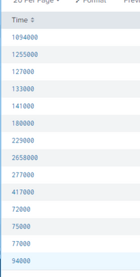
I get these results......
I'd like to now create a graph of these results showing a graduation or reduction of the response times.
Can someone help?
Best,
Sheldon.
- Mark as New
- Bookmark Message
- Subscribe to Message
- Mute Message
- Subscribe to RSS Feed
- Permalink
- Report Inappropriate Content
sheldonjolly
Engager
03-07-2022
10:46 PM
This worked quite nicely. Many thanks.
Now, how do I convert the response time to seconds?
- Mark as New
- Bookmark Message
- Subscribe to Message
- Mute Message
- Subscribe to RSS Feed
- Permalink
- Report Inappropriate Content
somesoni2
Revered Legend
03-07-2022
12:37 PM
Try something like this
index=homebanking "/soa/mcoi-rc-services/ContractService" Time="*" | rex field=_raw "\/(?<time>[^_\/]+)[\w\.]+($|\s)" | timechart avg(Time) as Avg_Response_Time- Mark as New
- Bookmark Message
- Subscribe to Message
- Mute Message
- Subscribe to RSS Feed
- Permalink
- Report Inappropriate Content
richgalloway

SplunkTrust
03-07-2022
08:03 AM
After running the search, click on the Visualization tab and select the visualization that best presents the data.
---
If this reply helps you, Karma would be appreciated.
If this reply helps you, Karma would be appreciated.
Get Updates on the Splunk Community!
Splunk Observability as Code: From Zero to Dashboard
For the details on what Self-Service Observability and Observability as Code is, we have some awesome content ...
[Puzzles] Solve, Learn, Repeat: Character substitutions with Regular Expressions
This challenge was first posted on Slack #puzzles channelFor BORE at .conf23, we had a puzzle question which ...
Shape the Future of Splunk: Join the Product Research Lab!
Join the Splunk Product Research Lab and connect with us in the Slack channel #product-research-lab to get ...

