
Join the Conversation
- Find Answers
- :
- Using Splunk
- :
- Dashboards & Visualizations
- :
- Re: How to create a Multi-Series Line Chart?
- Subscribe to RSS Feed
- Mark Topic as New
- Mark Topic as Read
- Float this Topic for Current User
- Bookmark Topic
- Subscribe to Topic
- Mute Topic
- Printer Friendly Page
- Mark as New
- Bookmark Message
- Subscribe to Message
- Mute Message
- Subscribe to RSS Feed
- Permalink
- Report Inappropriate Content

I can't figure out how to create a Multi-Series line chart.
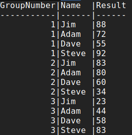
For example, the sample data below shows test scores (Result) for the 4 participants over 3 tests.
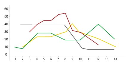
I'd like to have a line graph for each participant.
X-Axis = GroupNumber (1,2,3,4)
Y-Axis = Result (1-100)
And plotted would be 4 lines, one for each participant with their scores.
My data in Splunk is in the format as represented below under "Sample Data". each is a separate entry that has Name, Result, and GroupNumber
Example Desired Outcome (Data Not Representative to Sample Data):
Sample Data:
Thanks
- Mark as New
- Bookmark Message
- Subscribe to Message
- Mute Message
- Subscribe to RSS Feed
- Permalink
- Report Inappropriate Content
I think you may be looking for:
| chart first(Result) OVER GroupNumber BY Name
- Mark as New
- Bookmark Message
- Subscribe to Message
- Mute Message
- Subscribe to RSS Feed
- Permalink
- Report Inappropriate Content
I think you may be looking for:
| chart first(Result) OVER GroupNumber BY Name
- Mark as New
- Bookmark Message
- Subscribe to Message
- Mute Message
- Subscribe to RSS Feed
- Permalink
- Report Inappropriate Content

I looked way too hard to find this. Thank you for your answer!
- Mark as New
- Bookmark Message
- Subscribe to Message
- Mute Message
- Subscribe to RSS Feed
- Permalink
- Report Inappropriate Content
Perfect!. Thank you very much. Now that I see the solution, it makes sense.




Join the Splunk Community Slack to learn, troubleshoot, and make connections with fellow Splunk practitioners in real time!
Join Splunk User Groups to connect and learn in-person by region or remotely by topic or industry.
All Work and No Play? Not at .conf26! Unwind at These Evening Events
Join the Hackathon at .conf26 and build a No-Code AI agent
Level Up Your Workflow: Mastering Splunk Cloud Management via Terraform
