Join the Conversation
- Find Answers
- :
- Using Splunk
- :
- Dashboards & Visualizations
- :
- Re: How to create a Multi-Series Line Chart?
- Subscribe to RSS Feed
- Mark Topic as New
- Mark Topic as Read
- Float this Topic for Current User
- Bookmark Topic
- Subscribe to Topic
- Mute Topic
- Printer Friendly Page
- Mark as New
- Bookmark Message
- Subscribe to Message
- Mute Message
- Subscribe to RSS Feed
- Permalink
- Report Inappropriate Content
I can't figure out how to create a Multi-Series line chart.
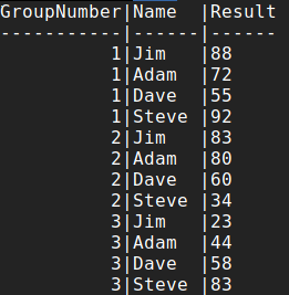
For example, the sample data below shows test scores (Result) for the 4 participants over 3 tests.
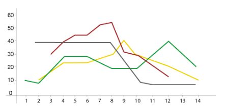
I'd like to have a line graph for each participant.
X-Axis = GroupNumber (1,2,3,4)
Y-Axis = Result (1-100)
And plotted would be 4 lines, one for each participant with their scores.
My data in Splunk is in the format as represented below under "Sample Data". each is a separate entry that has Name, Result, and GroupNumber
Example Desired Outcome (Data Not Representative to Sample Data):
Sample Data:
Thanks
- Mark as New
- Bookmark Message
- Subscribe to Message
- Mute Message
- Subscribe to RSS Feed
- Permalink
- Report Inappropriate Content
I think you may be looking for:
| chart first(Result) OVER GroupNumber BY Name
- Mark as New
- Bookmark Message
- Subscribe to Message
- Mute Message
- Subscribe to RSS Feed
- Permalink
- Report Inappropriate Content
I think you may be looking for:
| chart first(Result) OVER GroupNumber BY Name
- Mark as New
- Bookmark Message
- Subscribe to Message
- Mute Message
- Subscribe to RSS Feed
- Permalink
- Report Inappropriate Content
I looked way too hard to find this. Thank you for your answer!
- Mark as New
- Bookmark Message
- Subscribe to Message
- Mute Message
- Subscribe to RSS Feed
- Permalink
- Report Inappropriate Content
Perfect!. Thank you very much. Now that I see the solution, it makes sense.


