Are you a member of the Splunk Community?
- Find Answers
- :
- Using Splunk
- :
- Dashboards & Visualizations
- :
- How to change dashboard panel from line graph to p...
- Subscribe to RSS Feed
- Mark Topic as New
- Mark Topic as Read
- Float this Topic for Current User
- Bookmark Topic
- Subscribe to Topic
- Mute Topic
- Printer Friendly Page
- Mark as New
- Bookmark Message
- Subscribe to Message
- Mute Message
- Subscribe to RSS Feed
- Permalink
- Report Inappropriate Content
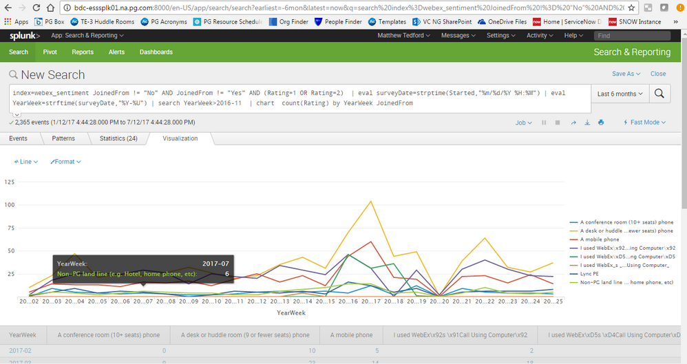
I have a line graph tracking different call sources over the past 6 months:
Here is the search code I have written:
index=webex_sentiment JoinedFrom != "No" AND JoinedFrom != "Yes" AND (Rating=1 OR Rating=2) | eval surveyDate=strptime(Started,"%m/%d/%Y %H:%M") | eval YearWeek=strftime(surveyDate,"%Y-%U") | search YearWeek>2016-11 | chart count(Rating) by YearWeek JoinedFrom
Rather than showing each source as an individual line, I want to create a pie chart that displays each call source as a percentage over the past six months.
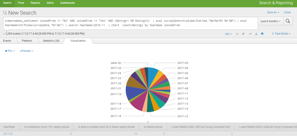
When I switch my visualization to Pie chart, this is what appears:
The data is incorrectly grouped by date, rather than type.
I believe I need to change my search query. Please advise.
- Mark as New
- Bookmark Message
- Subscribe to Message
- Mute Message
- Subscribe to RSS Feed
- Permalink
- Report Inappropriate Content
I like the trellis idea because it keeps both vectors ( JoinedFrom and YearWeek ) but it looks like you are just trying to ditch YearWeek so just swap the order like this:
| chart count(Rating) by YearWeek JoinedFrom
Or better yet, drop it entirely like this:
| chart count(Rating) by JoinedFrom
- Mark as New
- Bookmark Message
- Subscribe to Message
- Mute Message
- Subscribe to RSS Feed
- Permalink
- Report Inappropriate Content
@woodcock
Thanks so much!
For anyone interested, here is the graph I was looking for: http://imgur.com/a/jTe7Q
- Mark as New
- Bookmark Message
- Subscribe to Message
- Mute Message
- Subscribe to RSS Feed
- Permalink
- Report Inappropriate Content
Can you try to swap your by statement?
| chart count(Rating) by JoinedFrom YearWeek
You would also need trellis enabled to split it by YearWeek. Splunk version 6.6
Otherwise pie will only work with one by statement, so I would remove the YearWeek, or show multiple panels for each YearWeek
- Mark as New
- Bookmark Message
- Subscribe to Message
- Mute Message
- Subscribe to RSS Feed
- Permalink
- Report Inappropriate Content
@cmerriman
How do I split by YearWeek with trellis?
- Mark as New
- Bookmark Message
- Subscribe to Message
- Mute Message
- Subscribe to RSS Feed
- Permalink
- Report Inappropriate Content
you'll need to be on splunk version 6.6 to use the trellis option. https://docs.splunk.com/Documentation/SplunkCloud/6.6.0/Viz/VisualizationTrellis
When you're on the Visualization tab, you'll see a Trellis button next to Format. When you click on it, you'll see a checkbox for Use trellis layout. There is a Split by option and you can choose to split by various available fields or the aggregation of your fields.
There is a syntaxing note that I'll forewarn you about, and it's that I recommend you end the syntax with a command like stats, chart, timechart, etc. and not an eval command, because the split by option sometimes will only allow you to split by the aggregation in those cases.


