Join the Conversation
- Find Answers
- :
- Using Splunk
- :
- Splunk Search
- :
- Re: Timechart vs chart behaviour
- Subscribe to RSS Feed
- Mark Topic as New
- Mark Topic as Read
- Float this Topic for Current User
- Bookmark Topic
- Subscribe to Topic
- Mute Topic
- Printer Friendly Page
- Mark as New
- Bookmark Message
- Subscribe to Message
- Mute Message
- Subscribe to RSS Feed
- Permalink
- Report Inappropriate Content
When I run following query:
.... | bin _time span=5m | timechart avg(responseTime)
(responseTime is an extracted field)
What I understand of this query is this:
Divide timeline in a series of buckets of 5 minutes duration each, find average of responseTime for each such bucket and plot the graph(average of responsetime as Y axis, for timechart X axis is always time).
I see graph as:

Now, if I change my query to:
.... | bin _time span=5m | chart avg(responseTime) by _time
My understanding is that this query should behave same as first one.
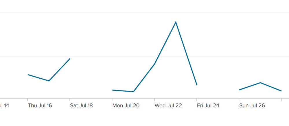
But graph I see is as:

I am not able to understand why the two queries behave differently.
- Mark as New
- Bookmark Message
- Subscribe to Message
- Mute Message
- Subscribe to RSS Feed
- Permalink
- Report Inappropriate Content
Both commands are supposed to fill in missing values by default. Try this to see if the output is any different.
.... | timechart span=5m avg(responseTime) ``` No bin command```You can try this to see if you get results similar to what you got from timechart.
.... | bin _time span=5m | chart cont=false avg(responseTime) by _time
If this reply helps you, Karma would be appreciated.
- Mark as New
- Bookmark Message
- Subscribe to Message
- Mute Message
- Subscribe to RSS Feed
- Permalink
- Report Inappropriate Content
How can you break this out into multiple lines from here? For example I am working on a line chart of speed by vehicle across mileposts. I can do speed by vehicle or speed by milepost.
To get speed at mileposts I have used:
| chart values(speed) BY Milepost
X axis would be mileposts, Y axis is speed and then line by Vehicle_ID
- Mark as New
- Bookmark Message
- Subscribe to Message
- Mute Message
- Subscribe to RSS Feed
- Permalink
- Report Inappropriate Content
Both commands are supposed to fill in missing values by default. Try this to see if the output is any different.
.... | timechart span=5m avg(responseTime) ``` No bin command```You can try this to see if you get results similar to what you got from timechart.
.... | bin _time span=5m | chart cont=false avg(responseTime) by _time
If this reply helps you, Karma would be appreciated.
- Mark as New
- Bookmark Message
- Subscribe to Message
- Mute Message
- Subscribe to RSS Feed
- Permalink
- Report Inappropriate Content
Yes, the first query results in a continuous curve.
So , the difference between mine and yous query is that I have explicitly used
| bin _time span=5m |
..while you have used span with timchart.
Can you explain how does it make difference conceptually?
- Mark as New
- Bookmark Message
- Subscribe to Message
- Mute Message
- Subscribe to RSS Feed
- Permalink
- Report Inappropriate Content
If this reply helps you, Karma would be appreciated.
- Mark as New
- Bookmark Message
- Subscribe to Message
- Mute Message
- Subscribe to RSS Feed
- Permalink
- Report Inappropriate Content
