Join the Conversation
- Find Answers
- :
- Using Splunk
- :
- Splunk Search
- :
- How to pull in client/server errors into table for...
- Subscribe to RSS Feed
- Mark Topic as New
- Mark Topic as Read
- Float this Topic for Current User
- Bookmark Topic
- Subscribe to Topic
- Mute Topic
- Printer Friendly Page
- Mark as New
- Bookmark Message
- Subscribe to Message
- Mute Message
- Subscribe to RSS Feed
- Permalink
- Report Inappropriate Content
Hello - thank you for assisting in advance. I need to write up a query which will pull in client/server errors from event message into table format as shown below.
| _time | status_category | Error Code | error_count |
| 2022-01-26:17:30:00 | server error | 503 | 2 |
| 2022-01-26:18:30:00 | client error | 404 | 6 |
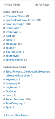
Here are examples of the EvenTypes and available fields for the index.


- Mark as New
- Bookmark Message
- Subscribe to Message
- Mute Message
- Subscribe to RSS Feed
- Permalink
- Report Inappropriate Content
- Your logs seem not to be formatted properly in order to extract the error code. As if you look at the two examples that you gave here there is no common format as such we can write a regex to extract those values.
- Let me know if any additional information you have on this.
- Though, I'm giving you a query that should be able to help you once you find out a way to extract the ErrorCode field.
<your search query>
| stats count as error_count, max(_time) as _time by ErrorCode
| eval status_category=case(ErrorCode>=400 AND ErrorCode<500, "client error", ErrorCode>=500, "server error", 1==1, "-")
I hope this helps!!!
- Mark as New
- Bookmark Message
- Subscribe to Message
- Mute Message
- Subscribe to RSS Feed
- Permalink
- Report Inappropriate Content
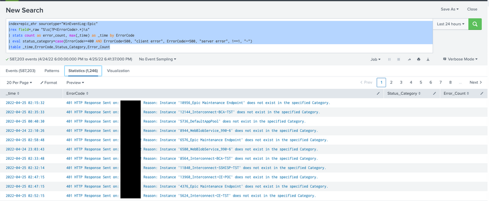
@VatsalJagani I figured out my rex query and was able to use yours to get my table but not all rows are populating. here is what I go so far.
Query:
index=epic_ehr sourcetype="WinEventLog:Epic"
|rex field=_raw "%\s(?P<ErrorCode>.*)\s"
| stats count as error_count, max(_time) as _time by ErrorCode
| eval status_category=case(ErrorCode>=400 AND ErrorCode<500, "client error", ErrorCode>=500, "server error", 1==1, "-")
|table _time,ErrorCode,Status_Category,Error_Count
How can convert this data into a Pie chart which shows percentage of each error code?
- Mark as New
- Bookmark Message
- Subscribe to Message
- Mute Message
- Subscribe to RSS Feed
- Permalink
- Report Inappropriate Content
@Khanu89 - For pie chart that shows count by ErrorCode.
index=epic_ehr sourcetype="WinEventLog:Epic"
|rex field=_raw "%\s(?P<ErrorCode>.*)\s"
| stats count by ErrorCode
- Mark as New
- Bookmark Message
- Subscribe to Message
- Mute Message
- Subscribe to RSS Feed
- Permalink
- Report Inappropriate Content
@VatsalJagani I have tired that it does not categorizes the errors. I'd like to see the pie chart breakdown by error code. For example 401 - 2%, 404 - 18%, 443 - 23% and etc.
- Mark as New
- Bookmark Message
- Subscribe to Message
- Mute Message
- Subscribe to RSS Feed
- Permalink
- Report Inappropriate Content
@Khanu89 - I thought that should work (reference - https://docs.splunk.com/Documentation/Splunk/8.2.6/Viz/PieChart), but please also try:
index=epic_ehr sourcetype="WinEventLog:Epic"
|rex field=_raw "%\s(?P<ErrorCode>.*)\s"
| chart count by ErrorCode
OR
index=epic_ehr sourcetype="WinEventLog:Epic"
|rex field=_raw "%\s(?P<ErrorCode>.*)\s"
| chart count over ErrorCode
And change the Visualization to Pie Chart and it should show what you want I think.
For % (percentage), you need to use the following option in the XML part of the pie chart to show percentage values.
<option name="charting.chart.showPercent">true</option>
I hope this helps!!!
- Mark as New
- Bookmark Message
- Subscribe to Message
- Mute Message
- Subscribe to RSS Feed
- Permalink
- Report Inappropriate Content
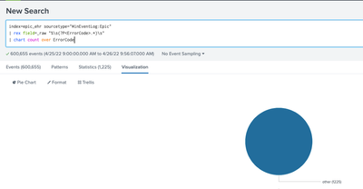
@VatsalJagani I have also tried what you've suggested and it gives me the following pie chart which isn't what I want.
I would like the pie chart to be like the one below but group all 400's, 500's, Other instead of listing individually as they are listed in the screenshot.
I
- Mark as New
- Bookmark Message
- Subscribe to Message
- Mute Message
- Subscribe to RSS Feed
- Permalink
- Report Inappropriate Content
It's not working as you expect because the ErrorCode field is not being extracted correctly.
Regex seems very generic. It would match anything that starts with % (percentage sign) and comes between two spaces (\s).
A somewhat better regex would be (still not 100% accurate as logs are not as formated):
| rex field=_raw "%\s(?P<ErrorCode>\d+)\s"


