
Join the Conversation
- Find Answers
- :
- Using Splunk
- :
- Splunk Search
- :
- Displaying very small values in timechart
- Subscribe to RSS Feed
- Mark Topic as New
- Mark Topic as Read
- Float this Topic for Current User
- Bookmark Topic
- Subscribe to Topic
- Mute Topic
- Printer Friendly Page
- Mark as New
- Bookmark Message
- Subscribe to Message
- Mute Message
- Subscribe to RSS Feed
- Permalink
- Report Inappropriate Content
Displaying very small values in timechart

Hi everyone,
I have continuous data from a leakage test station with values as low as 1e-8 and spikes up to 1e-2 mbar*l/s (in the image its way higher but this is very rare).
Is there a way to display them over this span correctly in a standard timechart?
I already tried to set min or max for y axis and converted the y axis to logarithmic.
The logarithmic scale seems to display only 1, 0.1, 0.01 and not smaller or at least gives the smaller numbers not enough 'room' to display (from 1 to 0.1 is 90% of the timechart area, from 0.1 to 0.01 is 8% and for the smaller values just 2 % of the area).
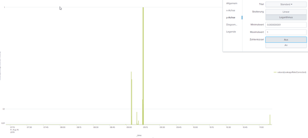
A other diagram with js or something is not possible for me at the moment.
Thanks!!
- Mark as New
- Bookmark Message
- Subscribe to Message
- Mute Message
- Subscribe to RSS Feed
- Permalink
- Report Inappropriate Content

Here's an example with data from 0-1. Here the "log-scale" chart is actually just a linear scale chart with gridlines for powers of 10, same as the original post. Small data is compressed at the bottom of the chart
| makeresults count=4
| streamstats count
| rename count as i
| eval value=pow(10,-i), logValue=log(value)
| chart avg(value) by i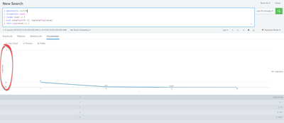
- Mark as New
- Bookmark Message
- Subscribe to Message
- Mute Message
- Subscribe to RSS Feed
- Permalink
- Report Inappropriate Content
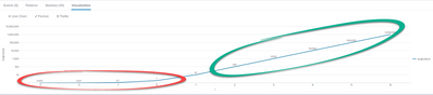
sample search:
| makeresults count=10
| streamstats count
| rename count as i
| eval i=i-4, value=pow(10,i), logValue=log(value)
| chart avg(value) by i
when charted log scale, this data should display as a straight line, and does for values from 10-1000000 (1e1-1e6). However, splunk does not create divisions for 0.1-1, 0.01-0.01, 0.001-0.01, etc., so the values <10 are incorrectly compressed on the chart
- Mark as New
- Bookmark Message
- Subscribe to Message
- Mute Message
- Subscribe to RSS Feed
- Permalink
- Report Inappropriate Content
I had trouble with this as well. Log scale charts in splunk appear to be broken for non-positive powers of 10:
- Like the above example, when my data is from 0-1 the gridlines display for powers of 10 but the chart is still linear scale (0-0.01 is 1% of the scale, 0.01-0.1 is 9% of the scale, 0.1-1.0 is 90% of the scale). For a true log scale, 0.01 to 0.1 would have the same vertical scale as 0.1 to 1.0, 1.0-10.0, 10.0.100.0, 0.001 to 0.01, etc.)
- When I have data from 0.001-100, the data is charted log scale but the divisions are 0-10, 10-100, 100-1000). These are equally spaced but I would expect to see gridlines for 1.0, 0.1, 0.01. The result is that data from 1-100 is easy to visualize but data from 0.001-1.0 is compressed at the bottom of the chart
My workaround is to chart log(value) on a linear scale, but this is not easy to consume for most folks.
- Mark as New
- Bookmark Message
- Subscribe to Message
- Mute Message
- Subscribe to RSS Feed
- Permalink
- Report Inappropriate Content
In the image there is no "0" value. They are actually something like 1e-8



Join the Splunk Community Slack to learn, troubleshoot, and make connections with fellow Splunk practitioners in real time!
Join Splunk User Groups to connect and learn in-person by region or remotely by topic or industry.
SOC4Kafka - New Kafka Connector Powered by OpenTelemetry
Rounding off the Splunk Dashboard Contest
A Four Part Event Series: AI + Observability: AI Agents, LLMs, Apps, & Infrastructure
