Join the Conversation
- Find Answers
- :
- Using Splunk
- :
- Splunk Search
- :
- Alpha based y axis
- Subscribe to RSS Feed
- Mark Topic as New
- Mark Topic as Read
- Float this Topic for Current User
- Bookmark Topic
- Subscribe to Topic
- Mute Topic
- Printer Friendly Page
- Mark as New
- Bookmark Message
- Subscribe to Message
- Mute Message
- Subscribe to RSS Feed
- Permalink
- Report Inappropriate Content
Alpha based y axis
Hello I'm new to splunk and was wondering if there is a way where the values on the y axis can be non numeric.
I'm trying to create a chart that maps classroom grades so y axis needs to be abcdf.
I was able to translate the grade to a number and then chart it but I was curious to see if there was a possible alternative
- Mark as New
- Bookmark Message
- Subscribe to Message
- Mute Message
- Subscribe to RSS Feed
- Permalink
- Report Inappropriate Content
@koreanfather can you add a mockup of what kind of output you are looking for? It can be whiteboard or sketch as well. The y-axis value (numeric) is used to plot the height of column or line chart. If you do not have the value how would you plot the height?
| makeresults | eval message= "Happy Splunking!!!"
- Mark as New
- Bookmark Message
- Subscribe to Message
- Mute Message
- Subscribe to RSS Feed
- Permalink
- Report Inappropriate Content
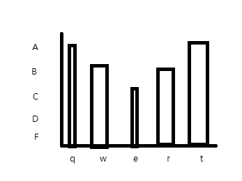
Apologies for the crude drawing but the desired output is a chart with X axis being students names and y axis being the grades.
As for the height of the chart, I was able to solve the problem by setting y axis to originally map to A=5,B=4,C=3,D=2,F=1.
My curiosity was if it its possible to change the value of the y axis on a cosmetic level
Thank You
- Mark as New
- Bookmark Message
- Subscribe to Message
- Mute Message
- Subscribe to RSS Feed
- Permalink
- Report Inappropriate Content
@koreanfather I did have an answer to add % or same prefix/suffix on y-axis. However, this seems like a data mapping based replacement of y-axis, which is indeed a difficult challenge to implement. I can try to have a look in some spare time 🙂 But see if you can use the following answer along with Data parsing through Custom cell renderer to solve your issue: https://community.splunk.com/t5/Splunk-Search/How-to-change-the-Y-axis-label-on-a-chart-overlay/td-p...
Could you add details on what is there on x-axis so that we can see if there is an alternate visualization for your needs?
| makeresults | eval message= "Happy Splunking!!!"

