
Join the Conversation
- Find Answers
- :
- Using Splunk
- :
- Splunk Search
- :
- Adjusting the Individual Columns on a Column Chart
- Subscribe to RSS Feed
- Mark Topic as New
- Mark Topic as Read
- Float this Topic for Current User
- Bookmark Topic
- Subscribe to Topic
- Mute Topic
- Printer Friendly Page
- Mark as New
- Bookmark Message
- Subscribe to Message
- Mute Message
- Subscribe to RSS Feed
- Permalink
- Report Inappropriate Content
Adjusting the Individual Columns on a Column Chart

Hello,
I have a <panel> <chart> that has extremely skinny columns on a simple column chart. What is the simplest way to increase the width or thickness of the actual columns in the chart? Seems to have large enough gaps in the chart to accommodate readable columns.
Thanks,
- Mark as New
- Bookmark Message
- Subscribe to Message
- Mute Message
- Subscribe to RSS Feed
- Permalink
- Report Inappropriate Content

You can use following code increase the column width.
<option name="charting.lineWidth">2</option>
- Mark as New
- Bookmark Message
- Subscribe to Message
- Mute Message
- Subscribe to RSS Feed
- Permalink
- Report Inappropriate Content
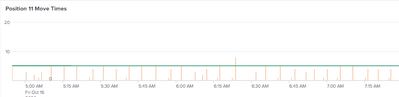
I have an overlay on that graph which does increase in size with this new code, but the column themselves don't get bigger. Here is a picture of the graph. I'd like the orange columns to be thicker. I have a very similar chart right above it and is much thicker.
- Mark as New
- Bookmark Message
- Subscribe to Message
- Mute Message
- Subscribe to RSS Feed
- Permalink
- Report Inappropriate Content


Aggregate your results into wider chunks e.g. if you are counting by minute, try changing the span to 5m or 10m
- Mark as New
- Bookmark Message
- Subscribe to Message
- Mute Message
- Subscribe to RSS Feed
- Permalink
- Report Inappropriate Content

The Splunk Dashboard Examples app has an example of that.
If this reply helps you, Karma would be appreciated.
- Mark as New
- Bookmark Message
- Subscribe to Message
- Mute Message
- Subscribe to RSS Feed
- Permalink
- Report Inappropriate Content
Thank you for the reply. It does not really help here at all.


Join the Splunk Community Slack to learn, troubleshoot, and make connections with fellow Splunk practitioners in real time!
Join Splunk User Groups to connect and learn in-person by region or remotely by topic or industry.
test 2
test
Join the Hackathon at .conf26 and build a No-Code AI agent
