
Join the Conversation
- Find Answers
- :
- Using Splunk
- :
- Splunk Search
- :
- Re: Adding static vertical lines to a scatter plot
- Subscribe to RSS Feed
- Mark Topic as New
- Mark Topic as Read
- Float this Topic for Current User
- Bookmark Topic
- Subscribe to Topic
- Mute Topic
- Printer Friendly Page
- Mark as New
- Bookmark Message
- Subscribe to Message
- Mute Message
- Subscribe to RSS Feed
- Permalink
- Report Inappropriate Content

Hello, right now I have a scatter plot of duration vs. size and i want to make 2 vertical lines at different values of duration. Any idea how to go about this? Note: This is not being plotted using the _time field at all. Thanks in advance!
- Mark as New
- Bookmark Message
- Subscribe to Message
- Mute Message
- Subscribe to RSS Feed
- Permalink
- Report Inappropriate Content

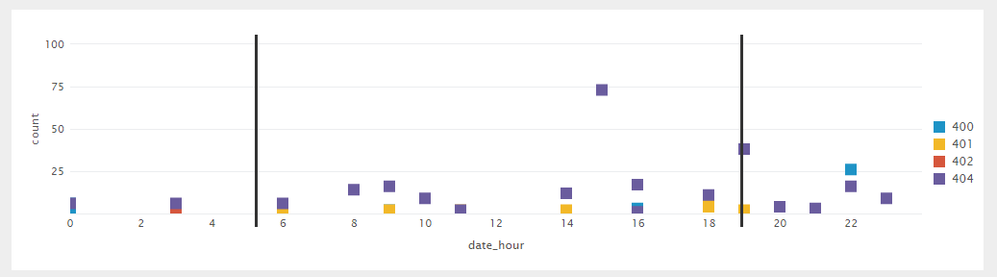
You can add a <HTML> panel to your simple XML just above the scatter chart.
Add two Thematic Breaks/Horizontal Rules i.e. <hr>, draw them vertically at 25% and 75% of the chart using following settings:
    <hr width="0px" size="200" style="position: absolute; left: 25%; top: 10px; border:1px solid;z-index:20; background-color:#333"/>
    <hr width="0px" size="200" style="position: absolute; left: 75%; top: 10px; border:1px solid;z-index:20; background-color:#333"/>
PS: You need to adjust size, top and left show horizontal lines at correct spot in the chart.
Following is a run anywhere sample:
<dashboard>
  <label>Scatter Chart with Horizontal lines</label>
  <row>
    <panel>
      <html>
        <hr width="0px" size="200" style="position: absolute; left: 25%; top: 10px; border:1px solid;z-index:20; background-color:#333"/>
        <hr width="0px" size="200" style="position: absolute; left: 75%; top: 10px; border:1px solid;z-index:20; background-color:#333"/>
      </html>
      <chart>
        <search>
          <query>index = _internal
| stats count, mode(status) by method, status, date_hour
| where (status) >= 400 and (status) < 500</query>
          <earliest>-24h@h</earliest>
          <latest>now</latest>
          <sampleRatio>1</sampleRatio>
        </search>
        <option name="charting.axisLabelsX.majorLabelStyle.overflowMode">ellipsisNone</option>
        <option name="charting.axisLabelsX.majorLabelStyle.rotation">0</option>
        <option name="charting.axisTitleX.visibility">visible</option>
        <option name="charting.axisTitleY.visibility">visible</option>
        <option name="charting.axisTitleY2.visibility">visible</option>
        <option name="charting.axisX.scale">linear</option>
        <option name="charting.axisY.scale">linear</option>
        <option name="charting.axisY2.enabled">0</option>
        <option name="charting.axisY2.scale">inherit</option>
        <option name="charting.chart">scatter</option>
        <option name="charting.chart.bubbleMaximumSize">50</option>
        <option name="charting.chart.bubbleMinimumSize">10</option>
        <option name="charting.chart.bubbleSizeBy">area</option>
        <option name="charting.chart.nullValueMode">gaps</option>
        <option name="charting.chart.showDataLabels">none</option>
        <option name="charting.chart.sliceCollapsingThreshold">0.01</option>
        <option name="charting.chart.stackMode">default</option>
        <option name="charting.chart.style">shiny</option>
        <option name="charting.drilldown">none</option>
        <option name="charting.layout.splitSeries">0</option>
        <option name="charting.layout.splitSeries.allowIndependentYRanges">0</option>
        <option name="charting.legend.labelStyle.overflowMode">ellipsisStart</option>
        <option name="charting.legend.placement">right</option>
        <option name="trellis.enabled">0</option>
        <option name="trellis.scales.shared">1</option>
        <option name="trellis.size">medium</option>
      </chart>
    </panel>
  </row>
</dashboard>
@rvs935, please try out and confirm.
| makeresults | eval message= "Happy Splunking!!!"
- Mark as New
- Bookmark Message
- Subscribe to Message
- Mute Message
- Subscribe to RSS Feed
- Permalink
- Report Inappropriate Content
- Mark as New
- Bookmark Message
- Subscribe to Message
- Mute Message
- Subscribe to RSS Feed
- Permalink
- Report Inappropriate Content
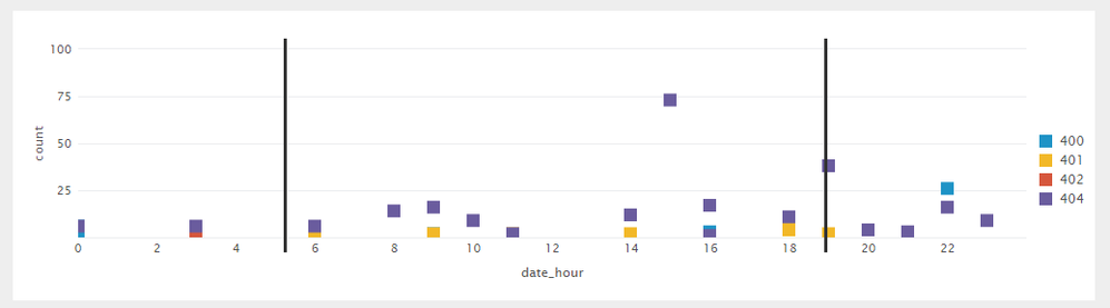
You can add a <HTML> panel to your simple XML just above the scatter chart.
Add two Thematic Breaks/Horizontal Rules i.e. <hr>, draw them vertically at 25% and 75% of the chart using following settings:
    <hr width="0px" size="200" style="position: absolute; left: 25%; top: 10px; border:1px solid;z-index:20; background-color:#333"/>
    <hr width="0px" size="200" style="position: absolute; left: 75%; top: 10px; border:1px solid;z-index:20; background-color:#333"/>
PS: You need to adjust size, top and left show horizontal lines at correct spot in the chart.
Following is a run anywhere sample:
<dashboard>
  <label>Scatter Chart with Horizontal lines</label>
  <row>
    <panel>
      <html>
        <hr width="0px" size="200" style="position: absolute; left: 25%; top: 10px; border:1px solid;z-index:20; background-color:#333"/>
        <hr width="0px" size="200" style="position: absolute; left: 75%; top: 10px; border:1px solid;z-index:20; background-color:#333"/>
      </html>
      <chart>
        <search>
          <query>index = _internal
| stats count, mode(status) by method, status, date_hour
| where (status) >= 400 and (status) < 500</query>
          <earliest>-24h@h</earliest>
          <latest>now</latest>
          <sampleRatio>1</sampleRatio>
        </search>
        <option name="charting.axisLabelsX.majorLabelStyle.overflowMode">ellipsisNone</option>
        <option name="charting.axisLabelsX.majorLabelStyle.rotation">0</option>
        <option name="charting.axisTitleX.visibility">visible</option>
        <option name="charting.axisTitleY.visibility">visible</option>
        <option name="charting.axisTitleY2.visibility">visible</option>
        <option name="charting.axisX.scale">linear</option>
        <option name="charting.axisY.scale">linear</option>
        <option name="charting.axisY2.enabled">0</option>
        <option name="charting.axisY2.scale">inherit</option>
        <option name="charting.chart">scatter</option>
        <option name="charting.chart.bubbleMaximumSize">50</option>
        <option name="charting.chart.bubbleMinimumSize">10</option>
        <option name="charting.chart.bubbleSizeBy">area</option>
        <option name="charting.chart.nullValueMode">gaps</option>
        <option name="charting.chart.showDataLabels">none</option>
        <option name="charting.chart.sliceCollapsingThreshold">0.01</option>
        <option name="charting.chart.stackMode">default</option>
        <option name="charting.chart.style">shiny</option>
        <option name="charting.drilldown">none</option>
        <option name="charting.layout.splitSeries">0</option>
        <option name="charting.layout.splitSeries.allowIndependentYRanges">0</option>
        <option name="charting.legend.labelStyle.overflowMode">ellipsisStart</option>
        <option name="charting.legend.placement">right</option>
        <option name="trellis.enabled">0</option>
        <option name="trellis.scales.shared">1</option>
        <option name="trellis.size">medium</option>
      </chart>
    </panel>
  </row>
</dashboard>
@rvs935, please try out and confirm.
| makeresults | eval message= "Happy Splunking!!!"
- Mark as New
- Bookmark Message
- Subscribe to Message
- Mute Message
- Subscribe to RSS Feed
- Permalink
- Report Inappropriate Content
Awesome! Thanks so much for this answer. One question, am I correct in saying that one limitation of this is that if you want your line to be at a set x value that you would need to set the graph's max and min so it is always in the same place? Thanks
- Mark as New
- Bookmark Message
- Subscribe to Message
- Mute Message
- Subscribe to RSS Feed
- Permalink
- Report Inappropriate Content
@rvs935, the lines on x axis is set to 25% and 75% to adjust automatically as per the width of chart (or number of data points). However, if you have fixed values and fixed number of buckets in x-axis you need to adjust the position of vertical lines using absolute pixel values.
Also, top is based on single (first row) panel right now which would need to be adjusted if your chart is in 2nd or 3rd row using top.
Please let me know if this is what you were looking for.
| makeresults | eval message= "Happy Splunking!!!"
- Mark as New
- Bookmark Message
- Subscribe to Message
- Mute Message
- Subscribe to RSS Feed
- Permalink
- Report Inappropriate Content
Alright that's what I thought, accepting answer, thanks again
- Mark as New
- Bookmark Message
- Subscribe to Message
- Mute Message
- Subscribe to RSS Feed
- Permalink
- Report Inappropriate Content
Anytime! 🙂
| makeresults | eval message= "Happy Splunking!!!"
- Mark as New
- Bookmark Message
- Subscribe to Message
- Mute Message
- Subscribe to RSS Feed
- Permalink
- Report Inappropriate Content
@rvs935, do you have a mock screenshot of what you need?
| makeresults | eval message= "Happy Splunking!!!"
- Mark as New
- Bookmark Message
- Subscribe to Message
- Mute Message
- Subscribe to RSS Feed
- Permalink
- Report Inappropriate Content
Sure thing here it is http://imgur.com/a/MX9kh



Join the Splunk Community Slack to learn, troubleshoot, and make connections with fellow Splunk practitioners in real time!
Join Splunk User Groups to connect and learn in-person by region or remotely by topic or industry.
Meet Splunk Observability Studio: AI-Assisted OpenTelemetry Instrumentation Without ...
Federated Search for Cisco Security and Analytics Logging (SAL) is now GA on Splunk ...
Your Path to AgenticOps: AI Experiences for Every Splunk Practitioner
