Join the Conversation
- Find Answers
- :
- Other Resources
- :
- #Random
- :
- What Font Is the Splunk Logo?
- Subscribe to RSS Feed
- Mark Topic as New
- Mark Topic as Read
- Float this Topic for Current User
- Bookmark Topic
- Subscribe to Topic
- Mute Topic
- Printer Friendly Page
- Mark as New
- Bookmark Message
- Subscribe to Message
- Mute Message
- Subscribe to RSS Feed
- Permalink
- Report Inappropriate Content
What Font Is the Splunk Logo?
- Mark as New
- Bookmark Message
- Subscribe to Message
- Mute Message
- Subscribe to RSS Feed
- Permalink
- Report Inappropriate Content
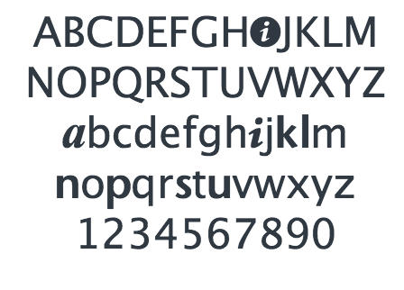
Myriad Pro is very, very close to the official Splunk branding font. But acharlieh's point is important: if you are creating something that will look like Splunk branding and will be distributed beyond the personal hobby level, you should proceed with caution, because Splunk branding belongs to Splunk.
- Mark as New
- Bookmark Message
- Subscribe to Message
- Mute Message
- Subscribe to RSS Feed
- Permalink
- Report Inappropriate Content
Try "Stone Sans Semi Bold Regular".
- Mark as New
- Bookmark Message
- Subscribe to Message
- Mute Message
- Subscribe to RSS Feed
- Permalink
- Report Inappropriate Content
Tried it in direct comparison to the Splunk logo - this is exactly right as far as I can see.
- Mark as New
- Bookmark Message
- Subscribe to Message
- Mute Message
- Subscribe to RSS Feed
- Permalink
- Report Inappropriate Content
Sadly it seems like it might not be a full blown font, but rather custom glyphs. (Then again I don't work for Splunk, Inc. so I might be wrong)
Looking at a Splunk 6.0.6 installation that I have handy, inspecting the "logo" on the front page you can see that it is in fact text, with a font family of "Splunk Icons" which happens to be served up at /en-US/static/fonts/splunkicons-regular-webfont.woff
Looking at this font, it looks like a base font was taken, and glyphs are overridden to give what is needed, and it doesn't really seem to be a unified font at all. (at least the splunk letters are different than the base font as you can see here):
Now the other font that is embedded in the page and seems to be the font used most other places is called Roboto. Maybe using this font might give you some of the style that you're looking for? Or you could try running the logo through something like What the Font! and see if you could get another approximation.
Edit to add: Do be careful in designing your newsletter. While we all love Splunk, and want to show how cool it is, your newsletter should be abundantly clear at a glance that you're a Splunk Enthusiast and not an employee of nor representing Splunk, Inc. themselves. IANAL but the more the line is blurred here the more trouble and headaches you might risk.

