Getting Data In
×
Are you a member of the Splunk Community?
Sign in or Register with your Splunk account to get your questions answered, access valuable resources and connect with experts!
- Find Answers
- :
- Splunk Administration
- :
- Getting Data In
- :
- Re: How to optimize view of a line chart in Splunk...
Options
- Subscribe to RSS Feed
- Mark Topic as New
- Mark Topic as Read
- Float this Topic for Current User
- Bookmark Topic
- Subscribe to Topic
- Mute Topic
- Printer Friendly Page
- Mark as New
- Bookmark Message
- Subscribe to Message
- Mute Message
- Subscribe to RSS Feed
- Permalink
- Report Inappropriate Content
How to optimize view of a line chart in Splunk?
kranthimutyala
Path Finder
02-17-2022
07:45 AM
Hi Everyone, I'm working on a Splunk dashboard visualisation using a line chart, and I span the data for every 1week.But the line is not consistent if there is no data and I see dots scattered here and there. Is there a way to optimise this view. Attached is the screenshot. Thanks
index = "abc" Environment = $environment$  ProcessName=*$task$* LogType = "*" TaskName =*  |bucket span=1w _time

|stats count(eval(LogMessage = "errorneously")) as Failed_Count, count(eval(LogMessage = "execution")) as Success_Count ,count(eval(LogMessage = "execution2")) as Success_Count1 by _time

|eval tot_count= Failed_Count + Success_Count + Success_Count1|eval scount=Success_Count + Success_Count1

| eval succ_per=round((scount/tot_count)*100,0)

|timechart span=1w avg(succ_per)
- Mark as New
- Bookmark Message
- Subscribe to Message
- Mute Message
- Subscribe to RSS Feed
- Permalink
- Report Inappropriate Content
ITWhisperer

SplunkTrust
02-17-2022
09:40 AM
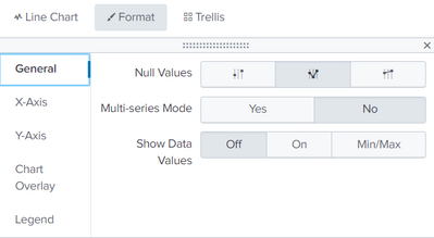
Set the format to zeroes
- Mark as New
- Bookmark Message
- Subscribe to Message
- Mute Message
- Subscribe to RSS Feed
- Permalink
- Report Inappropriate Content
isoutamo

SplunkTrust
02-17-2022
09:26 AM
Hi
you could try makecontinuous and fillnull to stretch and fill those with some defaults.
r. Ismo
Get Updates on the Splunk Community!
Get Operational Insights Quickly with Natural Language on the Splunk Platform
In today’s fast-paced digital world, turning data into actionable insights is essential for success. With ...
Stay Connected: Your Guide to August Tech Talks, Office Hours, and Webinars!
What are Community Office Hours?Community Office Hours is an interactive 60-minute Zoom series where ...
Unleash the Power of Splunk MCP and AI, Meet Us at .Conf 2025, and Find Even More New ...
Splunk Lantern is a Splunk customer success center that provides advice from Splunk experts on valuable data ...


