Turn on suggestions
Auto-suggest helps you quickly narrow down your search results by suggesting possible matches as you type.
Getting Data In
×
Join the Conversation
Without signing in, you're just watching from the sidelines. Sign in or Register to connect, share, and be part of the Splunk Community.
Turn on suggestions
Auto-suggest helps you quickly narrow down your search results by suggesting possible matches as you type.
- Find Answers
- :
- Splunk Administration
- :
- Getting Data In
- :
- Re: How to optimize view of a line chart in Splunk...
Options
- Subscribe to RSS Feed
- Mark Topic as New
- Mark Topic as Read
- Float this Topic for Current User
- Bookmark Topic
- Subscribe to Topic
- Mute Topic
- Printer Friendly Page
- Mark as New
- Bookmark Message
- Subscribe to Message
- Mute Message
- Subscribe to RSS Feed
- Permalink
- Report Inappropriate Content
How to optimize view of a line chart in Splunk?
kranthimutyala
Path Finder
02-17-2022
07:45 AM
Hi Everyone, I'm working on a Splunk dashboard visualisation using a line chart, and I span the data for every 1week.But the line is not consistent if there is no data and I see dots scattered here and there. Is there a way to optimise this view. Attached is the screenshot. Thanks
index = "abc" Environment = $environment$  ProcessName=*$task$* LogType = "*" TaskName =*  |bucket span=1w _time

|stats count(eval(LogMessage = "errorneously")) as Failed_Count, count(eval(LogMessage = "execution")) as Success_Count ,count(eval(LogMessage = "execution2")) as Success_Count1 by _time

|eval tot_count= Failed_Count + Success_Count + Success_Count1|eval scount=Success_Count + Success_Count1

| eval succ_per=round((scount/tot_count)*100,0)

|timechart span=1w avg(succ_per)
- Mark as New
- Bookmark Message
- Subscribe to Message
- Mute Message
- Subscribe to RSS Feed
- Permalink
- Report Inappropriate Content
ITWhisperer

SplunkTrust
02-17-2022
09:40 AM
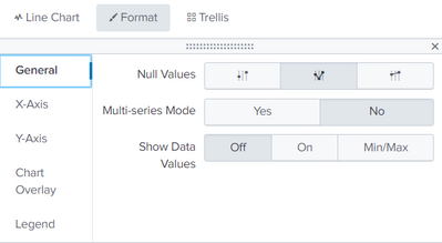
Set the format to zeroes
- Mark as New
- Bookmark Message
- Subscribe to Message
- Mute Message
- Subscribe to RSS Feed
- Permalink
- Report Inappropriate Content
isoutamo

SplunkTrust
02-17-2022
09:26 AM
Hi
you could try makecontinuous and fillnull to stretch and fill those with some defaults.
r. Ismo
Get Updates on the Splunk Community!
Enter the Agentic Era with Splunk AI Assistant for SPL 1.4
🚀 Your data just got a serious AI upgrade — are you ready?
Say hello to the Agentic Era with the ...
Stronger Security with Federated Search for S3, GCP SQL & Australian Threat ...
Splunk Lantern is a Splunk customer success center that provides advice from Splunk experts on valuable data ...
Accelerating Observability as Code with the Splunk AI Assistant
We’ve seen in previous posts what Observability as Code (OaC) is and how it’s now essential for managing ...


