Join the Conversation
- Find Answers
- :
- Using Splunk
- :
- Dashboards & Visualizations
- :
- timechart xaxis custom display text
- Subscribe to RSS Feed
- Mark Topic as New
- Mark Topic as Read
- Float this Topic for Current User
- Bookmark Topic
- Subscribe to Topic
- Mute Topic
- Printer Friendly Page
- Mark as New
- Bookmark Message
- Subscribe to Message
- Mute Message
- Subscribe to RSS Feed
- Permalink
- Report Inappropriate Content
timechart xaxis custom display text
Hi all,
It would be great if anyone have a solution for my timechart xaxis issue. Thanks in advance for you time and effort.
Here is the problem:
A timechart (5 line charts) with span=30min earliest=-180d@d. _time transforms to | eval Date=strftime(Date, "%d/%m/%y %H:%M") .
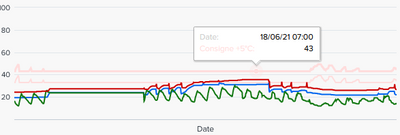
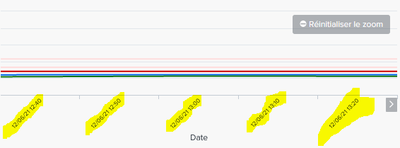
Since i dont use the _time var, so timechart does not display the Xaxis time interval ( 1st pic). If i zoom in, the Xaxis tecxt will be visible( 2nd pic).
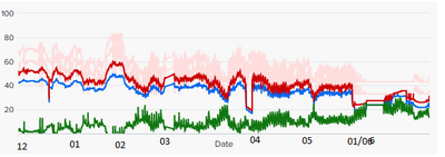
Is this possible to have xaxis time interval text ( by month 12 01 02 03 04 05 06). Because without it, user have to move the mouse to read lien chart by the tooltip box.
restriction: I need to respect the format "%d/%m/%y %H:%M" so i could not use default _time ( which is available in SPLUNK)
1st : without zoom, need to depend on tooltip to know the Date
2nd: zoom, xaxis lable become visible
What i looking to acheive by either ccs or SPL( dont think it is possible)
xaxis time interval text ( by month %m or %d/%m/%y %H:%M could be great)
thanks


