Join the Conversation
- Find Answers
- :
- Using Splunk
- :
- Dashboards & Visualizations
- :
- Visualization in chart- How to make first new and ...
- Subscribe to RSS Feed
- Mark Topic as New
- Mark Topic as Read
- Float this Topic for Current User
- Bookmark Topic
- Subscribe to Topic
- Mute Topic
- Printer Friendly Page
- Mark as New
- Bookmark Message
- Subscribe to Message
- Mute Message
- Subscribe to RSS Feed
- Permalink
- Report Inappropriate Content
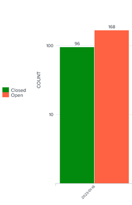
Visualization in chart- How to make first new and then closed?
- Mark as New
- Bookmark Message
- Subscribe to Message
- Mute Message
- Subscribe to RSS Feed
- Permalink
- Report Inappropriate Content
Columns are displayed in the order they appear in the table - these are normally sorted alphabetically / lexicographically. You should rename your your series so that they are in the order you want them, generate the chart statistics, then rename them back to the names you want.
- Mark as New
- Bookmark Message
- Subscribe to Message
- Mute Message
- Subscribe to RSS Feed
- Permalink
- Report Inappropriate Content
but how can u explain clearly ?
- Mark as New
- Bookmark Message
- Subscribe to Message
- Mute Message
- Subscribe to RSS Feed
- Permalink
- Report Inappropriate Content
Given that you haven't shared your events or your current SPL, I have made some results up to demonstrate what I mean. You can study the technique and apply it to your scenario.
Firstly, here is a generated chart similar to your example:
| makeresults count=100
| eval status=mvindex(split("Closed,Open",","),random()%2)
| bin _time span=1d
| chart count by _time status
Here are the modifications to switch the order of the columns
| makeresults count=100
| eval status=mvindex(split("Closed,Open",","),random()%2)
| bin _time span=1d
| eval status=case(status=="Closed","2:".status,status=="Open","1:".status)
| chart count by _time status
| transpose 0 column_name=status header_field=_time
| eval status=mvindex(split(status,":"),1)
| transpose 0 column_name=_time header_field=status- Mark as New
- Bookmark Message
- Subscribe to Message
- Mute Message
- Subscribe to RSS Feed
- Permalink
- Report Inappropriate Content
This can be used when the open and closed are values of a column
but in my case its a week, open and closed are three different columns and in which open column and closed has the count of each week so I can't use this method
- Mark as New
- Bookmark Message
- Subscribe to Message
- Mute Message
- Subscribe to RSS Feed
- Permalink
- Report Inappropriate Content
Perhaps it would be useful if you shared what SPL you do have rather than making us guess? Also, some sample events would be useful too.

