Join the Conversation
- Find Answers
- :
- Using Splunk
- :
- Dashboards & Visualizations
- :
- Using charting.lineDashStyle to edit only one line...
- Subscribe to RSS Feed
- Mark Topic as New
- Mark Topic as Read
- Float this Topic for Current User
- Bookmark Topic
- Subscribe to Topic
- Mute Topic
- Printer Friendly Page
- Mark as New
- Bookmark Message
- Subscribe to Message
- Mute Message
- Subscribe to RSS Feed
- Permalink
- Report Inappropriate Content
I have created a stacked bar chart with two line overlays, of which one line is a target and therefore would like to edit the xml so that this appears in a dash format, whilst the other line remains solid. Is this possible? Or can this only be done for all lines in graph.
- Mark as New
- Bookmark Message
- Subscribe to Message
- Mute Message
- Subscribe to RSS Feed
- Permalink
- Report Inappropriate Content
@jackreeves, fromSplunk Enterprise 7.0 this feature is inbuilt i.e. different series can have different styles applied through new Simple XML Chart Configuration called charting.fieldDashStyles
Foe example if you have two series field1 and field2 you can apply the following:
<option name="charting.fieldDashStyles">{"field1":"solid", "field2":"shortDash"}</option>
You can check out the same in Splunk 7.0 Overview App from Splunkbase
or read the documentation for Simple XML Chart Configuration and various series style options: http://docs.splunk.com/Documentation/Splunk/latest/Viz/ChartConfigurationReference#General_chart_pro...
| makeresults | eval message= "Happy Splunking!!!"
- Mark as New
- Bookmark Message
- Subscribe to Message
- Mute Message
- Subscribe to RSS Feed
- Permalink
- Report Inappropriate Content
Hi @niketn ,
I can use this property in XML format. However, i am not be able to use it in the WebFramework. Do I need a special quote to call this properties?
charting.fieldDashStyles and charting.lineWidth : not working
So far it does not work if i do like this:
....
new ChartView({
"id": "chart1",
"resizable": true,
"data": "results",
"charting.fieldDashStyles":'{"Global":"longDashDot", "Objectif":"dot"}',
"charting.axisLabelsX.majorLabelStyle.rotation": "-45",
//"charting.axisLabelsY.majorUnit": "0.2",
//"charting.axisY.maximumNumber":"2",
//"charting.axisY.minimumNumber":"0",
"height": "450", //600 trop grand
"charting.axisTitleX.visibility": "visible", //"collapsed",
"charting.axisTitleY.visibility": "visible",
"charting.axisTitleY.text": "Taux de pannes mensuel",
"charting.chart": "line",
"charting.chart.showDataLabels": "none",
"charting.chart.nullValueMode":"connect",//"zero",
"charting.drilldown": "none",
"charting.legend.mode": "standard",
"charting.legend.placement": "top",
"charting.lineWidth":"3px",
"charting.seriesColors": '["#000000", "#DDDDDD", "#006D9C", "#4FA484", "#EC9960", "#AF575A", "#B6C75A", "#62B3B2", "#294E70", "#738795", "#EDD051", "#BD9872" ]', //update
"charting.fontColor": "#123456",
"charting.backgroundColor": "#f8f8f8",
"managerid": "search1",
"el": $('#chart1')
}, { tokens: true, tokenNamespace: "submitted" }).render();
- Mark as New
- Bookmark Message
- Subscribe to Message
- Mute Message
- Subscribe to RSS Feed
- Permalink
- Report Inappropriate Content
It's working for me. Can you please try below code?
XML
<dashboard script="timechart.js">
  <label>time chart</label>
  <search id="search1">
    <query>index="_internal" | timechart count | eval count1=count+100</query>
    <earliest>-60m@m</earliest>
    <latest>now</latest>
    <sampleRatio>1</sampleRatio>
  </search>
  <row>
    <panel>
      <html>
        <div id="chart1"/>
      </html>
    </panel>
  </row>
</dashboard>
timechart.js
require([
    'underscore',
    'jquery',
    "splunkjs/mvc/chartview",
    'splunkjs/mvc/simplexml/ready!'
], function(_, $, ChartView) {
    console.log("Hiww")
    new ChartView({
        "id": "chart1",
        "resizable": true,
        "data": "results",
        "charting.lineWidth": "3px",
        "charting.fieldDashStyles": '{"count":"longDashDot", "count1":"dot"}',
        "charting.chart": "line",
        "charting.seriesColors": '["#000000", "#DDDDDD", "#006D9C", "#4FA484", "#EC9960", "#AF575A", "#B6C75A", "#62B3B2", "#294E70", "#738795", "#EDD051", "#BD9872" ]', //update
        "charting.fontColor": "#123456",
        "charting.backgroundColor": "#f8f8f8",
        "managerid": "search1",
        "el": $('#chart1')
    }, { tokens: true, tokenNamespace: "submitted" }).render();
});
Thanks
KV
▄︻̷̿┻̿═━一
If any of my reply helps you to solve the problem Or gain knowledge, an upvote would be appreciated.
- Mark as New
- Bookmark Message
- Subscribe to Message
- Mute Message
- Subscribe to RSS Feed
- Permalink
- Report Inappropriate Content
Hi @kamlesh_vaghela ,
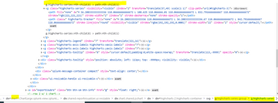
So it required the library path. However ,simplexml is not avaiable in our system. Do you know any css code or other way to walk arround. I want to apply "dot" into only oneline but not apply to do it event specify something like this "#chart1 svg g.highcharts-series-group g.highcharts-series:nth-child(8) path:nth-child(1)"
Thanks in advance!
"splunkjs/mvc/simplexml/ready!"
- Mark as New
- Bookmark Message
- Subscribe to Message
- Mute Message
- Subscribe to RSS Feed
- Permalink
- Report Inappropriate Content
Yeah.. We can achieve this by css. I've tried below css.
/* LongDashDot */
#chart1 path.highcharts-graph {
	stroke-width: 8px !important;
	/* LongDashDot */
	stroke-dasharray: 16, 6;
	d: path("M 10 233 L 390 233");
}

/* Dot */
#chart1 path.highcharts-graph {
	stroke-width: 8px !important;
	/* Dot */
	d: path("M 10 173 L 390 173");
	stroke-dasharray: 2, 6;
}- Mark as New
- Bookmark Message
- Subscribe to Message
- Mute Message
- Subscribe to RSS Feed
- Permalink
- Report Inappropriate Content
Thanks @kamlesh_vaghela
it works. It is quite visible to see the transformation from solid to dot. Another pb is a d value is changing so I did not works all the time.
        /*Global*/
        #chart1 svg g.highcharts-series-group g.highcharts-series:nth-child(1) path:nth-child(1){
            stroke-width: 4px !important;
        }
        /*Objectif-dot*/
        #chart1 svg g.highcharts-series-group g.highcharts-series:nth-child(2) path:nth-child(1){
            stroke-dasharray: 2, 6;
        }
        /*legend*/
        #chart1 svg g.highcharts-legend g g g.highcharts-legend-item:nth-child(1) path:nth-child(1){
            stroke-width: 4px !important;
        }
        #chart1 svg g.highcharts-legend g g g.highcharts-legend-item:nth-child(2) path:nth-child(1){
            stroke-dasharray: 2, 6;
        }
If i can do the opposite(all dot line, only one solid) and rewrite the properties stroke-dasharray: none; then it works all the time. However it is not what we want
- Mark as New
- Bookmark Message
- Subscribe to Message
- Mute Message
- Subscribe to RSS Feed
- Permalink
- Report Inappropriate Content
@jackreeves, you can do this using Simple XML CSS Extension.
svg displays series lines with various dash styles using stroke-dasharray while drawing the path. Refer to svg example on w3schools: https://www.w3schools.com/graphics/svg_stroking.asp
Since you know the CSS selector for override is based on position of series rather than name of the series in svg chart, you would need to ensure the following:
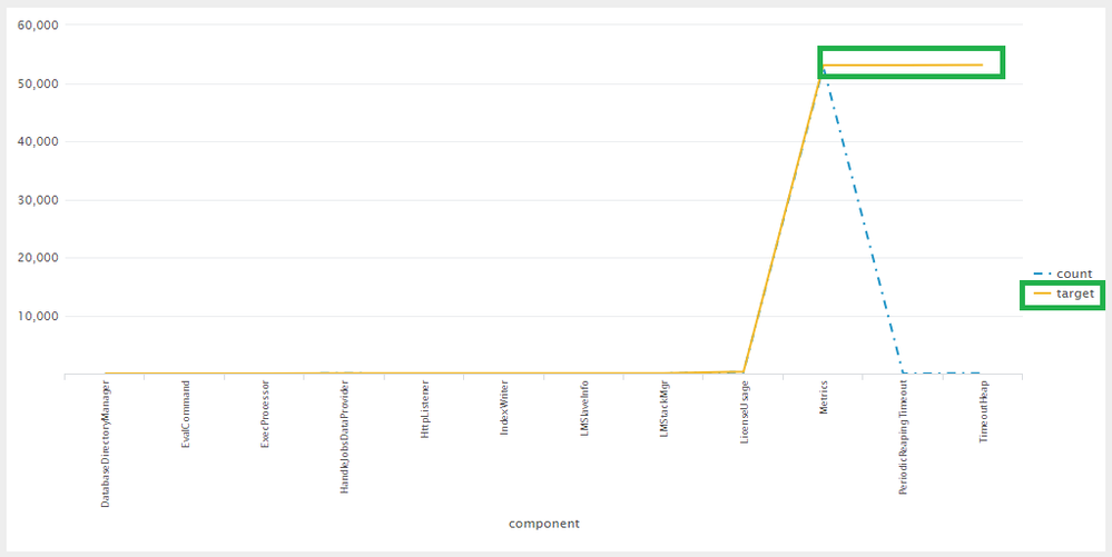
1) Your field target should be at specific position and should always be present. In following example there are two series and target series is at second position. Following are the selectors provided chart id is id="chart1". The CSS override converts target series to Solid (even the Legend for target field). The other series/s should retain the line dash style set by Simple XML Chart configuration charting.lineDashStyle i.e. <option name="charting.lineDashStyle">dashDot</option>
  <html depends="$alwaysHideCSS$">
    <style>
      #chart1 svg g.highcharts-series-group g.highcharts-series:nth-child(3) path:nth-child(1){
        stroke-dasharray:none;
      }
      #chart1 svg g.highcharts-legend g g g.highcharts-legend-item:nth-child(2) path{
        stroke-dasharray:none;
      }
    </style>
  </html>
Following is the complete Simple XML example with a run anywhere search:
<dashboard>
  <label>Line Dash Style CSS Override</label>
  <row>
    <panel>
      <html depends="$alwaysHideCSS$">
        <style>
          #chart1 svg g.highcharts-series-group g.highcharts-series:nth-child(3) path:nth-child(1){
            stroke-dasharray:none;
          }
          #chart1 svg g.highcharts-legend g g g.highcharts-legend-item:nth-child(2) path{
            stroke-dasharray:none;
          }
        </style>
      </html>
      <chart id="chart1">
        <search>
          <query>index=_internal sourcetype=splunkd
| stats count by component
| accum count as target</query>
          <earliest>-24h@h</earliest>
          <latest>now</latest>
          <sampleRatio>1</sampleRatio>
        </search>
        <option name="height">500</option>
        <option name="charting.axisLabelsX.majorLabelStyle.overflowMode">ellipsisNone</option>
        <option name="charting.axisLabelsX.majorLabelStyle.rotation">-90</option>
        <option name="charting.axisTitleX.visibility">visible</option>
        <option name="charting.axisTitleY.visibility">visible</option>
        <option name="charting.axisTitleY2.visibility">visible</option>
        <option name="charting.axisX.scale">linear</option>
        <option name="charting.axisY.scale">linear</option>
        <option name="charting.axisY2.enabled">0</option>
        <option name="charting.axisY2.scale">inherit</option>
        <option name="charting.chart">line</option>
        <option name="charting.chart.bubbleMaximumSize">50</option>
        <option name="charting.chart.bubbleMinimumSize">10</option>
        <option name="charting.chart.bubbleSizeBy">area</option>
        <option name="charting.chart.nullValueMode">gaps</option>
        <option name="charting.chart.overlayFields">Cumu</option>
        <option name="charting.chart.showDataLabels">none</option>
        <option name="charting.chart.sliceCollapsingThreshold">0.01</option>
        <option name="charting.chart.stackMode">default</option>
        <option name="charting.chart.style">shiny</option>
        <option name="charting.drilldown">none</option>
        <option name="charting.layout.splitSeries">0</option>
        <option name="charting.layout.splitSeries.allowIndependentYRanges">0</option>
        <option name="charting.legend.labelStyle.overflowMode">ellipsisStart</option>
        <option name="charting.legend.placement">right</option>
        <option name="charting.lineDashStyle">dashDot</option>
        <option name="trellis.enabled">0</option>
        <option name="trellis.scales.shared">1</option>
        <option name="trellis.size">medium</option>
      </chart>
    </panel>
  </row>
</dashboard>
| makeresults | eval message= "Happy Splunking!!!"


