
Join the Conversation
- Find Answers
- :
- Using Splunk
- :
- Dashboards & Visualizations
- :
- Marginal histogram visualization?
- Subscribe to RSS Feed
- Mark Topic as New
- Mark Topic as Read
- Float this Topic for Current User
- Bookmark Topic
- Subscribe to Topic
- Mute Topic
- Printer Friendly Page
- Mark as New
- Bookmark Message
- Subscribe to Message
- Mute Message
- Subscribe to RSS Feed
- Permalink
- Report Inappropriate Content
Marginal histogram visualization?

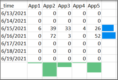
Has anyone used marginal histograms in their Splunk dashboards? It's similar to piping to addtotals and/or addcoltotals, except instead of a number, you'd display a bar/column. It's essentially a melding of a statistical table and a bar/column chart, in one object/panel. (You can do this in Excel for right-hand marginal histograms using conditional formatting to display a bar within the cell. Screenshot example included below. NOTE: the bottom marginal histogram was manipulated, because Excel doesn't let you do it that way.)
I would like to be able to display a chart like the one in the included screenshot, so that we can quickly (visually) identify the highest-activity application and/or days. Ideally, it would be nice to be able to put both margins on (one on the right, that sums the data in the row, and one on the bottom, that sums the data in the column).

Join the Splunk Community Slack to learn, troubleshoot, and make connections with fellow Splunk practitioners in real time!
Join Splunk User Groups to connect and learn in-person by region or remotely by topic or industry.
[Puzzles] Solve, Learn, Reuse: Word-play
Tuning Edge Processor in Hybrid Mode: What Limits Each Data Path
Best Practices: Splunk auto adjust pipeline queue
