Are you a member of the Splunk Community?
- Find Answers
- :
- Using Splunk
- :
- Dashboards & Visualizations
- :
- Is there any way we can have different colors on B...
- Subscribe to RSS Feed
- Mark Topic as New
- Mark Topic as Read
- Float this Topic for Current User
- Bookmark Topic
- Subscribe to Topic
- Mute Topic
- Printer Friendly Page
- Mark as New
- Bookmark Message
- Subscribe to Message
- Mute Message
- Subscribe to RSS Feed
- Permalink
- Report Inappropriate Content
Hi Experts ,
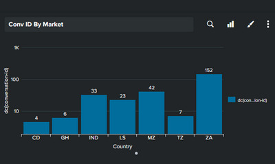
Is there any way we can have different colors on Bar chart based on X-Axis values , below is code to my bar chart, i want to have different color bars for different countries (X-Axis values).
<search base="base_search">
<query>|search Country=$Country$|stats dc(conversation-id) by Country</query>
</search>
<option name="charting.axisLabelsX.majorLabelStyle.rotation">0</option>
<option name="charting.axisTitleX.visibility">visible</option>
<option name="charting.axisTitleY.visibility">visible</option>
<option name="charting.axisTitleY2.visibility">visible</option>
<option name="charting.axisY.abbreviation">auto</option>
<option name="charting.axisY.minimumNumber">1</option>
<option name="charting.axisY.scale">log</option>
<option name="charting.axisY2.abbreviation">auto</option>
<option name="charting.axisY2.enabled">1</option>
<option name="charting.axisY2.scale">log</option>
<option name="charting.chart">column</option>
<option name="charting.chart.overlayFields">count</option>
<option name="charting.chart.showDataLabels">all</option>
<option name="charting.chart.sliceCollapsingThreshold">0.01</option>
<option name="charting.drilldown">none</option>
<option name="charting.fieldColors">{"CD";10": 0xFF0000, "IND": 0xFF9900, "ZA":0x008000}</option>
<option name="charting.legend.placement">right</option>
<option name="refresh.display">progressbar</option>
<option name="trellis.enabled">0</option>
<option name="trellis.size">large</option>
<option name="trellis.splitBy">Country</option>
</chart>
- Mark as New
- Bookmark Message
- Subscribe to Message
- Mute Message
- Subscribe to RSS Feed
- Permalink
- Report Inappropriate Content
That's not how fieldColors works, as you only have a single series in your data
|stats dc(conversation-id) by Countrywhich is your 'dc(conversation-id)'.
The fieldColors represents the columns in your data, not the rows, so you can transpose those so that the rows become columns and then you can use fieldColors.
Use this command to transpose
| transpose 0 header_field=Country column_name=Conversationsand then your fieldColors should work.
- Mark as New
- Bookmark Message
- Subscribe to Message
- Mute Message
- Subscribe to RSS Feed
- Permalink
- Report Inappropriate Content
Hi Rich,
thanks for reply , i have made corrections but Still not working :
<query>|search Country=$Country$|stats dc(conversation-id) by Country</query>
</search>
<option name="charting.axisLabelsX.majorLabelStyle.rotation">0</option>
<option name="charting.axisTitleX.visibility">visible</option>
<option name="charting.axisTitleY.visibility">visible</option>
<option name="charting.axisTitleY2.visibility">visible</option>
<option name="charting.axisY.abbreviation">auto</option>
<option name="charting.axisY.minimumNumber">1</option>
<option name="charting.axisY.scale">log</option>
<option name="charting.axisY2.abbreviation">auto</option>
<option name="charting.axisY2.enabled">1</option>
<option name="charting.axisY2.scale">log</option>
<option name="charting.chart">column</option>
<option name="charting.chart.overlayFields">count</option>
<option name="charting.chart.showDataLabels">all</option>
<option name="charting.chart.sliceCollapsingThreshold">0.01</option>
<option name="charting.drilldown">none</option>
<option name="charting.fieldColors">{"CD":0xf7bc38, "IND":0xeeeeee, "ZA":0x65a637}</option>
<option name="charting.legend.placement">right</option>
<option name="refresh.display">progressbar</option>
<option name="trellis.enabled">0</option>
<option name="trellis.size">large</option>
<option name="trellis.splitBy">Country</option>
</chart>
</panel>
- Mark as New
- Bookmark Message
- Subscribe to Message
- Mute Message
- Subscribe to RSS Feed
- Permalink
- Report Inappropriate Content
That's not how fieldColors works, as you only have a single series in your data
|stats dc(conversation-id) by Countrywhich is your 'dc(conversation-id)'.
The fieldColors represents the columns in your data, not the rows, so you can transpose those so that the rows become columns and then you can use fieldColors.
Use this command to transpose
| transpose 0 header_field=Country column_name=Conversationsand then your fieldColors should work.
- Mark as New
- Bookmark Message
- Subscribe to Message
- Mute Message
- Subscribe to RSS Feed
- Permalink
- Report Inappropriate Content
You already have the right idea, just not formatted correctly. The charting.fieldColors option has to be pairs of strings and hex color numbers. In the example code, the first string doesn't have a matching color code.
If this reply helps you, Karma would be appreciated.

