Turn on suggestions
Auto-suggest helps you quickly narrow down your search results by suggesting possible matches as you type.
Dashboards & Visualizations
×
Are you a member of the Splunk Community?
Sign in or Register with your Splunk account to get your questions answered, access valuable resources and connect with experts!
Turn on suggestions
Auto-suggest helps you quickly narrow down your search results by suggesting possible matches as you type.
- Find Answers
- :
- Using Splunk
- :
- Dashboards & Visualizations
- :
- Dynamic gauge values
Options
- Subscribe to RSS Feed
- Mark Topic as New
- Mark Topic as Read
- Float this Topic for Current User
- Bookmark Topic
- Subscribe to Topic
- Mute Topic
- Printer Friendly Page
- Mark as New
- Bookmark Message
- Subscribe to Message
- Mute Message
- Subscribe to RSS Feed
- Permalink
- Report Inappropriate Content
Dynamic gauge values
Marco
Communicator
10-28-2020
07:43 AM
Hi Splunkers,
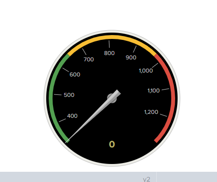
I am currently trying to create a gauge visualization, but the issue is that my daily number of events is showing up as 0.
This is my query:
host=* COMMAND="PWD"| bucket _time span=day
| stats count by _time| outlier | stats max(count) as mx | eval y1=mx/4| eval y2= y1*2 | eval y3= y1*3| eval y4= mx | gauge count 0 y1 y2 y3 y4

As you can see the gauge is pegged at zero. The needle represents the total number of events for today.
Any suggestions?
Thank You,
Marco
- Mark as New
- Bookmark Message
- Subscribe to Message
- Mute Message
- Subscribe to RSS Feed
- Permalink
- Report Inappropriate Content
richgalloway

SplunkTrust
10-28-2020
10:35 AM
The problem is there is no field called "count" for the gauge command to display. Try
... | | gauge mx 0 y1 y2 y3 y4BTW, I don't see the point of having the gauge always pinned at the max value.
---
If this reply helps you, Karma would be appreciated.
If this reply helps you, Karma would be appreciated.
Get Updates on the Splunk Community!
Observability Unlocked: Kubernetes Monitoring with Splunk Observability Cloud
Ready to master Kubernetes and cloud monitoring like the pros?
Join Splunk’s Growth Engineering team for an ...
Update Your SOAR Apps for Python 3.13: What Community Developers Need to Know
To Community SOAR App Developers - we're reaching out with an important update regarding Python 3.9's ...
October Community Champions: A Shoutout to Our Contributors!
As October comes to a close, we want to take a moment to celebrate the people who make the Splunk Community ...
