Turn on suggestions
Auto-suggest helps you quickly narrow down your search results by suggesting possible matches as you type.
Dashboards & Visualizations
×
Are you a member of the Splunk Community?
Sign in or Register with your Splunk account to get your questions answered, access valuable resources and connect with experts!
Turn on suggestions
Auto-suggest helps you quickly narrow down your search results by suggesting possible matches as you type.
- Find Answers
- :
- Using Splunk
- :
- Dashboards & Visualizations
- :
- Dashboard Studio Line chart, how to remove circles...
Options
- Subscribe to RSS Feed
- Mark Topic as New
- Mark Topic as Read
- Float this Topic for Current User
- Bookmark Topic
- Subscribe to Topic
- Mute Topic
- Printer Friendly Page
- Mark as New
- Bookmark Message
- Subscribe to Message
- Mute Message
- Subscribe to RSS Feed
- Permalink
- Report Inappropriate Content
leekeener
Path Finder
09-07-2021
08:44 AM
Howdy,
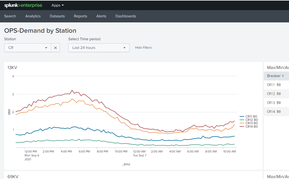
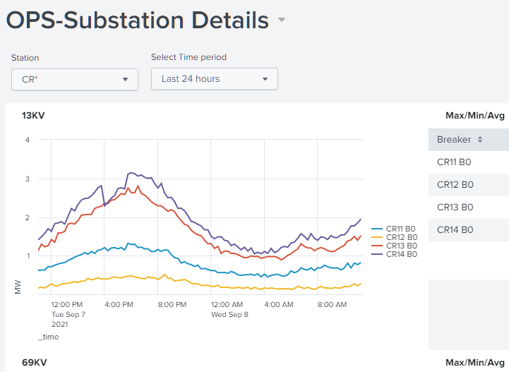
I have searched through the settings and can't seem to find out the parameter needed to disable the little circles in the new Line chart, what am I missing? The circles are quite jarring compared to what my dashboards used to look like. I can't imagine that they aren't configurable??
New chart:
Old chart
1 Solution
- Mark as New
- Bookmark Message
- Subscribe to Message
- Mute Message
- Subscribe to RSS Feed
- Permalink
- Report Inappropriate Content
leekeener
Path Finder
09-08-2021
08:18 AM
I finally found it in an example, "chart.showMarkers": false/true,
Maybe this helps somebody.
- Mark as New
- Bookmark Message
- Subscribe to Message
- Mute Message
- Subscribe to RSS Feed
- Permalink
- Report Inappropriate Content
leekeener
Path Finder
09-08-2021
08:24 AM
Here is an example with showMarkers false
- Mark as New
- Bookmark Message
- Subscribe to Message
- Mute Message
- Subscribe to RSS Feed
- Permalink
- Report Inappropriate Content
leekeener
Path Finder
09-08-2021
08:18 AM
I finally found it in an example, "chart.showMarkers": false/true,
Maybe this helps somebody.
Get Updates on the Splunk Community!
Splunk Observability for AI
Don’t miss out on an exciting Tech Talk on Splunk Observability for AI!Discover how Splunk’s agentic AI ...
Splunk Enterprise Security 8.x: The Essential Upgrade for Threat Detection, ...
Watch On Demand the Tech Talk, and empower your SOC to reach new heights!
Duration: 1 hour
Prepare to ...
Splunk Observability as Code: From Zero to Dashboard
For the details on what Self-Service Observability and Observability as Code is, we have some awesome content ...


