Are you a member of the Splunk Community?
- Find Answers
- :
- Using Splunk
- :
- Dashboards & Visualizations
- :
- Charting values are not right
- Subscribe to RSS Feed
- Mark Topic as New
- Mark Topic as Read
- Float this Topic for Current User
- Bookmark Topic
- Subscribe to Topic
- Mute Topic
- Printer Friendly Page
- Mark as New
- Bookmark Message
- Subscribe to Message
- Mute Message
- Subscribe to RSS Feed
- Permalink
- Report Inappropriate Content
I'm seeing a weird problem that I've been banging my head on today. I have the following search:
index="tap" eventType="messagesDelivered" OR eventType="messagesBlocked" | stats count(eval(eventType=="messagesBlocked")) AS Blocked, count(eval(eventType=="messagesDelivered")) AS Delivered | eval Total=(Blocked+Delivered) | eval divided = Blocked/Total | eval Percent_Blocked=round((divided*100),0)."%" | fields Blocked,Delivered,Total,Percent_Blocked
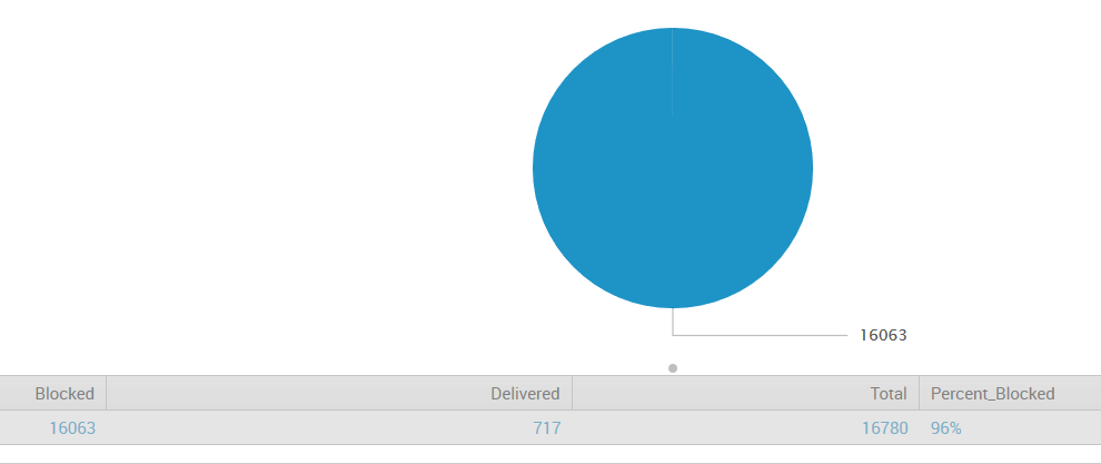
The search works fine, but it charts only the Blocked field and nothing else, so my pie chart is 100% Blocked and a single color. I'm wanting to chart the blocked and delivered as separate slices. I think it has something to do with my stats and eval command renaming.
The original data are from the field eventType. If I don't eval them to different fields, they show up as individual rows instead of columns - but this works:
If I do the original search with stats and eval, I get this:
Any ideas on how I can chart this based off of the Blocked and Delivered columns?
Thanks!
- Mark as New
- Bookmark Message
- Subscribe to Message
- Mute Message
- Subscribe to RSS Feed
- Permalink
- Report Inappropriate Content
I don’t think you’re going to be able to put that original search into a pie chart. Why do you need them in separate columns? Is it just for the total and percentage calculations? You can try ...|eventstats sum(count) as total|eval Percent=round((count/total)*100,0)."%"
- Mark as New
- Bookmark Message
- Subscribe to Message
- Mute Message
- Subscribe to RSS Feed
- Permalink
- Report Inappropriate Content
You are doing too much work for the system. Get lazier.
Try this...
 index="tap" eventType="messagesDelivered" OR eventType="messagesBlocked"
| stats count by eventType
That should give you two records. Drop it into the pie chart, and you should get two slices on the pie.
If you want to clean up the names a little, add these two...
| rex mode=sed field=eventType "s/messages//g"
| rename eventType as Type
... and you can also add this for some additional options
| chart sum(count) by Type
- Mark as New
- Bookmark Message
- Subscribe to Message
- Mute Message
- Subscribe to RSS Feed
- Permalink
- Report Inappropriate Content
This is how I received the chart at the top - minus cleaning it with sed. With this search though, I'm unable to show the % in the chart. Is there a way to chart messagesDelivered and messagesBlocked only, and still allow a 3rd row for Percentage (but not chart it).
- Mark as New
- Bookmark Message
- Subscribe to Message
- Mute Message
- Subscribe to RSS Feed
- Permalink
- Report Inappropriate Content
@johnblakely - glad you got your answer from the inestimable @cmerriman.
- Mark as New
- Bookmark Message
- Subscribe to Message
- Mute Message
- Subscribe to RSS Feed
- Permalink
- Report Inappropriate Content
I don’t think you’re going to be able to put that original search into a pie chart. Why do you need them in separate columns? Is it just for the total and percentage calculations? You can try ...|eventstats sum(count) as total|eval Percent=round((count/total)*100,0)."%"
- Mark as New
- Bookmark Message
- Subscribe to Message
- Mute Message
- Subscribe to RSS Feed
- Permalink
- Report Inappropriate Content
Thanks! I was able to add this to the original search (with help from DalJeanis) and come up with a perfect chart with percentages. I'm not able to upload a screenshot to a comment, but here's the final search below:
index="tap" eventType="messagesDelivered" OR eventType="messagesBlocked" | stats count by eventType | rex mode=sed field=eventType "s/messages//g" | eventstats sum(count) as total|eval Percent=round((count/total)*100,0)."%" | rename eventType as Type, count as Totals | fields Type, Totals, Percent


