Turn on suggestions
Auto-suggest helps you quickly narrow down your search results by suggesting possible matches as you type.
Dashboards & Visualizations
×
Are you a member of the Splunk Community?
Sign in or Register with your Splunk account to get your questions answered, access valuable resources and connect with experts!
Turn on suggestions
Auto-suggest helps you quickly narrow down your search results by suggesting possible matches as you type.
- Find Answers
- :
- Using Splunk
- :
- Dashboards & Visualizations
- :
- Can you help me color coordinate different charts ...
Options
- Subscribe to RSS Feed
- Mark Topic as New
- Mark Topic as Read
- Float this Topic for Current User
- Bookmark Topic
- Subscribe to Topic
- Mute Topic
- Printer Friendly Page
- Mark as New
- Bookmark Message
- Subscribe to Message
- Mute Message
- Subscribe to RSS Feed
- Permalink
- Report Inappropriate Content
Can you help me color coordinate different charts in a dashboard?
pascoaljo
New Member
09-20-2018
10:33 AM
Dear Team
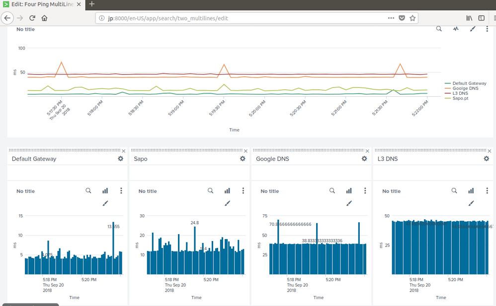
Could you please help me to get the same color in the charts, below the line chart... each one with the color of the line, in the Line Chart.
The code I have so far:
(host=jp) source="/home/jp/pings/targets/googledns.txt" OR source="/home/jp/pings/targets/defaultGateway.txt"  OR source="/home/jp/pings/targets/l3dns.txt"  OR source="/home/jp/pings/targets/sapo.txt"
| timechart avg(time) by source
| rename /home/jp/pings/targets/googledns.txt as "Google DNS" | rename /home/jp/pings/targets/defaultGateway.txt as "Default Gateway" | rename /home/jp/pings/targets/l3dns.txt as "L3 DNS" | rename /home/jp/pings/targets/sapo.txt as "sapo"
This code reads the data from 4 different .txt files in real time. The data is a ping to four different IPs.
Also the Legend on the right is customized.
Thank you in advance.
Best regards
JP
- Mark as New
- Bookmark Message
- Subscribe to Message
- Mute Message
- Subscribe to RSS Feed
- Permalink
- Report Inappropriate Content
somesoni2
Revered Legend
09-20-2018
11:53 AM
Is the name of the series (renamed source in your query) static? If they are, you should be able to assign specific color to them in chart configurations. See charting.fieldColors attribute in below link.
Get Updates on the Splunk Community!
Wrapping Up Cybersecurity Awareness Month
October might be wrapping up, but for Splunk Education, cybersecurity awareness never goes out of season. ...
🌟 From Audit Chaos to Clarity: Welcoming Audit Trail v2
🗣 You Spoke, We Listened
Audit Trail v2 wasn’t written in isolation—it was shaped by your voices.
In ...
What's New in Splunk Observability - October 2025
What’s New?
We’re excited to announce the latest enhancements to Splunk Observability Cloud and share ...

