Are you a member of the Splunk Community?
- Find Answers
- :
- Using Splunk
- :
- Dashboards & Visualizations
- :
- Add percent sign (%) on a stacked column chart dat...
- Subscribe to RSS Feed
- Mark Topic as New
- Mark Topic as Read
- Float this Topic for Current User
- Bookmark Topic
- Subscribe to Topic
- Mute Topic
- Printer Friendly Page
- Mark as New
- Bookmark Message
- Subscribe to Message
- Mute Message
- Subscribe to RSS Feed
- Permalink
- Report Inappropriate Content
Hello,
I'm trying to add a percent sign (%) on a stacked column chart's data label. I tried using eval but it's turning the values into a string and screws up the visualization. I'm trying to use javascript to add the "%" but I'm not having any luck. I can't seem to find the right property to change the data label. I'm only able to change the x-axis title, below is what I have:
require([
    "splunkjs/mvc",
    "splunkjs/mvc/simplexml/ready!"
], function(mvc) {

    // Get the chart
    var myChart = mvc.Components.get('myChart');

    // Programmatically change a property in the Events table
    myChart.getVisualization(function(chartView) {
        chartView.settings.set({
            "charting.axisTitleX.text": "My x-axis",
            "charting.legend.placement": "bottom",
        });
    });
});
Any advice is greatly appreciated. Thank you!
- Mark as New
- Bookmark Message
- Subscribe to Message
- Mute Message
- Subscribe to RSS Feed
- Permalink
- Report Inappropriate Content
[UPDATED]
Added myHighChart to jQuery selector to add percent specific to one chart with ID myHighChart
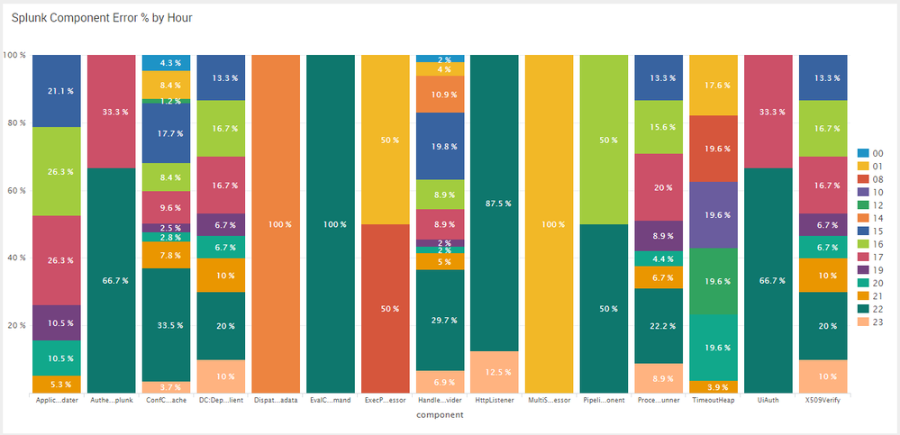
@jpvalenc, ideally this should happen within Highcharts using its built in API options. However, that would require an Enhancement to charts. If you have Splunk Entitlement you can request the same. Meanwhile, here is a workaround for your to code something similar with jQuery.
Step 1: Create Column Chart with Percent data as numeric values. Give chart some id. For the example it is id="myHighChart".
Step 2: Use jQuery to select text tspan element within highcharts-data-label and text tspan element within highcharts-yaxis-labels. Since JavaScript is overriding default chart and chart may load/refresh several times I am using :not(:contains(%)) for the text element to add % after the value only if it is not present.
Step 3: Use CSS to override Data Label fill color to make it more prominent. PS: I have changed to white.
PS: I have added % for Y-axis label as well, however on resizing browser window it gets overridden. This would require chart refresh after resize or edit. However, this is not your requirement, so you can ignore the same.
Since this requires Simple XML JS Extension, you might need to refresh/restart/bump Splunk after changes to JavaScript. Also, you may need to clear browser history as well.
Following is run anywhere dashboard Simple XML code:
 <dashboard script="highchart_data_label_percent.js">
  <label>Highchart Data Label Suffix Percent</label>
  <row>
    <panel>
      <title>Splunk Component Error % by Hour</title>
      <html>
        <style>
          #myHighChart g.highcharts-data-label text{
            fill: white !important;
          }
        </style>
      </html>
      <chart id="myHighChart">
        <search>
          <query>index=_internal sourcetype=splunkd log_level!=INFO
| stats count as errors by component date_hour
| eval date_hour=case(len(date_hour)=1,"0".date_hour,true(),date_hour)
| chart sum(errors) as Total over component by date_hour limit=24 useother=f usenull=f
| rename * as count*
| rename countcomponent as component
| fillnull value=0
| eval Total=0
| foreach count* [eval Total=Total+'<<FIELD>>']
| foreach count* [eval <<FIELD>>=round(('<<FIELD>>'/Total)*100,1)]
| fields - Total
| rename count* as *</query>
          <earliest>-1d@d</earliest>
          <latest>@d</latest>
          <sampleRatio>1</sampleRatio>
        </search>
        <option name="height">540</option>
        <option name="charting.axisLabelsX.majorLabelStyle.overflowMode">ellipsisNone</option>
        <option name="charting.axisLabelsX.majorLabelStyle.rotation">0</option>
        <option name="charting.axisLabelsY.majorUnit">20</option>
        <option name="charting.axisTitleX.visibility">visible</option>
        <option name="charting.axisTitleY.visibility">visible</option>
        <option name="charting.axisTitleY2.visibility">visible</option>
        <option name="charting.axisX.abbreviation">none</option>
        <option name="charting.axisX.scale">linear</option>
        <option name="charting.axisY.abbreviation">none</option>
        <option name="charting.axisY.maximumNumber">100</option>
        <option name="charting.axisY.minimumNumber">0</option>
        <option name="charting.axisY.scale">linear</option>
        <option name="charting.axisY2.abbreviation">none</option>
        <option name="charting.axisY2.enabled">0</option>
        <option name="charting.axisY2.scale">inherit</option>
        <option name="charting.chart">column</option>
        <option name="charting.chart.bubbleMaximumSize">50</option>
        <option name="charting.chart.bubbleMinimumSize">10</option>
        <option name="charting.chart.bubbleSizeBy">area</option>
        <option name="charting.chart.nullValueMode">gaps</option>
        <option name="charting.chart.showDataLabels">all</option>
        <option name="charting.chart.sliceCollapsingThreshold">0.01</option>
        <option name="charting.chart.stackMode">stacked</option>
        <option name="charting.chart.style">shiny</option>
        <option name="charting.drilldown">none</option>
        <option name="charting.layout.splitSeries">0</option>
        <option name="charting.layout.splitSeries.allowIndependentYRanges">0</option>
        <option name="charting.legend.labelStyle.overflowMode">ellipsisMiddle</option>
        <option name="charting.legend.mode">standard</option>
        <option name="charting.legend.placement">right</option>
        <option name="charting.lineWidth">2</option>
        <option name="refresh.display">progressbar</option>
        <option name="trellis.enabled">0</option>
        <option name="trellis.scales.shared">1</option>
        <option name="trellis.size">medium</option>
      </chart>
    </panel>
  </row>
</dashboard>
Following is the JavaScript Code highchart_data_label_percent.js to be included:
require([
    "jquery",
    "splunkjs/mvc",
    "splunkjs/mvc/simplexml/ready!"
], function($,mvc){

    mvc.Components.get("myHighChart").getVisualization(function(chartView) {
        chartView.on("rendered", function() {
                $("#myHighChart g.highcharts-data-label text:not(:contains(%)) tspan").after(" %");
                $("#myHighChart g.highcharts-yaxis-labels text:not(:contains(%)) tspan").after(" %");
        });
    });
});
| makeresults | eval message= "Happy Splunking!!!"
- Mark as New
- Bookmark Message
- Subscribe to Message
- Mute Message
- Subscribe to RSS Feed
- Permalink
- Report Inappropriate Content
- Mark as New
- Bookmark Message
- Subscribe to Message
- Mute Message
- Subscribe to RSS Feed
- Permalink
- Report Inappropriate Content
This worked perfectly!
Any idea how this can be modified to do a "replace" function , instead of an "append"? I am trying to make a barchart that shows the number value as well as percentages:
The best way i can think of doing this is to concatenate the number value and percentage with a period (e.g. 52.10 =52 10% ). This way , highchart can chart the numerical numbers since it cant chart a string. Then use jquery to separate out the values by replacing the "." with a space and appending a "%" at the end. I tried adding an extra line, but it doesnt seem to work:
$("g.highcharts-data-label text:not(:contains(%)) tspan").text("%");
$("g.highcharts-yaxis-labels text:not(:contains(%)) tspan").after("%");
$("g.highcharts-data-label text:not(:contains(&)) tspan").text().replace("."," ");
There is a probably a better way to add space without checking for "&" but just wanted to test out if the method worked.
Any help would be greatly appreciated!
- Mark as New
- Bookmark Message
- Subscribe to Message
- Mute Message
- Subscribe to RSS Feed
- Permalink
- Report Inappropriate Content
Hi. I just saw this and tried it on my dashboard and It works. My question is if I am using a chart overlay and have two Y-axis how can I implement this on just the Y-Axis on the left?
- Mark as New
- Bookmark Message
- Subscribe to Message
- Mute Message
- Subscribe to RSS Feed
- Permalink
- Report Inappropriate Content
I have the same question as you @michaelrosello do you find solution ??
- Mark as New
- Bookmark Message
- Subscribe to Message
- Mute Message
- Subscribe to RSS Feed
- Permalink
- Report Inappropriate Content
Do you want to change the field name? of field values to % ?
Do you mean datalabel means fieldname?
- Mark as New
- Bookmark Message
- Subscribe to Message
- Mute Message
- Subscribe to RSS Feed
- Permalink
- Report Inappropriate Content
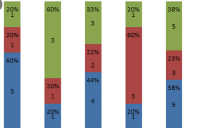
I mean the data values. So the stacked chart is currently showing numbers 60 and 40, for example. I want it to show 60% and 40%. I want to add a "%" character on the data value.
- Mark as New
- Bookmark Message
- Subscribe to Message
- Mute Message
- Subscribe to RSS Feed
- Permalink
- Report Inappropriate Content
I do not think it is possible in column chart but if you do the same in pie chart by adding this option in your dashboard XML
<option name="charting.chart.showPercent">1</option>
- Mark as New
- Bookmark Message
- Subscribe to Message
- Mute Message
- Subscribe to RSS Feed
- Permalink
- Report Inappropriate Content
Yeah that works for a pie chart but, unfortunately, I'll be showing a series of stacked column chart over a period of time.
- Mark as New
- Bookmark Message
- Subscribe to Message
- Mute Message
- Subscribe to RSS Feed
- Permalink
- Report Inappropriate Content
Hi jpvalenc,
You can try to create new field using eval command. eg. field = field + "%"


