Turn on suggestions
Auto-suggest helps you quickly narrow down your search results by suggesting possible matches as you type.
Dashboards & Visualizations
×
Join the Conversation
Without signing in, you're just watching from the sidelines. Sign in or Register to connect, share, and be part of the Splunk Community.
Turn on suggestions
Auto-suggest helps you quickly narrow down your search results by suggesting possible matches as you type.
- Find Answers
- :
- Using Splunk
- :
- Dashboards & Visualizations
- :
- sub aggregation pie chart with splunk ?
Options
- Subscribe to RSS Feed
- Mark Topic as New
- Mark Topic as Read
- Float this Topic for Current User
- Bookmark Topic
- Subscribe to Topic
- Mute Topic
- Printer Friendly Page
- Mark as New
- Bookmark Message
- Subscribe to Message
- Mute Message
- Subscribe to RSS Feed
- Permalink
- Report Inappropriate Content
mcarpentier
Engager
09-05-2016
09:30 AM
Hi all,
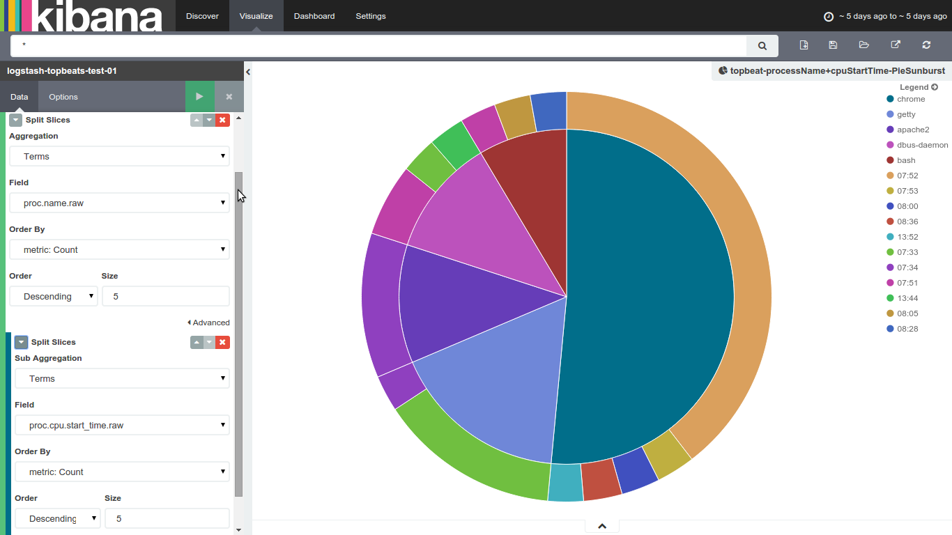
New to splunk, i'm quite used to kibana's sub aggreagation charts, like the one below : it's a very convenient way to show some of my datas
i know Splunk's pie charts are limited to one column, what would the best way to achieve that kind of visualization (sub aggregation ones) in splunk ?
Thanks for your help
Max
1 Solution
- Mark as New
- Bookmark Message
- Subscribe to Message
- Mute Message
- Subscribe to RSS Feed
- Permalink
- Report Inappropriate Content
inventsekar

SplunkTrust
09-06-2016
08:31 AM
Please check Donut Charts app -
https://splunkbase.splunk.com/app/1161/

thanks and best regards,
Sekar
PS - If this or any post helped you in any way, pls consider upvoting, thanks for reading !
Sekar
PS - If this or any post helped you in any way, pls consider upvoting, thanks for reading !
- Mark as New
- Bookmark Message
- Subscribe to Message
- Mute Message
- Subscribe to RSS Feed
- Permalink
- Report Inappropriate Content
inventsekar
SplunkTrust
09-06-2016
08:31 AM
Please check Donut Charts app -
https://splunkbase.splunk.com/app/1161/
thanks and best regards,
Sekar
PS - If this or any post helped you in any way, pls consider upvoting, thanks for reading !
Sekar
PS - If this or any post helped you in any way, pls consider upvoting, thanks for reading !
Get Updates on the Splunk Community!
App Platform's 2025 Year in Review: A Year of Innovation, Growth, and Community
As we step into 2026, it’s the perfect moment to reflect on what an extraordinary year 2025 was for the Splunk ...
Operationalizing Entity Risk Score with Enterprise Security 8.3+
Overview
Enterprise Security 8.3 introduces a powerful new feature called “Entity Risk Scoring” (ERS) for ...
Unlock Database Monitoring with Splunk Observability Cloud
In today’s fast-paced digital landscape, even minor database slowdowns can disrupt user experiences and ...
