- Mark as New
- Bookmark Message
- Subscribe to Message
- Mute Message
- Subscribe to RSS Feed
- Permalink
- Report Inappropriate Content
Can you help me produce a better scatter plot, which allows infinite dots?
Looking for a way produce a scatter plot that allows infinite dots (limited potentially only by memory).
The use case it to produce a scatter plot with dots of a settable size (or auto-adjusting based on scatter density) which visually demonstrates each and every single event result from a search.
More-specifically, I want every sign-in to our system to be represented on a scatter plot where X is the time and Y is the service-response-time. With thousands of sign-in's per minute, I need thousands of dots - either 1x1 pixel or 2x2, which results in a cloud-like pattern to be produced along the X series.
when response times go up, the 'cloud' of dots trends upwards and very-clearly identifies when an issue is affecting more than simply outliers.
- Mark as New
- Bookmark Message
- Subscribe to Message
- Mute Message
- Subscribe to RSS Feed
- Permalink
- Report Inappropriate Content
@dijikul have you tried Splunk Machine Learning Toolkit app from Splunkbase which has several custom visualizations including Scatter Line Chart.
| makeresults | eval message= "Happy Splunking!!!"
- Mark as New
- Bookmark Message
- Subscribe to Message
- Mute Message
- Subscribe to RSS Feed
- Permalink
- Report Inappropriate Content
The line scatter plot 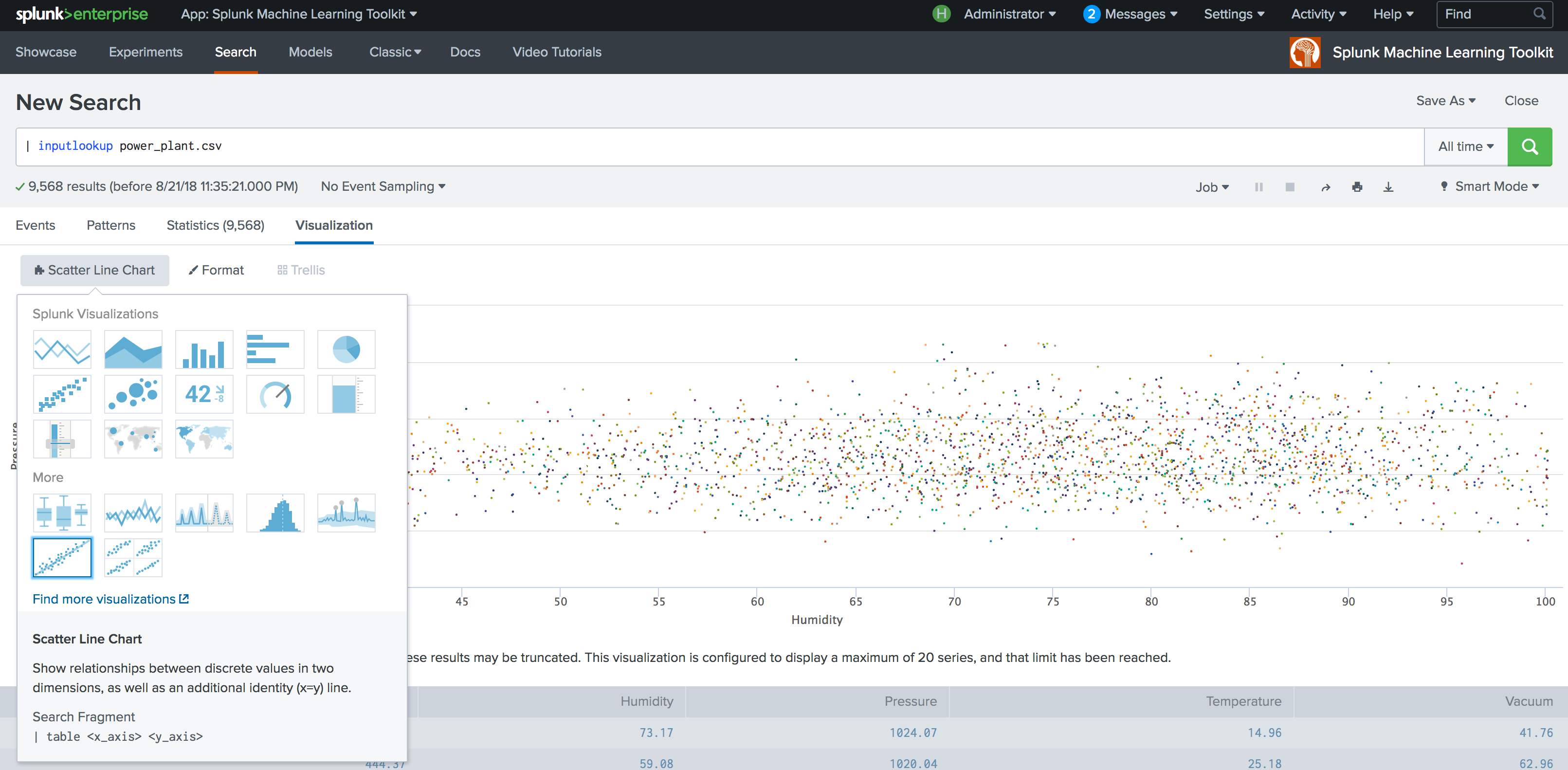 looks like what I'm envisioning in my head, but I want the X-axis to be time and the Y-axis to be response time. For every sign-in event.
Using an inputlookup in an example is a great way to obfuscate the data so that it's harder to recreate. I have response times; I have a timeline; why does my scatter line plot look like this: 
What am I doing wrong?
