Are you a member of the Splunk Community?
- Find Answers
- :
- Using Splunk
- :
- Other Using Splunk
- :
- Alerting
- :
- Re: Adaptive thresholds - upper and lower bands to...
- Subscribe to RSS Feed
- Mark Topic as New
- Mark Topic as Read
- Float this Topic for Current User
- Bookmark Topic
- Subscribe to Topic
- Mute Topic
- Printer Friendly Page
- Mark as New
- Bookmark Message
- Subscribe to Message
- Mute Message
- Subscribe to RSS Feed
- Permalink
- Report Inappropriate Content
Adaptive thresholds - upper and lower bands to trigger from + outliers chart
Hi
I am looking at working with alarm thresholds.
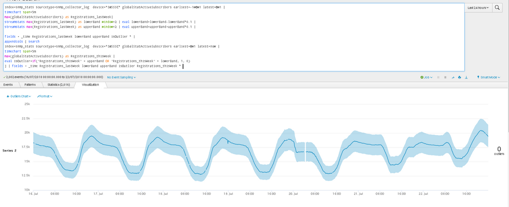
Basically, I want to have an upper band and lower band which is derived from the values for last week.
Then if the values for this week breach these bands then I would look to do some trigger
This is my search and graph, just a basice search with 4 lines in the graph.
What, specifically, are you trying to detect?
So when the black line(shich is me drawing an example of the yellow line breaching the upper and lower bands) goes high and breaks the upper band at point x this would be a breech.
Likewise if the black line goes low and breaks the lower band at point y this would be a breech.
The values of this week are the yellow line, so as these realtime values come in, if they go above upper band or below lower band then these bands would be breached, therefore I want an alert.
I hope my comments help explaing the graph/picture better now.
I wanted to try and do it in machine learning as this has the outliers chart, which it seems is only available in the machine learning app. The outliers chart looks useful but it may not be of value, i am thinking at this early stage
note: I have asked a similar question here before, But it is slightly different here.
- Mark as New
- Bookmark Message
- Subscribe to Message
- Mute Message
- Subscribe to RSS Feed
- Permalink
- Report Inappropriate Content
What, specifically, do you mean when you say "the values for this week breach these bands"?
You show obviously cyclic graphs. When a point is high on the low part of the cycle or low on the high part, is that a "breach"?
What, specifically, are you trying to detect?
- Mark as New
- Bookmark Message
- Subscribe to Message
- Mute Message
- Subscribe to RSS Feed
- Permalink
- Report Inappropriate Content
her you go.
What, specifically, are you trying to detect?
So when the black line(shich is me drawing an example of the yellow line breaching the upper and lower bands) goes high and breaks the upper band at point x this would be a breech.
Likewise if the black line goes low and breaks the lower band at point y this would be a breech.
The values of this week are the yellow line, so as these realtime values come in, if they go above upper band or below lower band then these bands would be breached, therefore I want an alert.
I hope my comments help explaing the graph/picture better now.


