Join the Conversation
- Find Answers
- :
- Using Splunk
- :
- Splunk Search
- :
- pie chart color with eval condition
- Subscribe to RSS Feed
- Mark Topic as New
- Mark Topic as Read
- Float this Topic for Current User
- Bookmark Topic
- Subscribe to Topic
- Mute Topic
- Printer Friendly Page
- Mark as New
- Bookmark Message
- Subscribe to Message
- Mute Message
- Subscribe to RSS Feed
- Permalink
- Report Inappropriate Content
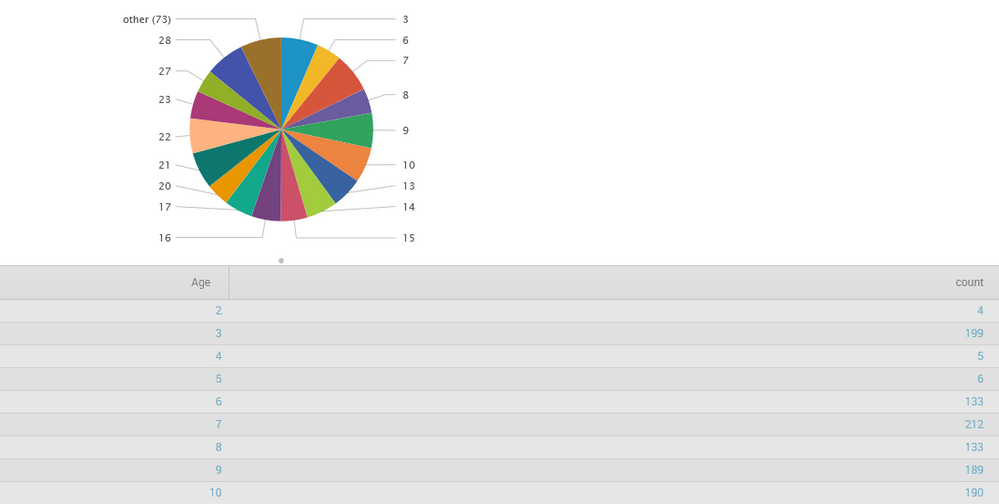
Am using query "index=level3 host=Test | stats count by Age | sort Age" and visualizing it in a pie chart.
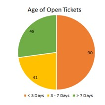
Now my requirement is I want to put some condition and color code it accordingly and show the result as in figure: Age
what query should I use and what xml editing should I do .
Currently using the query am getting result as shown in Fig: res
- Mark as New
- Bookmark Message
- Subscribe to Message
- Mute Message
- Subscribe to RSS Feed
- Permalink
- Report Inappropriate Content
You will need to save it as a dashboard panel first of all. Once there, you can edit the charting options to define the colors.
http://docs.splunk.com/Documentation/Splunk/6.1.3/Viz/Chartcustomization#Chart_colors
You may also want to use rangemap to break down the days into the sizes you want.
http://docs.splunk.com/Documentation/Splunk/6.1.3/SearchReference/Rangemap
Ive only ever done rangemap inline, so something similar to this. You're going probably going to have to tweak this to make it work.
index=level3 host=Test |rangemap AgeRange=count(Age) Under_3=0-3 4to7=4-7 Over=8-9999| chart count by AgeRange


