Join the Conversation
- Find Answers
- :
- Using Splunk
- :
- Splunk Search
- :
- Re: Visualizations: Why is there a dot in my time ...
- Subscribe to RSS Feed
- Mark Topic as New
- Mark Topic as Read
- Float this Topic for Current User
- Bookmark Topic
- Subscribe to Topic
- Mute Topic
- Printer Friendly Page
- Mark as New
- Bookmark Message
- Subscribe to Message
- Mute Message
- Subscribe to RSS Feed
- Permalink
- Report Inappropriate Content
Visualizations: Why is there a dot in my time chart graph?
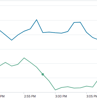
Just want to ask why sometimes there is a dot in my time chart graph? and how to erase that? The dot looks like picture attached.
- Mark as New
- Bookmark Message
- Subscribe to Message
- Mute Message
- Subscribe to RSS Feed
- Permalink
- Report Inappropriate Content
- Mark as New
- Bookmark Message
- Subscribe to Message
- Mute Message
- Subscribe to RSS Feed
- Permalink
- Report Inappropriate Content
@everynameIwantistaken seems like a bug to me.
1) Dot may come when Series Gaps are not connected and i.e. Null and there is only one occurrence of the series value in the chart. However, in your case this is ruled out because Series seems to be connected and values are already present.
2) On a series showMarkers can be turned on to make series better identifiable at various data points on the chart. However, this is ruled out because in the entire series it is happening at only one point.
I am interested in knowing what query you are running. However, you may want to reach out to the Splunk Support team as well if this issue is happening on a regular basis. I am hoping you are on Splunk 7+ version.
| makeresults | eval message= "Happy Splunking!!!"
- Mark as New
- Bookmark Message
- Subscribe to Message
- Mute Message
- Subscribe to RSS Feed
- Permalink
- Report Inappropriate Content
yes, Im on splunk 7.1.2. and is a query that sum up the bytes for the past hour and the same hour from last week, and graph them to show the differences

