Are you a member of the Splunk Community?
- Find Answers
- :
- Using Splunk
- :
- Splunk Search
- :
- Re: Stacked bar chart for specific columns
- Subscribe to RSS Feed
- Mark Topic as New
- Mark Topic as Read
- Float this Topic for Current User
- Bookmark Topic
- Subscribe to Topic
- Mute Topic
- Printer Friendly Page
- Mark as New
- Bookmark Message
- Subscribe to Message
- Mute Message
- Subscribe to RSS Feed
- Permalink
- Report Inappropriate Content
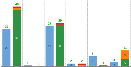
I have four fields, baseline, lvl1,lvl2,lv3. I have to compare baseline vs (lvl1+lvl2+lvl3) to see if sum of lvl1,lvl2,lvl3 is exceeding the baseline.
For that purpose I created stacked chart but it is combining all four fields including baseline, in bar.
Expected result:
Here blue is baseline and others are lvl1, lvl2,lvl3 in stack mode.
Any help would be great!!
- Mark as New
- Bookmark Message
- Subscribe to Message
- Mute Message
- Subscribe to RSS Feed
- Permalink
- Report Inappropriate Content
@prafulljha, with the current Column Chart in Splunk, you can either have Stacked or non stacked chart but not a combination of both. So as @cusello has stated, you can use Baseline as overlay field and for coloring the series you would need to use charting.fieldColors Simple XML Chart Configuration (https://docs.splunk.com/Documentation/Splunk/latest/Viz/ChartConfigurationReference#General_chart_pr...
<option name="charting.fieldColors">{"lvl1":0x00FF00,"lvl2":0xFFC200,"lvl3":0xFF0000}</option>
As evident, the above expects your series names to be lvl1, lvl2 and lvl3 and also if Baseline is the first series it will be picked up as Blue by default series color for the first series.
If you need the Columns as per your screenshot, you might have to build your own custom visualization using Highcharts JS library. Refer to documentation for Building Custom Visualization: https://docs.splunk.com/Documentation/Splunk/latest/AdvancedDev/CustomVizTutorial
| makeresults | eval message= "Happy Splunking!!!"
- Mark as New
- Bookmark Message
- Subscribe to Message
- Mute Message
- Subscribe to RSS Feed
- Permalink
- Report Inappropriate Content
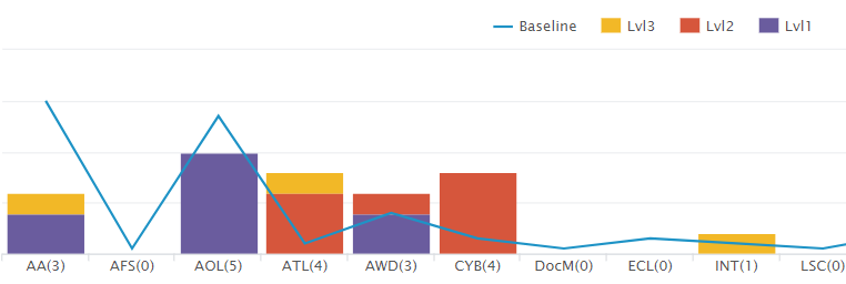
@niketnilay, thanks for your idea, actually this i have already done, the problem we are facing is difficulties while hovering and while clicking on the bar for lvls to see the data below (as these columns are populating data below in tabular form) as this baseline overlay always comes in between(if the values are of same range).
Here is how my panel looks like.
Can you please suggest any alternative way to achieve the same in splunk?
Thanks.
- Mark as New
- Bookmark Message
- Subscribe to Message
- Mute Message
- Subscribe to RSS Feed
- Permalink
- Report Inappropriate Content
@prafulljha, with the current Column Chart in Splunk, you can either have Stacked or non stacked chart but not a combination of both. So as @cusello has stated, you can use Baseline as overlay field and for coloring the series you would need to use charting.fieldColors Simple XML Chart Configuration (https://docs.splunk.com/Documentation/Splunk/latest/Viz/ChartConfigurationReference#General_chart_pr...
<option name="charting.fieldColors">{"lvl1":0x00FF00,"lvl2":0xFFC200,"lvl3":0xFF0000}</option>
As evident, the above expects your series names to be lvl1, lvl2 and lvl3 and also if Baseline is the first series it will be picked up as Blue by default series color for the first series.
If you need the Columns as per your screenshot, you might have to build your own custom visualization using Highcharts JS library. Refer to documentation for Building Custom Visualization: https://docs.splunk.com/Documentation/Splunk/latest/AdvancedDev/CustomVizTutorial
| makeresults | eval message= "Happy Splunking!!!"
- Mark as New
- Bookmark Message
- Subscribe to Message
- Mute Message
- Subscribe to RSS Feed
- Permalink
- Report Inappropriate Content
@niketnilay,
PFB my comments.
- Mark as New
- Bookmark Message
- Subscribe to Message
- Mute Message
- Subscribe to RSS Feed
- Permalink
- Report Inappropriate Content
You have two options,
1) You can use Left Click and Drag option to zoom in to smaller/specific range so that selection of various series is easier.
2) Splunk Enterprise 7.0 came up with new seriesCompare as legend mode using Simple XML Chart configuration: <option name="charting.legend.mode">seriesCompare</option>. This will allow you to hover over a specific region on chart and it will show selected values for all series for that region. This would however work only on Line Chart not Column Chart.

| makeresults | eval message= "Happy Splunking!!!"
- Mark as New
- Bookmark Message
- Subscribe to Message
- Mute Message
- Subscribe to RSS Feed
- Permalink
- Report Inappropriate Content
Hi,
Can anyone provide their inputs ?
Thanks.
- Mark as New
- Bookmark Message
- Subscribe to Message
- Mute Message
- Subscribe to RSS Feed
- Permalink
- Report Inappropriate Content
@prafulljha, can you add some sample tabular data for which you want to create chart?
| makeresults | eval message= "Happy Splunking!!!"
- Mark as New
- Bookmark Message
- Subscribe to Message
- Mute Message
- Subscribe to RSS Feed
- Permalink
- Report Inappropriate Content
@niketnilay, sure. I can provide you the CSVs which i am using, but don't know how to upload the same.
- Mark as New
- Bookmark Message
- Subscribe to Message
- Mute Message
- Subscribe to RSS Feed
- Permalink
- Report Inappropriate Content
You can type the values as text and choose <code> button (101010) while posting. Or else you can take a screenshot and upload to any image sharing site and paste the URL using the image button <img> here.
| makeresults | eval message= "Happy Splunking!!!"
- Mark as New
- Bookmark Message
- Subscribe to Message
- Mute Message
- Subscribe to RSS Feed
- Permalink
- Report Inappropriate Content
@niketnilay -In both the file common field is Dom,so we need to write our query using join so that we can join both the table using field Dom.
(1) For the Baseline count the values are:-
LastUpdatedDateTime Dom Baseline
20:11.5 AA 10
20:11.5 AOL 9
20:11.5 ATL 2
20:11.5 AWD 4
20:11.5 CYB 3
20:11.5 DocM 1
20:11.5 ECL 1
20:11.5 INT 2
20:11.5 LSC 1
20:11.5 LUS 4
20:11.5 NEBAS 1
20:11.5 Ralie 2
20:11.5 SCD 1
20:11.5 TRN 5
(2) For the Levels count these are the values:-
LastUpdatedDateTime Dom MyCount Lvl
56:20.0 TRN 1 Lvl2
56:20.0 ATL 1 Lvl2
56:20.0 TRN 1 Lvl2
56:20.0 CYB 1 Lvl2
56:20.0 TRN 1 Lvl2
56:20.0 LUS 1 Lvl2
56:20.0 CYB 1 Lvl2
56:20.0 ATL 1 Lvl2
56:20.0 CYB 1 Lvl2
56:20.0 TRN 1 Lvl2
56:20.0 TRN 1 Lvl2
56:20.0 LUS 1 Lvl2
56:20.0 AWD 1 Lvl2
56:20.0 TRN 1 Lvl2
56:20.0 CYB 1 Lvl2
56:20.0 TRN 1 Lvl2
56:20.0 ATL 1 Lvl2
56:20.0 LUS 1 Lvl2
56:20.0 INT 1 Lvl3
56:20.0 SCD 1 Lvl3
56:20.0 ATL 1 Lvl3
56:20.0 AA 1 Lvl3
56:20.0 AWD 1 Lvl1
56:20.0 AOL 1 Lvl1
56:20.0 AOL 1 Lvl1
56:20.0 AOL 1 Lvl1
56:20.0 AA 1 Lvl1
56:20.0 AWD 1 Lvl1
56:20.0 AOL 1 Lvl1
56:20.0 AOL 1 Lvl1
56:20.0 AA 1 Lvl1
56:20.0 AA 1 Lvl1
56:20.0 AA 1 Lvl1
56:20.0 AOL 1 Lvl1
56:20.0 AA 1 Lvl1
56:20.0 TRN 1 Lvl1
56:20.0 AA 1 Lvl1
56:20.0 AOL 1 Lvl1
56:20.0 AA 1 Lvl1
56:20.0 AOL 1 Lvl1
56:20.0 AA 1 Lvl1
56:20.0 AA 1 Lvl1
56:20.0 AA 1 Lvl1
56:20.0 AA 1 Lvl1
56:20.0 AOL 1 Lvl1
56:20.0 AWD 1 Lvl1
56:20.0 AOL 1 Lvl1
56:20.0 AOL 1 Lvl1
56:20.0 AA 1 Lvl1
56:20.0 AWD 1 Lvl1
56:20.0 AA 1 Lvl1
56:20.0 AA 1 Lvl1
56:20.0 AWD 1 Lvl1
56:20.0 AOL 1 Lvl1
56:20.0 AOL 1 Lvl1
56:20.0 AA 1 Lvl1
56:20.0 AOL 1 Lvl1
56:20.0 AOL 1 Lvl1
56:20.0 AA 1 Lvl1
56:20.0 AOL 1 Lvl1
56:20.0 AA 1 Lvl1
56:20.0 AA 1 Lvl1
56:20.0 AWD 1 Lvl1
56:20.0 AA 1 Lvl1
56:20.0 AOL 1 Lvl1
56:20.0 AA 1 Lvl1
56:20.0 AOL 1 Lvl1
56:20.0 AA 1 Lvl1
56:20.0 AA 1 Lvl1
56:20.0 AA 1 Lvl1
56:20.0 AA 1 Lvl1
56:20.0 AA 1 Lvl1
56:20.0 AA 1 Lvl1
56:20.0 AOL 1 Lvl1
56:20.0 AOL 1 Lvl1
56:20.0 AWD 1 Lvl1
56:20.0 AWD 1 Lvl1
56:20.0 AOL 1 Lvl1
56:20.0 AA 1 Lvl1
56:20.0 AOL 1 Lvl1
56:20.0 AOL 1 Lvl1
56:20.0 AA 1 Lvl1
56:20.0 AA 1 Lvl1
- Mark as New
- Bookmark Message
- Subscribe to Message
- Mute Message
- Subscribe to RSS Feed
- Permalink
- Report Inappropriate Content
Hi prafulljha,
do you want to have a graphic solution or a calculated solution?
if you want a graphic solution you could create a new field that sum lvl1,lvl2 and lv3 and then overlay this value in your graphic.
If instead you want a calculated solution you could add to your search a field from eval command
| eval result=if(baseline>lvl1+lvl2+lv3,"OK","NOK")
Bye.
Giuseppe
- Mark as New
- Bookmark Message
- Subscribe to Message
- Mute Message
- Subscribe to RSS Feed
- Permalink
- Report Inappropriate Content
I want the graphic solution. I tried overlay option also. But the problem with that is, coincidentally the count of baseline (overlay field) is overlapping with count of stacked bars of fields (lvl1 or lvl2 or lv3) in visualization. So that is not impressive. If there is any way to take care of this situation in this method or any alternate, will be helpful
- Mark as New
- Bookmark Message
- Subscribe to Message
- Mute Message
- Subscribe to RSS Feed
- Permalink
- Report Inappropriate Content
You could put in your graphic only baseline and the sum of other fields, not staked, so you can see any difference.
Bye.
Giuseppe
- Mark as New
- Bookmark Message
- Subscribe to Message
- Mute Message
- Subscribe to RSS Feed
- Permalink
- Report Inappropriate Content
I have to see levels also, like in above pic, different colors represents different levels. Green for Lvl1, Orange for lvl3, Red for lvl3 and blue for baseline


