Turn on suggestions
Auto-suggest helps you quickly narrow down your search results by suggesting possible matches as you type.
Splunk Search
×
Join the Conversation
Without signing in, you're just watching from the sidelines. Sign in or Register to connect, share, and be part of the Splunk Community.
Turn on suggestions
Auto-suggest helps you quickly narrow down your search results by suggesting possible matches as you type.
- Find Answers
- :
- Using Splunk
- :
- Splunk Search
- :
- Move or add Y axis to the right of multi-series li...
Options
- Subscribe to RSS Feed
- Mark Topic as New
- Mark Topic as Read
- Float this Topic for Current User
- Bookmark Topic
- Subscribe to Topic
- Mute Topic
- Printer Friendly Page
- Mark as New
- Bookmark Message
- Subscribe to Message
- Mute Message
- Subscribe to RSS Feed
- Permalink
- Report Inappropriate Content
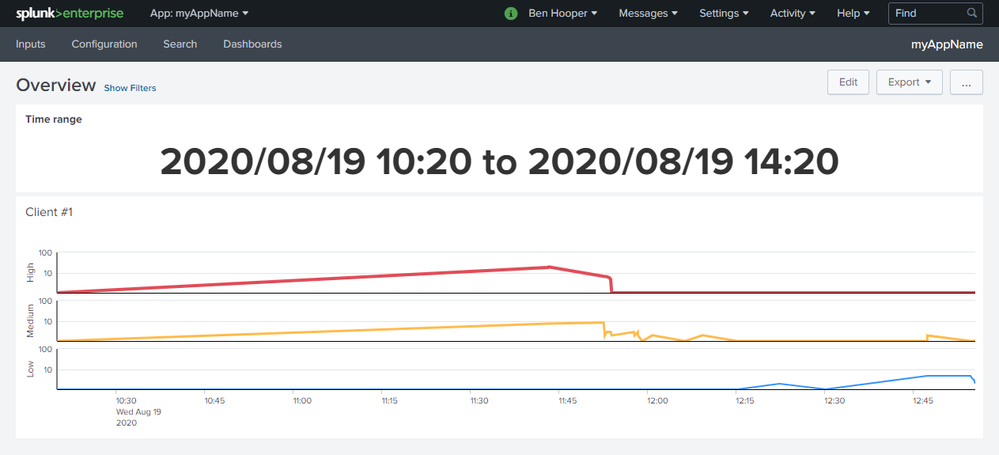
Move or add Y axis to the right of multi-series line chart
benhooper
Communicator
08-20-2020
07:37 AM
I've made the following multi-series line chart (details) where it makes much more sense to have the Y axis on the right-hand side as that's where the most recent values are charted:
Unfortunately, I can't see a way to do this. The most common recommendation that I've found is to use an overlay but it seems that that's incompatible with multi-series mode.
Can anyone help?
Get Updates on the Splunk Community!
[Puzzles] Solve, Learn, Repeat: Reprocessing XML into Fixed-Length Events
This challenge was first posted on Slack #puzzles channelFor a previous puzzle, I needed a set of fixed-length ...
Data Management Digest – December 2025
Welcome to the December edition of Data Management Digest!
As we continue our journey of data innovation, the ...
Index This | What is broken 80% of the time by February?
December 2025 Edition
Hayyy Splunk Education Enthusiasts and the Eternally Curious!
We’re back with this ...

