Turn on suggestions
Auto-suggest helps you quickly narrow down your search results by suggesting possible matches as you type.
Splunk Search
×
Are you a member of the Splunk Community?
Sign in or Register with your Splunk account to get your questions answered, access valuable resources and connect with experts!
Turn on suggestions
Auto-suggest helps you quickly narrow down your search results by suggesting possible matches as you type.
- Find Answers
- :
- Using Splunk
- :
- Splunk Search
- :
- Move or add Y axis to the right of multi-series li...
Options
- Subscribe to RSS Feed
- Mark Topic as New
- Mark Topic as Read
- Float this Topic for Current User
- Bookmark Topic
- Subscribe to Topic
- Mute Topic
- Printer Friendly Page
- Mark as New
- Bookmark Message
- Subscribe to Message
- Mute Message
- Subscribe to RSS Feed
- Permalink
- Report Inappropriate Content
Move or add Y axis to the right of multi-series line chart
benhooper
Communicator
08-20-2020
07:37 AM
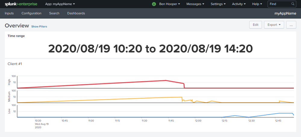
I've made the following multi-series line chart (details) where it makes much more sense to have the Y axis on the right-hand side as that's where the most recent values are charted:
Unfortunately, I can't see a way to do this. The most common recommendation that I've found is to use an overlay but it seems that that's incompatible with multi-series mode.
Can anyone help?
Career Survey
First 500 qualified respondents will receive a $20 gift card! Tell us about your professional Splunk journey.
Get Updates on the Splunk Community!
Can’t Make It to Boston? Stream .conf25 and Learn with Haya Husain
Boston may be buzzing this September with Splunk University and .conf25, but you don’t have to pack a bag to ...
Splunk Lantern’s Guide to The Most Popular .conf25 Sessions
Splunk Lantern is a Splunk customer success center that provides advice from Splunk experts on valuable data ...
Unlock What’s Next: The Splunk Cloud Platform at .conf25
In just a few days, Boston will be buzzing as the Splunk team and thousands of community members come together ...

