Are you a member of the Splunk Community?
- Find Answers
- :
- Using Splunk
- :
- Splunk Search
- :
- Re: Is there a better way to represent varying dat...
- Subscribe to RSS Feed
- Mark Topic as New
- Mark Topic as Read
- Float this Topic for Current User
- Bookmark Topic
- Subscribe to Topic
- Mute Topic
- Printer Friendly Page
- Mark as New
- Bookmark Message
- Subscribe to Message
- Mute Message
- Subscribe to RSS Feed
- Permalink
- Report Inappropriate Content
Hi all,
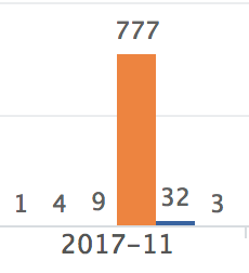
I am having an issue with a dashboard that I am working with. The values of the bucket I am using vary from 1 to ~800. Because of this, it makes it impossible to effectively convey the data using this visualization as seen in the attached picture. Has anyone found a way to better represent varying data sets or have any suggestions?
Thanks in advance
- Mark as New
- Bookmark Message
- Subscribe to Message
- Mute Message
- Subscribe to RSS Feed
- Permalink
- Report Inappropriate Content
Hi,
In the chart option format, in Y-Axis, you can change the scale from Linear to Log.
Maybe that could help you with your visualization.
You can put 0 in Min Value and 800 for the Max Value
Let me know
Kail
- Mark as New
- Bookmark Message
- Subscribe to Message
- Mute Message
- Subscribe to RSS Feed
- Permalink
- Report Inappropriate Content
Hi Kali,
I was able to switch to log scale and it made it much more useful.
Thanks for the help!
- Mark as New
- Bookmark Message
- Subscribe to Message
- Mute Message
- Subscribe to RSS Feed
- Permalink
- Report Inappropriate Content
Great !
I convert my comment to an answer so you can accept it !
Kail

