Are you a member of the Splunk Community?
- Find Answers
- :
- Using Splunk
- :
- Splunk Search
- :
- Re: Is conditional background coloring possible in...
- Subscribe to RSS Feed
- Mark Topic as New
- Mark Topic as Read
- Float this Topic for Current User
- Bookmark Topic
- Subscribe to Topic
- Mute Topic
- Printer Friendly Page
- Mark as New
- Bookmark Message
- Subscribe to Message
- Mute Message
- Subscribe to RSS Feed
- Permalink
- Report Inappropriate Content
Hi Team,
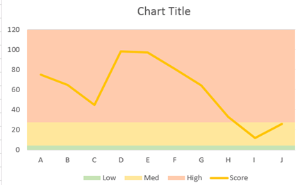
Can any one help me to know if conditional coloring is possible in Splunk Charts as shown in the below image?
Basically, the background color will be horizontal divisions on basis of condition defined, like for the below chart,
0-5 -> Low - Green Colour
6-25-> Medium - Yellow Colour
more than 25 -> High - Amber Colour

Please guide how such chart can be made in Splunk Dashboard.
Update
If not colouring, atleast can we add additional graph lines, perhaps dotted across the graph to show the threshold boundaries?
Anyone who can help on pointers on this?
- Mark as New
- Bookmark Message
- Subscribe to Message
- Mute Message
- Subscribe to RSS Feed
- Permalink
- Report Inappropriate Content
If not colouring, atleast can we add additional graph lines, perhaps dotted across the graph to show the threshold boundaries?
That you can be done simply enough.
eval threshold1 = 100 ; eval threshold2 = 200 ; eval threshold1 = 500
Then just select each of those in the visualization panel as a new axis.
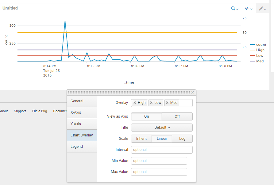
Example search : index=_internal | timechart count | eval Low=10, Med=20, High=50
Those numbers could be calculated in your search dynamically aswell.
And what it looks like
- Mark as New
- Bookmark Message
- Subscribe to Message
- Mute Message
- Subscribe to RSS Feed
- Permalink
- Report Inappropriate Content
Hey Ashish,
Not sure if you found a solution to your problem but I like the idea of what you are trying to achieve so I played around with it to see what could be done.
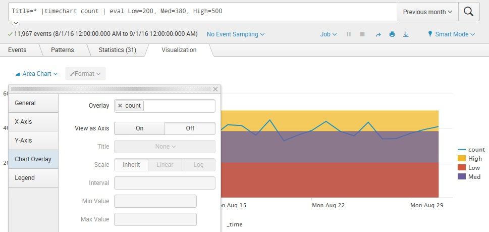
Taking the ideas posted by Lucas K I tweaked it and came up with this:
Basically you run your search | pipe a timechart with a count | then pipe an eval with your high med and low values.
Change your chart type to an area chart (This will give you the coloured stripes)
Then instead of overlaying the low, med, high.
The overlay your count.
It looks the way you want it but be aware that your high, medium and low chart levels will have total mouse overs just like the count chart
Hope this helps
Mel
the app assembly
- Mark as New
- Bookmark Message
- Subscribe to Message
- Mute Message
- Subscribe to RSS Feed
- Permalink
- Report Inappropriate Content
Close enough! Almost similar to what i needed. The only issue which appears to be here is that if my low value is 200, med value is 400 and High value is 600 then High value (600) color is from 0 to 600. Which basically overlaps the low and medium colour.
Apart from that this looks good!
Thanks @Melstrathdee
- Mark as New
- Bookmark Message
- Subscribe to Message
- Mute Message
- Subscribe to RSS Feed
- Permalink
- Report Inappropriate Content
If not colouring, atleast can we add additional graph lines, perhaps dotted across the graph to show the threshold boundaries?
That you can be done simply enough.
eval threshold1 = 100 ; eval threshold2 = 200 ; eval threshold1 = 500
Then just select each of those in the visualization panel as a new axis.
Example search : index=_internal | timechart count | eval Low=10, Med=20, High=50
Those numbers could be calculated in your search dynamically aswell.
And what it looks like
- Mark as New
- Bookmark Message
- Subscribe to Message
- Mute Message
- Subscribe to RSS Feed
- Permalink
- Report Inappropriate Content
seems to be good workaround! Thanks @Lucas K
any ideas on how can i make the lines distinct/dotted or bit lighter as compared to other graph lines?
- Mark as New
- Bookmark Message
- Subscribe to Message
- Mute Message
- Subscribe to RSS Feed
- Permalink
- Report Inappropriate Content
Additionally, if you make it a non-stacked area graph instead of a line (if that visualization has the same settings), the white part below the lines will be colored, too.
- Mark as New
- Bookmark Message
- Subscribe to Message
- Mute Message
- Subscribe to RSS Feed
- Permalink
- Report Inappropriate Content
yes not exactly the way wanted, but yes! Thanks @woodcock
- Mark as New
- Bookmark Message
- Subscribe to Message
- Mute Message
- Subscribe to RSS Feed
- Permalink
- Report Inappropriate Content
See if you get any ideas from this post here. You can setup score as an overlay
https://answers.splunk.com/answers/58335/change-chart-bar-color-based-on-data-value.html
- Mark as New
- Bookmark Message
- Subscribe to Message
- Mute Message
- Subscribe to RSS Feed
- Permalink
- Report Inappropriate Content
The above link, does helps me to change the color of the chart. But i do not see any hint of changing the background color of chart. Is there something which i am missing? Can you help?
- Mark as New
- Bookmark Message
- Subscribe to Message
- Mute Message
- Subscribe to RSS Feed
- Permalink
- Report Inappropriate Content
Hi ashish9433,
Take a look at the links below. I believe this can help.
http://docs.splunk.com/Documentation/Splunk/6.1.3/Viz/Chartcustomization
http://docs.splunk.com/Documentation/Splunk/6.2.3/Viz/PanelreferenceforSimplifiedXML
http://docs.splunk.com/Documentation/Splunk/6.2.2/AdvancedDev/CustomChartingConfig-ChartLegend#radia...
https://answers.splunk.com/answers/22989/how-to-custom-chart-x-axis-labelposition-viz-uprotationlabe...
- Mark as New
- Bookmark Message
- Subscribe to Message
- Mute Message
- Subscribe to RSS Feed
- Permalink
- Report Inappropriate Content
Let us suppose, i have a chart as below
search = basically count of events in all of my index and assume that score is the count (in the main question image).
This is the XML code with no modification (default)
<dashboard>
  <label>Chart Colouring</label>
  <description>Test App</description>
  <row>
    <panel>
      <chart>
        <search>
          <query>index=* | stats count by index</query>
          <earliest>-24h@h</earliest>
          <latest>now</latest>
        </search>
        <option name="charting.axisLabelsX.majorLabelStyle.overflowMode">ellipsisNone</option>
        <option name="charting.axisLabelsX.majorLabelStyle.rotation">0</option>
        <option name="charting.axisTitleX.visibility">visible</option>
        <option name="charting.axisTitleY.visibility">visible</option>
        <option name="charting.axisTitleY2.visibility">visible</option>
        <option name="charting.axisX.scale">linear</option>
        <option name="charting.axisY.scale">linear</option>
        <option name="charting.axisY2.enabled">0</option>
        <option name="charting.axisY2.scale">inherit</option>
        <option name="charting.chart">line</option>
        <option name="charting.chart.bubbleMaximumSize">50</option>
        <option name="charting.chart.bubbleMinimumSize">10</option>
        <option name="charting.chart.bubbleSizeBy">area</option>
        <option name="charting.chart.nullValueMode">gaps</option>
        <option name="charting.chart.showDataLabels">none</option>
        <option name="charting.chart.sliceCollapsingThreshold">0.01</option>
        <option name="charting.chart.stackMode">default</option>
        <option name="charting.chart.style">shiny</option>
        <option name="charting.drilldown">all</option>
        <option name="charting.layout.splitSeries">0</option>
        <option name="charting.layout.splitSeries.allowIndependentYRanges">0</option>
        <option name="charting.legend.labelStyle.overflowMode">ellipsisMiddle</option>
        <option name="charting.legend.placement">right</option>
      </chart>
    </panel>
  </row>
</dashboard>
I tried adding the below code
<option name="charting.backgroundBrush">solidFill</option>
<option name="charting.backgroundBrush.color">0xFF0000</option>
<option name="charting.backgroundBrush.alpha">0.5</option>
in the dashboard as below
<dashboard>
  <label>Chart Colouring</label>
  <description>Test App</description>
  <row>
    <panel>
      <chart>
        <search>
          <query>index=* | stats count by index</query>
          <earliest>-24h@h</earliest>
          <latest>now</latest>
        </search>
        <option name="charting.backgroundBrush">solidFill</option>
        <option name="charting.backgroundBrush.color">0xFF0000</option>
        <option name="charting.backgroundBrush.alpha">0.5</option>
        <option name="charting.axisLabelsX.majorLabelStyle.overflowMode">ellipsisNone</option>
        <option name="charting.axisLabelsX.majorLabelStyle.rotation">0</option>
        <option name="charting.axisTitleX.visibility">visible</option>
        <option name="charting.axisTitleY.visibility">visible</option>
        <option name="charting.axisTitleY2.visibility">visible</option>
        <option name="charting.axisX.scale">linear</option>
        <option name="charting.axisY.scale">linear</option>
        <option name="charting.axisY2.enabled">0</option>
        <option name="charting.axisY2.scale">inherit</option>
        <option name="charting.chart">line</option>
        <option name="charting.chart.bubbleMaximumSize">50</option>
        <option name="charting.chart.bubbleMinimumSize">10</option>
        <option name="charting.chart.bubbleSizeBy">area</option>
        <option name="charting.chart.nullValueMode">gaps</option>
        <option name="charting.chart.showDataLabels">none</option>
        <option name="charting.chart.sliceCollapsingThreshold">0.01</option>
        <option name="charting.chart.stackMode">default</option>
        <option name="charting.chart.style">shiny</option>
        <option name="charting.drilldown">all</option>
        <option name="charting.layout.splitSeries">0</option>
        <option name="charting.layout.splitSeries.allowIndependentYRanges">0</option>
        <option name="charting.legend.labelStyle.overflowMode">ellipsisMiddle</option>
        <option name="charting.legend.placement">right</option>
      </chart>
    </panel>
  </row>
</dashboard>
and i even tried adding the below code
<option name="charting.backgroundBrush">gradientFill</option>
<option name="charting.backgroundBrush.type">radial</option>
<option name="charting.backgroundBrush.colors">[0xFF0000,0x0000FF]</option>
<option name="charting.backgroundBrush.alphas">[1,1]</option>
<option name="charting.backgroundBrush.ratios">[0,255]</option>
<option name="charting.backgroundBrush.focalPointRatio">.5</option>
in the XML code as below
<dashboard>
  <label>Chart Colouring</label>
  <description>Test App</description>
  <row>
    <panel>
      <chart>
        <search>
          <query>index=* | stats count by index</query>
          <earliest>-24h@h</earliest>
          <latest>now</latest>
        </search>
        <option name="charting.backgroundBrush">gradientFill</option>
        <option name="charting.backgroundBrush.type">radial</option>
        <option name="charting.backgroundBrush.colors">[0xFF0000,0x0000FF]</option>
        <option name="charting.backgroundBrush.alphas">[1,1]</option>
        <option name="charting.backgroundBrush.ratios">[0,255]</option>
        <option name="charting.backgroundBrush.focalPointRatio">.5</option>
        <option name="charting.axisLabelsX.majorLabelStyle.overflowMode">ellipsisNone</option>
        <option name="charting.axisLabelsX.majorLabelStyle.rotation">0</option>
        <option name="charting.axisTitleX.visibility">visible</option>
        <option name="charting.axisTitleY.visibility">visible</option>
        <option name="charting.axisTitleY2.visibility">visible</option>
        <option name="charting.axisX.scale">linear</option>
        <option name="charting.axisY.scale">linear</option>
        <option name="charting.axisY2.enabled">0</option>
        <option name="charting.axisY2.scale">inherit</option>
        <option name="charting.chart">line</option>
        <option name="charting.chart.bubbleMaximumSize">50</option>
        <option name="charting.chart.bubbleMinimumSize">10</option>
        <option name="charting.chart.bubbleSizeBy">area</option>
        <option name="charting.chart.nullValueMode">gaps</option>
        <option name="charting.chart.showDataLabels">none</option>
        <option name="charting.chart.sliceCollapsingThreshold">0.01</option>
        <option name="charting.chart.stackMode">default</option>
        <option name="charting.chart.style">shiny</option>
        <option name="charting.drilldown">all</option>
        <option name="charting.layout.splitSeries">0</option>
        <option name="charting.layout.splitSeries.allowIndependentYRanges">0</option>
        <option name="charting.legend.labelStyle.overflowMode">ellipsisMiddle</option>
        <option name="charting.legend.placement">right</option>
      </chart>
    </panel>
  </row>
</dashboard>
But there was no change in the background of the chart. I am able to change the background (white color) to any one single colour by adding the below code
<option name="charting.backgroundColor">0xFFFFFF</option>
But how do i add multiple colours in the background with specific conditions is what i am looking at.
Can you help me what exactly i am missing? or what way should i proceed to get the required background in the chart?
- Mark as New
- Bookmark Message
- Subscribe to Message
- Mute Message
- Subscribe to RSS Feed
- Permalink
- Report Inappropriate Content
I tried and read all the links thoroughly, and i got one link which describes filling the background of the graph.
So basically changing the background to one specific colour is working. But i when i tried some other options like SolidFill, GradientFill with multiple colours i do not see any change in the graph.
Is there anything i am missing?
- Mark as New
- Bookmark Message
- Subscribe to Message
- Mute Message
- Subscribe to RSS Feed
- Permalink
- Report Inappropriate Content
Could you post your code for looking any thing can help you?
- Mark as New
- Bookmark Message
- Subscribe to Message
- Mute Message
- Subscribe to RSS Feed
- Permalink
- Report Inappropriate Content
any clues, after looking at the code below?


