Are you a member of the Splunk Community?
- Find Answers
- :
- Using Splunk
- :
- Splunk Search
- :
- How to properly display trend comparison of values...
- Subscribe to RSS Feed
- Mark Topic as New
- Mark Topic as Read
- Float this Topic for Current User
- Bookmark Topic
- Subscribe to Topic
- Mute Topic
- Printer Friendly Page
- Mark as New
- Bookmark Message
- Subscribe to Message
- Mute Message
- Subscribe to RSS Feed
- Permalink
- Report Inappropriate Content
The following query will display a simple chart for trend comparison. This works well if you keep the days you're comparing =< 4 days.
The Query:
index="my_index"
| search src="all_sources"
| bin _time as Time
| eval Day=strftime(Time,"%m-%d")
| eval Hour=strftime(Time,"%H")
| chart eval(round(avg(transfer_duration), 2)) as AvgXferDuration over Hour by Day
The above query will produce the following graph. (as long as its =< 4 days)
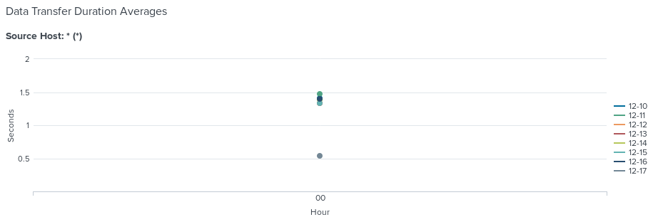
Now, if you increase the days to > 4 days. For example, if you want to see a week's trend (7 days). You will get the following graph. Notice the graph lines become scattered points in the center. (not sure why this happens)
What is the proper way to display the graph for multiple days? e.g. > 4 days, 7 days, etc.
- Mark as New
- Bookmark Message
- Subscribe to Message
- Mute Message
- Subscribe to RSS Feed
- Permalink
- Report Inappropriate Content
| makeresults count=2
| streamstats count
| eval _time = if (count==2,relative_time(_time,"-2month@d"), relative_time(_time,"@d"))
| makecontinuous _time span=15min
| eval transfer_duration=random() % 3.50 + .5

| rename COMMENT AS "Everything above generates sample event data; everything below is your solution."

| eval Day=strftime(_time,"%m-%d")
| eval Hour=strftime(_time,"%H")

| rename COMMENT AS "this is key logic"

| where _time >relative_time(now(),"-7d@d")

| chart eval(round(avg(transfer_duration), 2)) as AvgXferDuration over Hour by Day
- Mark as New
- Bookmark Message
- Subscribe to Message
- Mute Message
- Subscribe to RSS Feed
- Permalink
- Report Inappropriate Content
Thank you very much @to4kawa . I see where my issue was. Your example helped me pay attention to the details.
Turns out if I DO NOT bin _time, but instead remove it from my query, the chart command processes my transform correctly.
Again, thank you for your suggestion. Please enjoy some of my karma.


