Turn on suggestions
Auto-suggest helps you quickly narrow down your search results by suggesting possible matches as you type.
Splunk Search
×
Are you a member of the Splunk Community?
Sign in or Register with your Splunk account to get your questions answered, access valuable resources and connect with experts!
Turn on suggestions
Auto-suggest helps you quickly narrow down your search results by suggesting possible matches as you type.
- Find Answers
- :
- Using Splunk
- :
- Splunk Search
- :
- Re: How to edit my search to display a distributio...
Options
- Subscribe to RSS Feed
- Mark Topic as New
- Mark Topic as Read
- Float this Topic for Current User
- Bookmark Topic
- Subscribe to Topic
- Mute Topic
- Printer Friendly Page
- Mark as New
- Bookmark Message
- Subscribe to Message
- Mute Message
- Subscribe to RSS Feed
- Permalink
- Report Inappropriate Content
kualo
Explorer
11-21-2016
08:51 AM
[2016-xx-xx-xx:xx:xx:xxxx] modelName=model1, modelScore=10
[2016-xx-xx-xx:xx:xx:xxxx] modelName=model2, modelScore=100
[2016-xx-xx-xx:xx:xx:xxxx] modelName=model3, modelScore=50
My log looks something like above
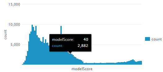
some search| stats count by modelScore | sort modelScore
I have the above search to show the distribution of the modelScore using bar visualization.
However, I would like to show modelScore for each modelName in the same bar graph in different colors.
Is there any way I can do that?
Thanks.
1 Solution
- Mark as New
- Bookmark Message
- Subscribe to Message
- Mute Message
- Subscribe to RSS Feed
- Permalink
- Report Inappropriate Content
gokadroid
Motivator
11-21-2016
09:09 AM
can you try this please based on whichever way you want to chart:
Keeping modelName on x axis
some search| chart count over modelName by modelScore
OR
Keeping modelScore on x axis
some search| chart count over modelScore by modelName
- Mark as New
- Bookmark Message
- Subscribe to Message
- Mute Message
- Subscribe to RSS Feed
- Permalink
- Report Inappropriate Content
aljohnson_splun

Splunk Employee
11-22-2016
08:26 AM
You probably want to use some search| stats count by modelScore | makecontinuous modelScore as to add any potentially empty buckets/bins.
- Mark as New
- Bookmark Message
- Subscribe to Message
- Mute Message
- Subscribe to RSS Feed
- Permalink
- Report Inappropriate Content
gokadroid
Motivator
11-21-2016
09:09 AM
can you try this please based on whichever way you want to chart:
Keeping modelName on x axis
some search| chart count over modelName by modelScore
OR
Keeping modelScore on x axis
some search| chart count over modelScore by modelName
- Mark as New
- Bookmark Message
- Subscribe to Message
- Mute Message
- Subscribe to RSS Feed
- Permalink
- Report Inappropriate Content
kualo
Explorer
11-22-2016
08:31 AM
Thanks! I works perfectly.
Get Updates on the Splunk Community!
Index This | Why did the turkey cross the road?
November 2025 Edition
Hayyy Splunk Education Enthusiasts and the Eternally Curious!
We’re back with this ...
Enter the Agentic Era with Splunk AI Assistant for SPL 1.4
🚀 Your data just got a serious AI upgrade — are you ready?
Say hello to the Agentic Era with the ...
Feel the Splunk Love: Real Stories from Real Customers
Hello Splunk Community,
What’s the best part of hearing how our customers use Splunk? Easy: the positive ...

