- Find Answers
- :
- Using Splunk
- :
- Splunk Search
- :
- How to create pie charts with column values?
- Subscribe to RSS Feed
- Mark Topic as New
- Mark Topic as Read
- Float this Topic for Current User
- Bookmark Topic
- Subscribe to Topic
- Mute Topic
- Printer Friendly Page
- Mark as New
- Bookmark Message
- Subscribe to Message
- Mute Message
- Subscribe to RSS Feed
- Permalink
- Report Inappropriate Content
Hi guys, I am quite new to the Splunk world, pls forgive me for asking a very basic question.
So I have a table as following:
job_id total_passed total_failed total_not_run
9 14 20 6
10 25 31 9
and so on. I want to create a pie chart for different job_ids (lets say 9), with total_passed, total_failed, total_not_run values (14, 20, 6) and total_passed, total_failed, total_not_run as the headers of the chart in Splunk dashboard. how to do it? any help will be deeply appreciated.
- Mark as New
- Bookmark Message
- Subscribe to Message
- Mute Message
- Subscribe to RSS Feed
- Permalink
- Report Inappropriate Content
So, if you're only looking to show a pie chart for a single job_id, then you could do this
| makeresults
| eval _raw="job_id     total_passed        total_failed      total_not_run
9                14                           20                         6
10              25                            31                        9"
| multikv forceheader=1

| table job_id total_passed total_failed total_not_run
| where job_id=9
| transpose 0 header_field=job_id
The first part up to the '| table..' is creating your example.
The 'where' statement is just filtering only job_id 9
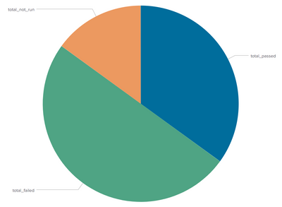
and the transpose statement converts columns to rows, so you will have 3 rows with the names/values and then the pie chart will look like this
- Mark as New
- Bookmark Message
- Subscribe to Message
- Mute Message
- Subscribe to RSS Feed
- Permalink
- Report Inappropriate Content
Thanks @bowesmana !
- Mark as New
- Bookmark Message
- Subscribe to Message
- Mute Message
- Subscribe to RSS Feed
- Permalink
- Report Inappropriate Content
Thanks a lot @bowesmana. Tried it, works like a charm!
1 follow up question on this, how can I change the colour of the pie chart sections and the name of the fields shown on the pie chart section (instead of total_passed, I would like to see Total Passed).
Thanks a lot mate for helping me out here!
- Mark as New
- Bookmark Message
- Subscribe to Message
- Mute Message
- Subscribe to RSS Feed
- Permalink
- Report Inappropriate Content
Here's an example dashboard showing the rename and setting the colours.
In the XML you can see charting.fieldColors option to set the colours
<dashboard>
  <label>tst1</label>
  <row>
    <panel>
      <chart>
        <search>
          <query>| makeresults
| eval _raw="job_id     total_passed        total_failed      total_not_run
9                14                           20                         6
10              25                            31                        9"
| multikv forceheader=1

| table job_id total_passed total_failed total_not_run
| where job_id=9
| rename total_passed as "Total Passed" total_failed as "Total Failed" total_not_run as "Total not Run"
| transpose 0 header_field=job_id</query>
          <earliest>-24h@h</earliest>
          <latest>now</latest>
          <sampleRatio>1</sampleRatio>
        </search>
        <option name="charting.chart">pie</option>
        <option name="charting.drilldown">none</option>
        <option name="refresh.display">progressbar</option>
        <option name="charting.fieldColors">
          {"Total Failed": 0xFF0000, "Total not Run": 0xFF9900, "Total Passed":0x009900, "NULL":0xC4C4C0}
        </option>
      </chart>
    </panel>
  </row>
</dashboard>
- Mark as New
- Bookmark Message
- Subscribe to Message
- Mute Message
- Subscribe to RSS Feed
- Permalink
- Report Inappropriate Content
So, if you're only looking to show a pie chart for a single job_id, then you could do this
| makeresults
| eval _raw="job_id     total_passed        total_failed      total_not_run
9                14                           20                         6
10              25                            31                        9"
| multikv forceheader=1

| table job_id total_passed total_failed total_not_run
| where job_id=9
| transpose 0 header_field=job_id
The first part up to the '| table..' is creating your example.
The 'where' statement is just filtering only job_id 9
and the transpose statement converts columns to rows, so you will have 3 rows with the names/values and then the pie chart will look like this

