- Splunk Answers
- :
- Using Splunk
- :
- Splunk Search
- :
- How to create a stacked column chart with dynamic ...
- Subscribe to RSS Feed
- Mark Topic as New
- Mark Topic as Read
- Float this Topic for Current User
- Bookmark Topic
- Subscribe to Topic
- Mute Topic
- Printer Friendly Page
- Mark as New
- Bookmark Message
- Subscribe to Message
- Mute Message
- Subscribe to RSS Feed
- Permalink
- Report Inappropriate Content
How to create a stacked column chart with dynamic content where I'll have a column for each timestamp?
Hi.
I have a very simple log this time where I find two boolean vars A and B which values can be 'FAIL' and 'PASS'.
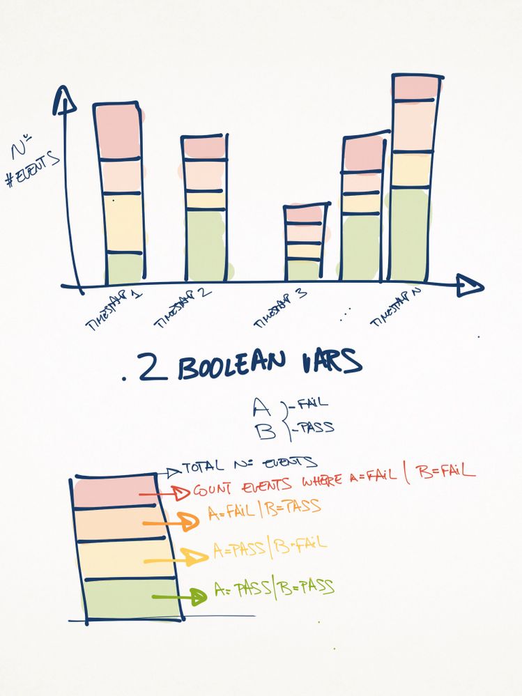
I'd like to create a stacked column chart where I'll have a different column for each timestamp. In every column, I'll have 4 different colours like this:
Don't panic, I attached a picture of what I'd need to get 😉
- the height of the column will be the total count of events for a given timestamp.
- the red area (first from the top) will represent a % of events where A=FAIL AND B=FAIL
- the orange area (second from the top) will represent a % of events where A=FAIL AND B=PASS
- the yellow area (third from the top) will represent a % of events where A=PASS AND B=FAIL
- the green area (fourth from the top) will represent a % of events where A=PASS AND B=PASS
I hope I made myself clear and any help will be absolutely valuable and welcome, thanks in advance!!!
The promised picture:
Best regards,
David Eladio García Ontañón.-
- Mark as New
- Bookmark Message
- Subscribe to Message
- Mute Message
- Subscribe to RSS Feed
- Permalink
- Report Inappropriate Content
This should do it
your base search | table _time A B | eval BothPass=if(A="PASS" AND B="PASS",1,0) | eval APass=if(A="PASS" AND B="FAIL",1,0) | eval BPass=if(A="FAIL" AND B="PASS",1,0) | eval BothFail=if(A="FAIL" AND B="FAIL",1,0) | table _time BothPass APass BPass BothFail | timechart span=yourChosenSpan sum(*) as *
During visualization, choose the stacked option in the column chart. For specific colors, you'd need to add the fieldColor option in the chart visualization.
 <chart>
       <search.....  </search>
       <option name="charting.chart">column</option>
       <option name="charting.chart.stackMode">stacked</option>
       <option name="charting.fieldColors">{"BothFail":0xFF0000,"BPass":"0xFFA500","APass":0xFFFF00, "BothPass":0x73A550}</option>
       .....remaining option....
     </chart>
- Mark as New
- Bookmark Message
- Subscribe to Message
- Mute Message
- Subscribe to RSS Feed
- Permalink
- Report Inappropriate Content
Thanks! i followed the two answers to learn myself and finally managed to get the chart i needed. Thanks!
- Mark as New
- Bookmark Message
- Subscribe to Message
- Mute Message
- Subscribe to RSS Feed
- Permalink
- Report Inappropriate Content
Glad you found the guidance you needed from @somesoni2 and @sundareshr 🙂 I know it's tough, but could you resolve the post by clicking "Accept" below the answer you used the most to get your final result? Also, it would be great if you could share that final solution here for others to learn and see how you produced your desired chart. Don't forget to upvote both answers for helping you out!
Patrick
- Mark as New
- Bookmark Message
- Subscribe to Message
- Mute Message
- Subscribe to RSS Feed
- Permalink
- Report Inappropriate Content
Without data sample, give this a shot
base search here | eventstats count as total | eval state=case(A="Pass" AND B="Pass", "ABPass", A="Pass" AND B="Fail", "APassBFail", A="Fail" AND B="Pass", "AFailBPass", A="Fail" AND B="Fail", "ABFail", 1=1, "UNK") | bin span=1h | eventstats countevat as statecount by _time state | eval time=_time."#".total | chart max(statecount) over time by state | rex field=time "(?<Time>[^#]+)#(?<total>.*)" | fields - time | eval ABPassPerc=ABPass/total*100 ..... you get the idea.
Format you chart as a stacked chart. And you should get the desired outcome.
- Mark as New
- Bookmark Message
- Subscribe to Message
- Mute Message
- Subscribe to RSS Feed
- Permalink
- Report Inappropriate Content
Wow! Thank you two!!! i'll make my best to test this asap today and of course i'll let you know the result!
Thanks!

